
The Principles of Adaptive Design. There’s a conversation that crops up time to time again about the definition of responsive design and treating RWD as a goal unto itself.

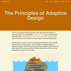
Has it evolved beyond Ethan Marcotte’s original definition? There are so many articles out there on the subject already, but since it keeps coming up I figure it’s still worth talking about. Of course there’s a whole lot more to creating a great multi-device than fluid grids, flexible media, and media queries. The core tenets of responsive design are obviously important, and over the last few years they’ve helped the Web community better cope with the never-ending flood of Web-enabled devices.
But those three ingredients are just the tip of the iceberg. So what beyond fluid grids, flexible media, and media queries do we need to concern ourselves with when crafting multi-device Web experiences? Ubiquity The power of the Web is its ubiquity, and it’s our responsibility as web designers to do our best to preserve the Web’s biggest feature. Flexibility. Adaptive Images in HTML. Demo: Adaptive Design With Media Queries.
Fusce ut sem est.

In eu sagittis felis. In gravida arcu ut neque ornare vitae rutrum turpis vehicula. Nunc ultrices sem mollis metus rutrum non malesuada metus fermentum. Vestibulum ante ipsum primis in faucibus orci luctus et ultrices posuere cubilia Curae; Pellentesque interdum rutrum quam, a pharetra est pulvinar ac. Vestibulum congue nisl magna. Vimeo Video YouTube. Readability: the Optimal Line Length. Having the right amount of characters on each line is key to the readability of your text.

It shouldn’t merely be your design that dictates the width of your text, it should also be a matter of legibility. The optimal line length for your body text is considered to be 50-60 characters per line, including spaces (“Typographie”, E. Ruder). Other sources suggest that up to 75 characters is acceptable. So what’s the downsides of violating this range? Too wide – if a line of text is too long the reader’s eyes will have a hard time focusing on the text. It turns out that the subconscious mind is energized when jumping to the next line (as long as it doesn’t happen too frequently, see above bullet point). In order to avoid the drawbacks of too long and too short lines, but still energize your readers and keep them engaged, we suggest keeping your text within the range of 50-75 characters per line. Here at baymard.com we use FF Tisa Pro in size 18 for our articles. Image by m4tik. Adaptive Images in HTML. Adaptive Web Design (Book review)
You have likely seen the term “progressive enhancement” quite a lot, especially if you’re a regular reader of this website.

But do you understand exactly what it means, and do you try to apply it in every detail of your daily work? If the answer is no, you’re far from alone. The last couple of years, with HTML5 (or more correctly parts of CSS3 and various JavaScript techniques) becoming the new Ajax, it seems that people are so eager to apply the shiny new front-end toys that they forget that the Web is supposed to be universal. And in doing so, many developers unfortunately forget about or ignore progressive enhancement.
One reason may be that there aren’t enough resources that explain progressive enhancement in a practical and easy-to-digest way. Adaptive Web Design does not just contain theory. The Web would simply be more robust. Adaptive Web Design Author: Aaron Gustafson.