
Email Design Guide. Content Focus your message Some of the most effective emails have one clear message.
If you have multiple messages to send, try breaking them up into a series of emails. Be concise Reduce the length of your email until you can simplify no more. Create a hierarchy Put the most important information first for people who are short on time. Break it up Use headings and bulleted lists to divide content into sections that are easy to understand. Link out If you have a lot of information to convey, link to a page on your website (or someone else's website) where subscribers can learn more. Templates Start from scratch Sometimes it's easiest to start from scratch. Save your template Instead of starting over every time you send an email, create a template you can use and modify again and again. Identity Label it Make sure the reader knows who the message is coming from by putting your logo or name at the top of the email. Color Pick a palette Choose just one or two colors for your emails.
Images. Mailgun. Mailjet. The Fab Four technique - Responsive Emails without Media Queries. The Fab Four technique to create Responsive Emails without Media Queries I think I found a new way to create responsive emails, without media queries.
The solution involves the CSS calc() function and the three width, min-width and max-width properties. Or as I like to call them all together: the Fab Four (in CSS). The problem Making responsive emails is hard, especially since email clients on mobile (like Gmail, Yahoo or Outlook.com) don’t support media queries. That last approach has been my favorite so far. Once all the blocks are stacked, they don’t take the full width of the email. I’ve been looking for ways to solve this problem for a long time. A solution Remembering width, min-width and max-width On top of the calc() function, the solution I found involves these three CSS properties.
If the width value is greater than the max-width value, max-width wins.If the min-width value is greater than the width or max-width values, min-width wins. (Answer : the box would be 480px wide.) Demo. A Responsive Email Framework. We know building HTML emails is hard, especially responsive emails.
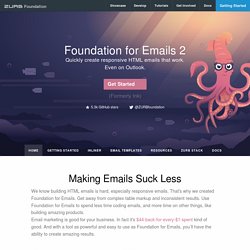
That's why we created Foundation for Emails. Get away from complex table markup and inconsistent results. Use Foundation for Emails to spend less time coding emails, and more time on other things, like building amazing products. Email marketing is good for your business. In fact it's $44-back-for-every-$1-spent kind of good. Common UI Patterns to Build Faster You can use these UI patterns in your designs to quickly get your email into shape.
Emails that work in all of the major clients, even Outlook There’s no need to worry about inconsistent spacing and odd rendering issues with your layouts. View our compatibility chart → The ZURB Email Stack will make you an email pro Upgrade your email workflow to save time be more efficient. Learn more about the ZURB Email Stack → Inlining CSS is was a pain Check out our web inliner → Increasing Usability for E-mail Newsletters. E-mail marketing has been very popular in the past ten years and it still is, most likely because of its relatively reduced costs, low amount of work required and quite large potential audience.
E-mail marketing is a direct way of sending commercial messages to a group of people by using the e-mail as the main and only channel. E-mail newsletters are not always sent because a company needs to sell a product, sell ads or request donations, but is sometimes meant to build loyalty, trust and brand awareness. There are many usability guidelines for e-mail marketers to follow and in the past couple of years the number of guidelines has actually increased, as users request more and more from providers and tend to ignore poorly designed layouts. Time is also an important matter today; more important than it was ten years ago. Users have to be able to find information within less than three clicks.
Subject line What can you learn from here? E-mail marketing: when? Scanning, not reading. Content Hub. Constant Contact Blogs. Email Design Inspiration by HTML Email Designs.