Book - Scalable and Modular Architecture for CSS. Every project needs some organization.
Throwing every new style you create onto the end of a single file would make finding things more difficult and would be very confusing for anybody else working on the project. Of course, you likely have some organization in place already. Hopefully, what you read among these pages will highlight what works with your existing process and, if I’m lucky, you will see new ways in which you can improve your process. How do you decide whether to use ID selectors, or class selectors, or any number of selectors that are at your disposal? How do you decide which elements should get the styling magic you wish to bestow upon it? At the very core of SMACSS is categorization. There are five types of categories: Base Layout Module State Theme We often find ourselves mixing styles across each of these categories.
Each category has certain guidelines that apply to it. Base rules are the defaults. Examples of Base Styles Layout rules divide the page into sections. Compass Help. Compass is an open-source CSS authoring framework which uses the Sass stylesheet language to make writing stylesheets powerful and easy.
If you're not familiar with Sass, you can take a look at these simple tutorials to get caught up. An introduction to Compass from Lorin Tackett on Vimeo. Installing Compass Compass is a tool that runs on the command line. On any system with ruby installed, open your terminal and type: gem install compass This will install Compass and Sass too. Compass version Manual Setup.
Multi-Device Layout Patterns. * { box-sizing: border-box } FTW. One of my least favorite parts about layout with CSS is the relationship of width and padding.
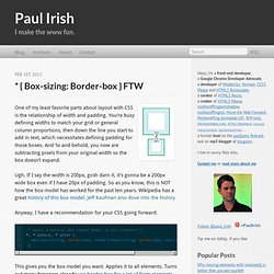
You’re busy defining widths to match your grid or general column proportions, then down the line you start to add in text, which necessitates defining padding for those boxes. And ‘lo and behold, you now are subtracting pixels from your original width so the box doesn’t expand. Ugh. If I say the width is 200px, gosh darn it, it’s gonna be a 200px wide box even if I have 20px of padding. So as you know, this is NOT how the box model has worked for the past ten years. Anyway, I have a recommendation for your CSS going forward: This gives you the box model you want. Browser support. Re-thinking Breakpoints in Responsive Design. As someone who’s been thinking about responsive design theory and building fluid CSS grids with media queries for the last six months or so, I began to notice that I was spending a lot of time and effort massaging my media queries to get things to scale nicely.
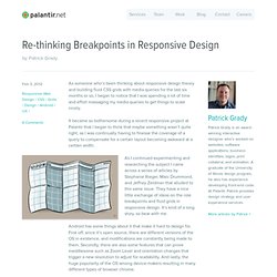
It became so bothersome during a recent responsive project at Palantir that I began to think that maybe something wasn’t quite right, as I was continually having to finesse the coverage of a query to compensate for a certain layout becoming awkward at a certain width. As I continued experimenting and researching the subject I came across a series of articles by Stephanie Rieger, Marc Drummond, and Jeffrey Zeldman that alluded to this same issue. 960 Grid System.
Responsive Web Design just got Easier with the Responsive Grid System. 13 Best Responsive CSS Grid Systems for Your Web Designs. When it comes to CSS grid systems there’s a lot to choose from.
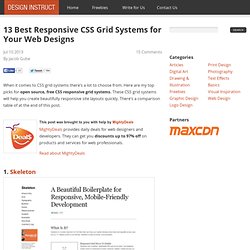
Here are my top picks for open source, free CSS responsive grid systems. These CSS grid systems will help you create beautifully responsive site layouts quickly. There’s a comparison table of at the end of this post. 1. Responsive Website & PSD Design. Responsive PSD Responsive web design (often abbreviated to RWD) is a web design approach aimed at crafting sites to provide an optimal viewing experience-easy reading and navigation with a minimum of resizing, panning, and scrolling – across a wide range of devices (from desktop computer monitors to tablets and mobile phones ).
A site designed with RWD uses CSS3 media queries, an extension of the @media rule, to adapt the layout to the viewing environment-along with fluid proportion-based grids and flexible images. 1. Media queries allow the page to use different CSS style rules based on characteristics of the device the site is being displayed on, most commonly the width of the browser. 2.
The Mobile App User Experience. "The 1.5 billion downloads thus far from Apple’s App Store clearly demonstrate a user experience in high demand.
" But why are native mobile applications such a desirable user experience? Three factors come to mind: Applications by their nature are task focused. They consist of optimized user interfaces for handling certain types of actions and data. In other words, a singular focus on actions like tracking a flight, looking up a stock price, checking the weather -and that's it.Mobile devices also force software designers to focus on only the most important data and actions in an application. To illustrate this, consider the difference between reading a news story on the Associated Press news mobile application and the same news story on the Miami Herald Web site.
Organizing Mobile. When it comes to organizing the content and actions on mobile, solid information architecture principles like clear labeling, balanced breadth and depth, and appropriate mental models remain important.
But the organization of mobile web experiences also needs to: Align with how people use their mobile devices and why.Emphasize content over navigation.Provide relevant options for exploration and pivoting.Maintain clarity and focus.Align with mobile behaviors Article Continues Below In the previous part, we talked about the constraints and capabilities that make designing for mobile unique. Similarly, the desktop web also has a set of limitations and possibilities that make it distinct. Foundation: The Most Advanced Responsive Front-end Framework from ZURB.
25 Beautiful Responsive Web Design Examples for Inspiration. Six Revisions Menu Main Categories.