
Table - How to set cellpadding and cellspacing in CSS. Responsive HTML Emails: a Different Strategy. Email has become quite the funny thing.
It follows us everywhere. To the grocery line. To the dinner table. To the… shower? CSS - border-collapse, border-spacing, caption-side, empty-cells, and table-layout. Page last changed today On this page I explain some of the new CSS declarations to be used with tables.
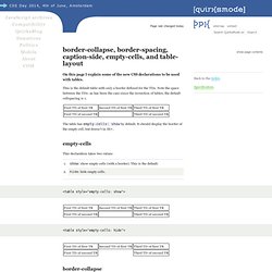
This is the default table with only a border defined for the TDs. Note the space between the TDs: as has been the case since the invention of tables, the default cellspacing is 1. Responsive HTML Emails: a Different Strategy. Responsive HTML Emails: a Different Strategy. MailChimp Email Template Reference.
Modern web designers must account for a handful of browsers when designing and building a website.
Standards-based web design has brought most browsers into relative parity with each other, but the opposite is the true where email is concerned. There are dozens of email clients, including some that have been around for decades. Large, slow-to-update companies still have employees relying on outdated clients like Lotus Notes or Outlook 2000. In addition to long-in-the-tooth desktop clients, web-based clients have issues which are two-fold: you’re forced to account for how the email client itself renders HTML and CSS, and also how the browser that client is viewed in renders HTML and CSS. An email viewed in Gmail and Firefox can look quite different than one in Gmail and Internet Explorer 8.
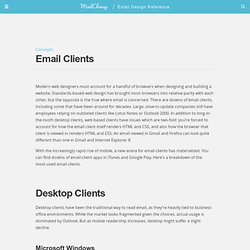
With the increasingly rapid rise of mobile, a new arena for email clients has materialized. Microsoft Windows Microsoft’s Outlook desktop client is the world’s most-popular by far. Windows Live Mail. Style Campaign. Android: grid of grim. Designing for Android is rough.
We’ve limited stats due to image blocking and there’s a range of screen sizes and active platform versions. Worse of all, it expects users to piece together our creative like a jigsaw puzzle. Android only displays the top left-hand corner by default and those dimensions vary. While there’s not one “fold”, you still want to try for some level of optimization. I created this grid showing the default view of eight Android devices and thought I’d share. Keep High-Density Displays from Uglifying Your Emails. High pixel density displays are becoming more and more common, with Apple’s Retina display available on the iPhone 4S, iPad 3, and now the MacBook Pro, and also showing up in devices such as the Samsung Galaxy Nexus.
There’s no denying that these new-era displays are gorgeous, but they’re not without fault: high-density displays can make your email ugly. The reason for that ugliness is an increase in PPI, or Pixels Per Inch, the measurement of the number of pixels spread across an inch of screen space. As displays get better and better, this number climbs higher. This increase has doubled the CSS pixel ratio of these displays from 1 to 2 (quirksmode explains here), so that a high-density display now has double the resolution of an older one; in the case of an iPhone 4s you go from a resolution of 480×320 to one of 960×640 instead, on the same 3.5 inches of screen.
The increased definition makes the small images we all use across the web — icons, logos, etc. — look fuzzy and unfocused. MailChimp Email Template Reference. Now that you have a solid understanding of how HTML emails work, we can get to the fun stuff: designing and coding your emails.
Use existing materials to craft the tone and look of your email into a solid and effective layout. Keep your design simple and straight forward, focus on your message, not your craftiness. Focus on typography first. The type is the one thing that is consistently rendered across different email clients. Responsive Email Design. Just as most web designers take a ‘design-first’ approach to their projects, we’re going to cover the visual side of creating a mobile-optimized email newsletter in this guide, before going elbows-deep into coding.
This will help you make informed decisions when next planning an email newsletter, plus make it that much easier to conceptualize the techniques we’ll be discussing later on. We’ve already started talking about responsive email design. If you’re familiar with the use of this term in the context of the web, then you’ll be pleased to know that we’ll be using the same concepts and techniques here for email. If things like ‘adaptive layouts’ are new to you, I highly recommend reading this primer by ‘A List Apart’. Designing and Coding Effective Adaptive Email Layouts. With the explosion of responsive/adaptive techniques on the web in the last few years, it is surprising to see how slowly these concepts have been adopted into email marketing.
While we can't technically make email page layouts dance and flex with the bells and whistles seen on websites, we can alter the layout to give subscribers on mobile devices a better reading experience and increase the chances that they will follow through on your priority messaging. Take a look at some of the emails in your smartphone's inbox: Are you squinting trying to read the text? 17 Must-Know Tricks for Outlook 2007, 2010 and 2013. Designing for Outlook is like chasing the ever elusive White Whale.
We spend hours pursuing it, tracking down bugs and glitches, trying to achieve pixel perfection in a distinctly imperfect environment. Here are 17 tips to improve your outlook on Outlook. 1. Outlook ignores margin and padding on images. Email Standards Project. Creating a Responsive HTML Email Newsletter for Codecademy. Note: This article has been updated to include information on revisions that were applied to the template after seeing how it performed and how it was being used.
I recently had the pleasure of converting Codecademy’s monthly email newsletter into a responsive one. I thought I would share the process because it is a nice example of creating a responsive template from an existing newsletter without redesigning the desktop version. The Desktop Template This is the Desktop template that I created which is almost identical to the original supplied files from Codecademy. The only change that I made was switching the view online text from ‘Email looking funny? Click to view at full size Setting the breakpoints. Mastering the dark art of HTML email, one UTF-8 encoded character at a time. Stop Yahoo! Mail from Rendering Your Media Queries. In April 2011, Campaign Monitor published this article which identifies an issue in the way Yahoo! Mail handles media queries. With the help of Brian Sisolak @bsisolak at Trilogy Interactive, we've identified a few more issues with regard to the way Yahoo! Mail handles media query styles intended for mobile devices only.
To make a long story short, each version of Yahoo! Ignores your media query declaration along with all of its conditional statements. Will get converted to this: MailChimp Email Template Reference. Prevent Yahoo! Mail from displaying the mobile version of your email. Soon after publishing our recent post on ‘Mobile email design in practice’, it was pointed out to us that using @media queries to optimize email for mobile devices has a glaring downside.
As it turns out, Yahoo! Mail inexplicably gives precedence to the @media stylesheet, using the CSS styles defined within, over any inline styles in the HTML email. Html - Override/Remove underline link style in Outlook. Ink: Responsive Email Documentation. Dive into creating your responsive email. The Boilerplate Starting a new Ink project is fairly straightforward. If you aren’t using one of our templates, grab the boilerplate code from below to use as a starting point. While you can reference ink.css using a <link> tag for testing purposes, be sure to remove the <link rel="stylesheet" href="ink.css" /> statement and paste your CSS into the <style> tag in the head before running your email through an inliner. Boilerplate.html. Why can't I get my HTML email to look great on Android devices?
Every now and then, we receive a mobile email question that goes along the lines of, "I've done everything to get my HTML email to look right on mobile devices. So why does it still fall apart on my Android handset? " Aside from the fact that there are no guarantees that any HTML email design will adapt nicely from one email client to another, there are two distinct issues that give email design for Android a bad name. We'll look at both and how you can do your best to tackle them.
Which clients support media queries? - Help. Which clients support media queries? If you’ve built a responsive email design using media queries, but your Litmus screenshot is showing the desktop version of the email, it could be that the particular client/device you’re viewing doesn’t support media queries. The chart below outlines support for media queries across a range of mobile email clients and applications. When troubleshooting responsive designs and media queries, also keep in mind that the media query will be triggered by the viewport size of the device. Viewport sizes can vary drastically based on the physical screen size of the phone, the screen’s resolution and the pixel density or device-pixel-ratio of the device.
Coding your Emails. The modern Web contains a lot more than HTML, CSS, and images. JavaScript,audio, Flash, video, animations, and forms are all part of a designer’s toolkit. Mobile Email Compatibility Guide: What Works Where? My original mobile compatibility post offered up a one-stop shop for knowing what was supported where in each of the major mobile operating systems. Two years later, mobile email is still as confusing and popular as ever, meaning an update is in order! Email Client Popularity. Guide to CSS support in email. Version history 14 November 2017 Outlook.com and the Outlook iOS app added support for CSS background images and some related properties, as well as certain Flexbox and Grid properties. Responsive Email Design. While phone screen sizes have been steadily increasing over the years along with screen resolution, it can be tempting to include more and more images in your emails.
But a word of caution: While images can bring an extra wow factor to your emails, images should always be thoughtfully added with accessibility and mobile load times top of mind. Ultimate Field Guide to Common Bugs in HTML Email. While testing HTML emails, I've come across a variety of bugs, quirks, and behaviors. Most of these can be fixed by adjusting your markup and styles— the main obstacle is figuring out what's going on. If you're really stumped, you might even decide to google a description of the problem, rephrasing it several times, sifting through dozens of outdated, dead-end pages until you stumble on one that offers some insight. Repeat for each bug, and you've got your work cut out for you.
Code-Therapy-Troubleshooting.png (1000×4500) 600+ Free Email Templates. How-to-responsive-email-design-infographic.png (975×5571)