
Responsive CSS3 Mega Drop Down Menu v6.0 by Pixelworkshop. This Responsive Mega Drop Down Menu is a flexible and easy to integrate solution to build your custom menus.
The drop down relies only on CSS/HTML and comes with a fully working contact form. 3 main variants are included : horizontal, vertical aligned on the left and vertical aligned on the right. The content can be organized into 6 columns based on the 960 grid system. Since the version 6.0, the column grid works with percentages and is much more flexible. This menu comes with 9 color variants, 2 color schemes for the drop downs – dark and light) and a detailed documentation to help you to integrate it.
IMPORTANT : this demo shows a single variant of the menu, for more example, see the screenshots. Features Compatible Browsers This menu has been tested (and works !) Internet Explorer 7+ Firefox 2+ Safari 3+ Opera 10+ Chrome 1+ Mobile Devices This mega menu is fully responsive since the version 6.0. Support and Updates Thanks for reading ! Pixelworkshop. 20 Best Responsive Web Design Examples of 2012. The Boston Globe The largest responsive website to date, The Boston Globe handles loads of content effortlessly, keeping the site intuitive and the content easily accessible on the device of your choice.
Smashing Magazine I love this site. I really do. Smashing takes advantage of horizontal screen real estate like few responsive sites do. Food Sense Clean layout, beautiful photography and playful iconography made me like this site immediately on my first visit. Andersson Wise Type designer, Jan Tschichold once said, ‘Simplicity of form is never a poverty, it is a great virtue.’ Sphero If you haven’t check out Sphero, you should. CSS Tricks It might be the conspicuous green frog that causes me love this site. Grey Goose The Grey Goose site shows that designing responsively does not limit our designs to columns of fluid text and images on solid backgrounds. New Adventures In Web Design Lancaster University Fundraise.com Web Designer Wall Heathlife London & Partners Oliver Russell Ryan O’Rourke Fork. Why 2013 Is the Year of Responsive Web Design. You may have noticed that Mashable got a new look recently.
The design seems wider than usual, and when you shrink your browser, the content resizes to fit. The aim here isn't merely prettiness or technical trickery, however: Media companies like ours are seeing a major shift in the consumption habits of their audiences. Those organizations that don't act may find themselves behind the curve. BKWLD. FlexNav - Flexible, Device Agnostic Navigation. A Device-Agnostic Approach to Complex Site Navigation FlexNav is a mobile-first example of using media queries and javascript to make a decent multi-level menu with support for touch, hover reveal, and keyboard tab input accessibility.
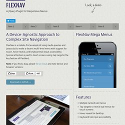
Special attention is paid to touch screens using tap targets (the key feature of FlexNav). Note: If you find a bug, please file an issue and note device and browser versions. Download on GitHub → Basic Usage Start with a simple unordered list, adding in the class and data attributes:<ul class="flexnav" data-breakpoint="800"><li>... Add the small screen menu button somewhere outside your navigation markup:<div class="menu-button">Menu</div> Add flexnav.css to the head of your document:<link href="css/flexnav.css" rel="stylesheet" type="text/css" /> Add jquery.flexnav.min.js before the closing body tag:<script type="text/javascript" src="js/jquery.flexnav.min.js"></script> Initialize FlexNav right before your closing body tag:$(".flexnav").flexNav(); Options.
Responsive Multi-Level Menu. A responsive multi-level menu that shows its submenus in their own context, allowing for a space-saving presentation and usage.
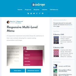
View demo Download source Today we want to share an experimental drop-down menu with you. The main idea is to save space for menus that have a lot of content and sub-levels. Each sub-level in this menu will be shown in its own context, making the “parent” level disappear. This is done with subtle animations that are defined in separate animation classes. Please note: this only works as intended in browsers that support the respective CSS properties. The structure of the menu contains an unordered list that can have an arbitrary number of sub-lists: Animations are defined in animation classes: And the plugin is called as following: