
A Better Day-emaze-amazing presentations in minutes. Ein Ideenlabor für eine bessere Arbeitswelt. Dieser Gastbeitrag von Thomas Sattelberger und Dr.

Thomas Vollmoeller ist heute in gekürzter Form im Handelsblatt erschienen. Der 1. Mai ist der „Tag der Arbeit“. Er geht zurück auf den 1. Mai 1886. Die Autoren Sattelberger (li.) und Vollmoeller gründen ein Ideenlabor für eine bessere Arbeitswelt 1. 2. 3. Blog von Heike Simmet. Knowmia. Education video library focused on math, science, and other academic subjects. Educational Videos and Games for Kids about Science, Math, Social Studies and English.
Teacher Videos for Students. WatchKnowLearn - Free Educational Videos for K-12 Students. Mathtrain.TV Education How-to Videos. Academic Video Lectures. Free video lectures,Free Animations, Free Lecture Notes, Free Online Tests, Free Lecture Presentations. Education in Österreich, Deutschland und de. Das Thema informelles Lernen wird als eine der Antworten auf die Herausforderungen an Weiterbildungsexperten gesehen (Fachkräftemangel, schneller Wissensverfall, neue Anforderungen der GenY etc.).

Speziell wenn es unterstützt wird mit neuen Medien wie social Media (wie SAP JAM). Es ist auch common sense, dass der Erwerb neuer Kompetenzen, Wissen und Einstellungen zum Grossteil on-the-job oder near-the-job (coaching, mentoring etc.) stattfindet - und nur zu ca. 20% im Klassenverbund. Jedoch fokussieren Weiterbildungsexperten oft bis zu 80% Ihrer Budgets auf formelles Lernen im Klassenraum - viele Weiterbildungsabteilungen fahren immer noch das Konzept der "firmeninternen Volkshochschule". Mit dieser provokativen Message soll verdeutlicht werden, dass die Bildungsverantwortlichen sich mehr dem informellen Lernen zuwenden sollen.
Ist dies jedoch wirklich so einfach? Dimensional storytelling - New Meograph 1. PsycNET Login. Scitation. PLOS. Physical Review Online Archive (PROLA) Digital Library. Create An Infographic With Your Daily Facebook Activity. Infographics.
Infographics Lesson Plans. 10_Ways_to_Enhance_Communication_and_Collaboration_in_Education_en.pdf. Qualtrics. Citation Machine. Datavisualization.ch Selected Tools. Many Eyes. Data Visualization, Infographics, and Statistics. Online Diagram Software and Flowchart Software - Gliffy. Pictures of Numbers. Data Visualizations, Challenges, Community.
Envisioning Information. Information Is Beautiful. Create Infographics. Create and share visual ideas online. InfoGraphic Designs: Overview, Examples and Best Practices. Information graphics or infographics are visual representations of information, data or knowledge.

These graphics are used where complex information needs to be explained quickly and clearly, such as in signs, maps, journalism, technical writing, and education. They are also used extensively as tools by computer scientists, mathematicians, and statisticians to ease the process of developing and communicating conceptual information. They can present a rich amount of information without intimidating you. Or sometimes they intimidate you, but make the digesting of the information much more bearable. Here in this article below, we are going to discuss best practices for designing infographics followed by some examples which might help you learn a thing or two. You may be interested in the following related articles as well. Feel free to join us and you are always welcome to share your thoughts that our readers may find helpful. Don’t forget to and follow us on Twitter — for recent updates.
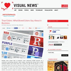
Public Data Explorer. 10 Fun Tools To Easily Make Your Own Infographics. People love to learn by examining visual representations of data. That’s been proven time and time again by the popularity of both infographics and Pinterest. So what if you could make your own infographics ? What would you make it of? It’s actually easier than you think… even if you have zero design skills whatsoever. Below are my two favorite infographic-making web 2.0 tools that I highly recommend. Click the name of each tool to learn more! Visual.ly One of the more popular ways to discover infographics, Visual.ly actually just launched a design overhaul of their website. Dipity. Information Is Beautiful. Information Is Beautiful. True Colors: What Brand Colors Say About A Business. Studies have shown that a product’s color influences 60-80 percent of a customer’s purchasing decision, which makes choosing the wrong color a death sentence before your brand ever has a chance to get off the ground.

The most recognizable labels in the world are defined by their colors. Take a second to think of some of the most popular brands that instantly come to mind: Coca-Cola, Facebook, Apple, McDonalds, and Google – to name a few. All of these companies strategically use colors in their logo, website, and product to appeal to customers, making them instantly recognizable across the globe. Color is one of the first things people notice about a brand, and there are a few colors which get the most play: blue, red, black/grayscale, and yellow. 95 percent of companies only use one or two colors, 5 percent use more than two, 41 percent use text only, and 9 percent don’t feature the company name at all.
Click here or below for a full-sized version. via: Marketo. Color Scheme Designer 3. Communication & Collaboration. Azendoo.