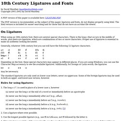

Paper. 18th Century Ligatures and Fonts. By David Manthey (manthey@orbitals.com) Copyright 2001-2002 by David Manthey A PDF version of this paper is available here: LIGATURE.PDF The PDF version is recommended, as the subject of this paper, ligatures and fonts, do not display properly using html.

The html version is included for easier searching and for those that do not have an acrobat file viewer. On Ligatures When using an 18th century font, there are several special characters. Generally, whatever 18th century font you use will have the following 12 ligature characters. Depending on the font, these special characters may appear in different places. May be necessary. The standard ligatures are only used on lower case letters; never on uppercase. Rules for using ligatures: Neutra Face : An Ode On A Typeface (A Bearded Poker Face Parody) Fonts, Typography, Lettering, Design. Write Like an Architect. How to Make an Ambigram. Edit Article Sample Ambigrams Edited by Ryan Coyle, Josh W., Andy Zhang, Master Tyler and 65 others An ambigram is a form of typographical art that allows one word to be read in a number of ways.

The most common ambigram is rotational, or flipscript, and will read the same when the paper is rotated 180 degrees (i.e. flipped both vertically and horizontally). While it may seem like only a few words can easily be turned into an ambigram, with a few tricks you'll see that you can do it yourself with practically any word you like! Ad Steps an Ambigram Step 1.360p.mp4 00:00 00:09 00:09 spaceplay / pauseescstopffullscreenshift + ←→slower / faster (latest Chrome and Safari)←→seek . seek to previous 12…6 seek to 10%, 20%, …60% 1Write out the word in print in the same case (e.g., all caps). Tips Sometimes you may be able to combine two letters to form a single letter when flipped.Don't focus too much on the obvious letter pairs. Warnings. EUROSTILE: LA FORMA DEL FUTURO. All the fonts you'll ever want. T.y.p.o.r.g.a.n.i.s.m : ASCII-O-Matic.
Free Stuff of the Moment. Risus: The Anything RPG (20th Anniversary Edition) Way back in 1993, when my ties to the internet consisted of local Bulletin Board Systems, my original io.com email address (now long defunct), and an unruly pack of echonets communicating through nightly hub-connections, I published a free roleplaying game called Risus: The Anything RPG, one of the first of its kind. It went out by echo, by email and by post, and I had no idea, not even a daydream hope, that it would one day have a global fan-following as enthusiastic, busy, and friendly as Risus has today.
This new edition is just as free as ever, just as huggy as ever (huggier, really) and, by the by, may be the first RPG to ever lose 33% of it's page-count in its second (indeed, 20th-Anniversary) edition. Need to roleplay, but only have 4 pages of attention span? Welcome to Risus, and I do mean welcome. >>>>Download <<<< Fountain Avenue v2p0 An all-new version of one of my older fonts (I have 11-year old fonts now?
>>>>Download<<<< E-Zombie.com - Welcome to the Zombocalypse. De Vita In Excessum____________A World of Darkness E-Zine_______________ Lord Kyl's Medieval & Fantasy Fonts. Kheldar Studios. ÆNIGMA FONTS: Font Archive. Iconian Fonts. VINTAGETYPE.COM. Best fonts of the Web. Fontifier - Your own handwriting on your computer! Blackletter Revival. Articles: Arial Sidebar 1. Many of the characters in Helvetica and Arial are very similar to each other, although none are quite identical.

Other characters are quite a bit different, and they are the key to telling which is which. Here are some of the most obvious ones (Grotesque 215, Arial’s ancestor, has also been included for comparison): The “a” in Helvetica has a tail; Arial does not. Also, the bowl of the “a” flows into the stem like a backwards “s”; the bowl of Arial’s “a” simply intersects the stem with a slight curve. (Interestingly, the Grotesque “a” has a tail, just like Helvetica. The top of the Arial “t” is cut off at an angle; the Helvetica “t” is cut off straight. The ends of the strokes of letters like “S” and “C” are perfectly horizontal in Helvetica; in Arial and Grotesque they are cut off at a slight angle. The Scourge of Arial. Arial is everywhere.

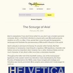
If you don’t know what it is, you don’t use a modern personal computer. Arial is a font that is familiar to anyone who uses Microsoft products, whether on a PC or a Mac. It has spread like a virus through the typographic landscape and illustrates the pervasiveness of Microsoft’s influence in the world. Arial’s ubiquity is not due to its beauty. It’s actually rather homely. Throughout the latter half of the twentieth century, one of the most popular typefaces in the western world was Helvetica. An icon of the Swiss school of typography, Helvetica swept through the design world in the ’60s and became synonymous with modern, progressive, cosmopolitan attitudes.
As it spread into the mainstream in the ’70s, many designers tired of it and moved on to other typographic fashions, but by then it had become a staple of everyday design and printing. Google Logo Maker-Logogle.