
Intro Free Font. What distinguishes the new Intro free font from FontFabric is the strongly expressed geometric makeup and structure.
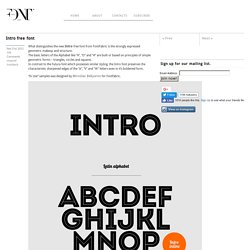
The basic letters of the Alphabet like “A”, “O” and “H” are built or based on principles of simple geometric forms – triangles, circles and squares. In contrast to the Futura font which possesses similar styling, the Intro font preserves the characteristic sharpened edges of the “А”, “V” and “W” letters even in it’s boldened form. Benton Sans® So you want to learn hand lettering? In 5 Years, Searches for “Hand Lettering” Increased Over 1000%!
Hey, Friend! Sean McCabe here.
Gratuit - 10 typographies tendances pour graphistes. Il y a quelques temps, je vous avais proposé 10 typographies manuscrites, aujourd’hui, je vais vous présenter 10 typographies qui sont dans la tendance.
25 Free Comic Fonts to Use Instead of Comic Sans. Oh, Comic Sans, the font we all love to hate.
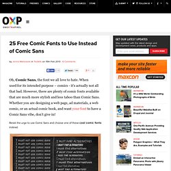
When used for its intended purpose – comics - it's actually not all that bad. However, there are plenty of comic fonts available that are much more stylish and less taboo than Comic Sans. Whether you are designing a web page, ad materials, a web comic, or an actual comic book, and want your font to have a Comic Sans vibe, don’t give in! Resist the urge to use Comic Sans and choose one of these cool comic fonts instead. Lisibilité et typographie web.
Font events: Controlling the flash of unstyled text. This is our second post in an ongoing series about using font events for better control over how web fonts load.
Read the first post for an overview of font events, the third post to learn how to control fallback fonts and styles, and the fourth post to learn about JavaScript callbacks with font events. An example of FOUT—before and after fonts have loaded—on the blog A Working Library. We’ve designed Typekit to deliver fonts to web pages as quickly and efficiently as possible.
We strive to minimize download size, use as few requests as possible, and distribute fonts around the globe using a CDN so there’s always a server nearby. We also cache fonts so that subsequent page loads have web fonts available immediately. Pricing. CODE Pro. Code Pro is a font family inspired by the original Sans Serif fonts like Avant Garde or Futura, but with a modern twist.
It is clean, elegant and straight-to-the-point. Code font is applicable for any type of graphic design—web, print, motion graphics, etc. 80 Beautiful Typefaces For Professional Design. Advertisement You don’t like to scroll?
Be prepared. (We warned you.) Every now and again designers stumble upon the very same problem: the choice of a unique and beautiful typeface which manages to fulfill three basic tasks. Support the corporate identity, enrich the visual appearance and is compatible with the overall design. Which Are More Legible: Serif or Sans Serif Typefaces? Update March 2012 See my expanded critique of Colin Wheildon’s legibility research.
Back in 1998 when Times New Roman was still widely used on the web, my then boss made sure we always designed our web sites with Arial, as she hated the look of serif fonts on the web. Was it the case that sans serif fonts were more legible, or was it just a matter of taste? In 2003 as part of my master’s degree I reviewed over 50 empirical studies in typography and found a definitive answer. Introduction An argument has been raging for decades within the scientific and typographic communities on what seems a very insignificant issue: Do serifs contribute to the legibility of typefaces, and by definition, are sans serif typefaces less legible? Part 1 provides typographical definitions. Part 2 reviews the evidence for and against the legibility of serif and sans serif typefaces.
Web Font Specimen. (URW)++ 8 façons simples d'améliorer la typographie dans vos designs. Par Antonio Carusone Cet article a été écrit pour publication dans Smashing Magazine le 3 avril 2009.
Je le reproduis ici pour vous être agréable. Beaucoup de gens, y compris les designers, pensent que la typographie consiste à choisir une police, sa taille et si elle doit être grasse ou pas. Pour la plupart des gens, ça s'arrête là. Obtenir une bonne typographie demande tellement plus, notamment de s'attarder sur les détails que les designers négligent souvent. Ces détails donnent au designer le contrôle total, leur permettant d'apporter une typographie belle et cohérente à leurs designs. Voici donc 8 façons simples d'améliorer la typographie, et donc l'ergonomie, de vos designs. Justification La justification est la longueur d'une ligne de texte. Une manière simple pour calculer la justification est d'utiliser la méthode de Robert Bringhurst, qui multiplie la taille de la police par 30.
Claire Coullon. Rickman Script by *SpazChicken on deviantART. CODE Pro. Jura typeface. Tikal Sans. The 40 best free fonts for designers. Lato: new free open-source sanserif family by Lukasz Dziedzic. TyPoland presents its first public typeface release Lato Lato is a sanserif typeface family designed in the Summer 2010 by Warsaw-based designer Łukasz Dziedzic (“Lato” means “Summer” in Polish).
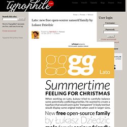
In December 2010 the Lato family was published under the open-source Open Font License by his foundry tyPoland, with support from Google. In the last ten or so years, during which Łukasz has been designing type, most of his projects were rooted in a particular design task that he needed to solve. Bree Serif for Free! - Special Content. Download Cabin Font. Impallari Type.
The Cabin Font is a humanist sans inspired by Edward Johnston's and Eric Gill's typefaces, with a touch of modernism. Cabin incorporates modern proportions, optical adjustments, and some elements of the geometric sans. It remains true to its roots, but has its own personality. The weight distribution is almost monotone, although top and bottom curves are slightly thin. Counters of the b, g, p and q are rounded and optically adjusted. The curved stem endings have a 10 degree angle. Cabin comes in 8 styles: Regular, Medium, Semibold & Bold, with their corresponding italics Thanks: Thanks to Igino Marini. Download the latest version: Free. Car Fonts - Car Font Generator. Logo Fonts - Logo Font Generator. Web Fonts Podkova. Grumpy wizards make toxic brew for the evil Queen and Jack. Normal 400Grumpy wizards make toxic brew for the evil Queen and Jack. Bold 700Grumpy wizards make toxic brew for the evil Queen and Jack.
One morning, when Gregor Samsa woke from troubled dreams, he found himself transformed in his bed into a horrible vermin. He lay on his armour-like back, and if he lifted his head a little he could see his brown belly, slightly domed and divided by arches into stiff sections. The bedding was hardly able to cover it and seemed ready to slide off any moment. Deftone Stylus™ Ministry Script. Kelson. Mood Type - Free Font on the Behance Network. Ask H&FJ: Four Ways to Mix Fonts. Font Viewer - myFontbook.com.