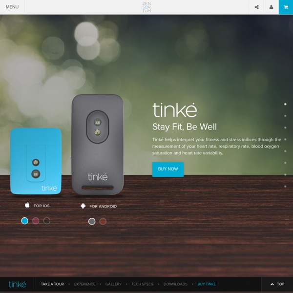


http://www.zensorium.com/tinke/
Unforgettable: 10 Purple Cow Websites to Spark Your Imagination and Your Creativity On this blog we talk a lot about websites that have effective calls to action, non-cluttered home pages, and trustworthy designs with the intention of showing what techniques help improve conversions. After years of showing our readers examples of what works and what doesn’t, one thing we have noticed is an awful lot of similarity between website designs in the same space. Above: We have your typical “software as a service” (SaaS) website. Look! They even have a template for it!
Jess & Russ She bought a Smashing Pumpkins album, painted stars on her bedroom ceiling, and felt emotional. He kissed a real girl at the annual latin camp dance social. Spoiler alert: he didn't marry her. Almost four years ago, fate and a few mouse clicks brought Russ Maschmeyer and Jessica Hische together. They went from complete strangers to inseparable companions in work and love. This is how it all began. Don’t Use Automatic Image Sliders or Carousels, Ignore the Fad 553inShareinShare I’m sure you’ve come across dozens, if not hundreds of image sliders or carousels (also called ‘rotating offers’). You might even like them. But the truth is that they’re conversion killers.
Why Your Qualified Leads Refuse to Sign Up: The UX of Plans and Pricing Every SaaS application has a funnel. Landing page, maybe a demo or pricing page, and then sign up. Qualified leads will stop by your “Plans and Pricing” page to make an informed decision. Fluid CSS3 Slideshow with Parallax Effect In this tutorial we will create a slideshow with a parallax effect using several CSS3 properties. The idea is to move the background positions of two backgrounds while sliding the container of the slides. View demo Download source In this tutorial, we are going to create a slideshow with a parallax effect with the help of some CSS3 properties. We’ll use radio buttons and sibling combinators for controlling which slide is shown. There will be two backgrounds and the idea is to change the background positions and the position of the slider with transitions in order to create a slight parallax effect.
Idan Gazit · UI/UX and Subjectivity Because design is often confused with art, designers must contend with the (mistaken) opinion that design is purely subjective. UI/UX is purely a matter of taste in much the same way that cooking is just a matter of taste. There are a many cooks who can prepare delicious food. They have an instinct for the art, and often these instincts are rooted in very different approaches. Some rely on having quality raw ingredients and improvise based on what is available.
I'm Google I’m Google is an ongoing tumblr blog in which batches of images and videos that I cull from the internet are compiled into a long stream-of-consciousness. Both the searching and arranging processes are done manually. The batches move seamlessly from one subject to the next based on similarities in form, composition, color, and theme. Know Thy User: The Role of Research in Great Interactive Design By David Sherwin - September 30, 2012 At the recent HOW Interactive Design Conference in Washington DC, I gave a presentation called "Know Thy User: The Role of Research in Great Interactive Design." This 30-minute high-level talk was intended to provide conference attendees with repeatable processes that will help them integrate user research into their interactive projects.
twitter data visualization 3D data visualization for the last twitter messages containing a certain term or group of terms. the visualization was made in processing, using a ‘compact’ version of the twitter4j library and the twitter API. this was proposed as an exercise for the workshop datajockey, that took place in the Museum of Image and Sound of São Paulo, Brazil, from may 17th to 31st, 2011. it searches for a term in the last tweets stored in twitter database, and shows those tweets in a 3D space, the position and the color are given according to the time of the post. if two or more posts are close in time, a line that connects them in the space, forming structures. the size of the cubes are given by the minute of the post.