
Why cards are the future of the web. Cards are fast becoming the best design pattern for mobile devices.
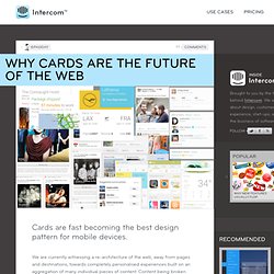
We are currently witnessing a re-architecture of the web, away from pages and destinations, towards completely personalised experiences built on an aggregation of many individual pieces of content. Content being broken down into individual components and re-aggregated is the result of the rise of mobile technologies, billions of screens of all shapes and sizes, and unprecedented access to data from all kinds of sources through APIs and SDKs. This is driving the web away from many pages of content linked together, towards individual pieces of content aggregated together into one experience. The aggregation depends on: The person consuming the content and their interests, preferences, behaviour.Their location and environmental context.Their friends’ interests, preferences and behaviour.The targeting advertising eco-system.
Twitter is moving to cards Google is moving to cards. Design Is About Intent. The most admired companies of each age are often associated with a certain core competency.
Ford popularized assembly line manufacturing in the 1910s. Toyota kicked off the lean revolution with its Toyota Production System in the postwar years. GE’s enthusiastic adoption of Six Sigma in the ’90s spread the mantra of quality. These capabilities are credited with helping transform the respective industry of each company. Apple is unquestionably the most admired company in the world today. Lest there be any doubt, they told us last summer: Apple is about design. Flat Pixels: The Battle Between Flat Design And Skeuomorphism. Get the Kindle version: If you're paying attention to what's going on in the design world, you've probably noticed the ongoing debate around skeuomorphism vs flat design.
So here's a quick test. Which of these two calculators feature a skeuomorphic design? Which of these two apps is skeuomorphic? If you answered "skeuowhat? " 11 Common Web Design Mistakes (Blunders) There are tons of website on the Internet, and hundreds or probably thousands are created by day.
Here’s a very interesting thing to ponder – What are the elements of a good website? Image Credit: tveskov Building a website can be daunting but the real challenge lies in making it usable. The problem is most web designers forget that the website wasn’t created for themselves but to solve the users’ needs.
They give creativity priority over practicality and usability. In this article, we would like to highlight 11 web design blunders that web developers and designers make and some suggestions how these mistakes can be easily avoided. 1. The web is like an archive of information. Suggestions:Google Custom Search is a neat, simple and effective way to get started. Here’s a simple form code to display Google’s search engine on your site too.
More: Designing The Holy Search Box: Examples And Best Practice- This article details guidelines for designing the search box. 2. User Experience. Why Your Links Should Never Say “Click Here” By anthony on 06/20/12 at 10:39 pm Have you ever wanted your users to click your links, but didn’t know how to get them to act?
When some designers run into this problem they’re tempted to use the words “click here” on their links. Before you give in to the temptation, you should know that using these words on a link can affect how users experience your interface. “Click” Puts Too Much Focus on Mouse Mechanics Using the word “click” on your links takes the user’s attention away from your interface and on to their mouse. “view” relates to the users task, while “click” puts the focus on mouse mechanics Instead of using the word “click”, look for a different verb you can use that relates to the user’s task.
“Here” Conceals What Users are Clicking. How to increase signups by 50% using “popup forms” Posted in A/B Split Testing, Case Studies on March 15th, 2011 We recently did an A/B test on Visual Website Optimizer homepage with an aim to increase signups for our free 30 day trial account.
As you can see, our signup form is short (with just a couple of fields), has good social proof (testimonials on the right) and we have a direct link to the signup page in the website header. Thanks to these practices, our signup conversion rate was already quite satisfactory. However, being an A/B testing company, we can’t be content with status quo. So, we decided to optimize our website for more signups. Homepage as a sweet-spot for optimizing signups We could have tweaked our signup page in this A/B test. Note that above the page fold, we had a Watch Video call to action. Change the Watch Video button to Start Now button The first change we wanted to test was the most obvious one. This increased signups somewhat but the real game-changer was the following change.
What this did was amazing! Tags. Mobile UI Patterns. Outils collaboratifs. Designer. Web Design. Web design & code Tools.