
Graph Vis and Net Analysis. ReMap. ConceptNet 5. Welcome to FCMappers! DESKTOP-APPS-NODES3D - BRAINMAPS.ORG - BRAIN ATLAS, BRAIN MAPS, BRAIN STRUCTURE, NEUROINFORMATICS, BRAIN, STEREOTAXIC ATLAS, NEUROSCIENCE. C-Link - Concept Linkage In Knowledge Repositories. Enterprise Software Doesn't Have to Suck: Social Network Analysis using R and Gephis.
After learning the basics of R, I decided to learn something harder last week.
I picked Social Network Analysis (SNA) to learn the concepts of SNA and R. My primary interest in SNA is visual exploration of networks, so I needed to find a tool first. Which tool to use for visual SNA? Features needed: 1) graphical representation of network 2) visually navigate the graph (zoom in/out, drag) to explore large graphs 3) manipulate the graph (filter nodes, edit/delete/group nodes and same for edges) Visualisation tools resource list. Connect Distributed Data across the Web. Pajek.net files from Roget's Thesaurus. Thinkmap visualization software facilitates communication, learning, and discovery. Thinkmap Visual Thesaurus. We offer a number of programs that make it easy for institutions to purchase the Visual Thesaurus and provide access to their population at a discounted rate.
We also offer special discounts to accredited academic institutions. Site Licenses to the Visual Thesaurus: With a Site License, your entire organization has instant access to the Visual Thesaurus, VocabGrabber, the Visual Thesaurus Spelling Bee, and the online magazine. The Visual Thesaurus is easy to install and administrate. We offer: Flexible Authentication Options. How It Works. The Visual Thesaurus is an interactive dictionary and thesaurus which creates word maps that blossom with meanings and branch to related words.
Its innovative display encourages exploration and learning. You'll understand language in a powerful new way. Say you have a meaning in mind, like "happy. " Architecture. We have designed Thinkmap to be easily extendable, fast, and able to integrate with a wide variety of legacy systems.
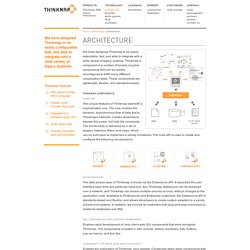
Thinkmap is composed of a number of loosely coupled components that can be quickly reconfigured to fulfill many different visualization tasks. These components are lightweight, flexible, and standards-based. The unique features of Thinkmap start with a sophisticated core. The core enables the dynamic, asynchronous flow of data that is Thinkmap's hallmark. Graphical dictionary and thesaurus. Ontology Tools Survey, Revisited. July 14, 2004 A new survey of ontology editors was conducted as a follow-up to an initial survey conducted in 2002.
The results of the survey are summarized in this article. Mapping del.icio.us with Anthracite and OmniGraffle. Several people have asked me how I produced the visualizations that I used in my talk on del.icio.us.
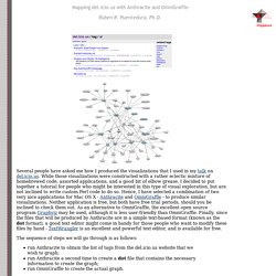
While those visualizations were constructed with a rather eclectic mixture of homebrewed code, assorted applications, and a good bit of elbow grease, I decided to put together a tutorial for people who might be interested in this type of visual exploration, but are not inclined to write custom Perl code to do so. Hence, I have selected a combination of two very nice applications for Mac OS X - Anthracite and OmniGraffle - to produce similar visualizations. Spicynodes. MINE: Max Info Nonparametric Exploration. Systems Biology. Cytoscape: OS Platform for Net Analysis and Vis. Circos. NetworkX. OS Java Network Visualization. Visualizing RDF Schema inferencing through Neo4J, Tinkerpop, Sail and Gephi - Datablend. Graphical visualization of text similarities in essays in a book.
Gaping Holes In Your Password Security. It’s hard to instill the importance of using a multitude of passwords across services, especially when it’s tough to remember, just how many times did I use that old go-to password, anyway?

The Password Reuse Visualizer by Paul Sawaya isn’t an art project or artist’s rendering. It’s a free Firefox add-on that you can download to view the relationships of your own Firefox-saved passwords. Orange. Tulip. Action Science Explorer (Formerly iOpener Workbench)
Latest News January 2012.
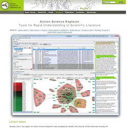
Our paper on Action Science Explorer was accepted by JASIST, the Journal of the American Society for Information Science and Technology. See the Publications section below for more details. December 2011. Action Science Explorer was featured in a NSF Discoveries report, "A New Visualization Method Makes Research More Organized and Efficient" (pdf). July 2010. Description The goal of the iOpener project is to generate readily-consumable surveys of different scientific domains and topics, targeted to different audiences and levels. Action Science Explorer is partially an integration of two powerful existing tools the SocialAction network analysis tool and the JabRef reference manager. These tools are linked together to form multiple coordinated views of the data.
There are other coordinated views that provide the user with other aspects of the field. SBR_summary. Could A Tool Like This Turn Every M.D. Into Dr. House? When you visit the doctor complaining of a cough or stomach pain, they usually seem to know what to do: They'll ask if you have trouble breathing, or check your heart rate.
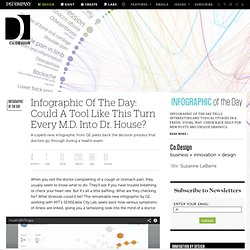
But it's all a little baffling: What are they checking for? What illnesses could it be? This remarkable new infographic by GE, working with MIT's SENSEable City Lab, peels back how various symptoms of illness are linked, giving you a tantalizing look into the mind of a doctor. The interactive chart is powered by 7.2 million medical records, gathered between 2005 and 2010. RDF. Gephi.