
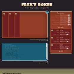
Flexy Boxes — CSS flexbox playground and code generation tool. Flexbox browser support Three versions of the flexbox spec – each with different syntax – have been implemented in browsers.
The two 2012 specs are roughly equivilant in terms of features, differing mainly in syntax. The earlier 2009 spec is less comprehensive though covers a lot of the same ground. Flexbox 2012 — W3C Candidate Recommendation, September 2012 Opera 12.1+, Firefox 22+. "Old" Flexbox and "New" Flexbox. Share this: Easily manager projects with monday.com Just so everyone is clear on this: "Flexbox" (more specifically: CSS Flexible Box Layout Module) has undergone a lot of changes in the last three years.
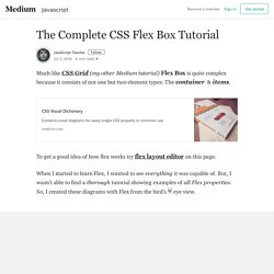
Changes both to the spec and what browsers have implemented. Flexbox Defense. Building Flexbox website. The Complete CSS Flex Box Tutorial – JavaScript Teacher. Much like CSS Grid (my other Medium tutorial) Flex Box is quite complex because it consists of not one but two element types: The container & items.
To get a good idea of how flex works try flex layout editor on this page. When I started to learn Flex, I wanted to see everything it was capable of. But, I wasn’t able to find a thorough tutorial showing examples of all Flex properties. So, I created these diagrams with Flex from the bird’s 🐦 eye view. That’s everything Flex is capable of. The Complete CSS Flex Box Tutorial – JavaScript Teacher. CSS Flex – Animated Tutorial. In my previous tutorial, I dumped all of the flex diagrams in one place to give you a bird’s eye view of flex box - but pictures are not always enough, especially when there’s something better.
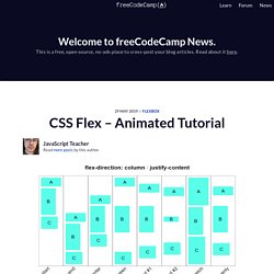
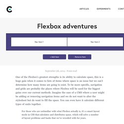
If a picture is worth a thousand words - what about an animation? Flex cannot be efficiently & fully explained by text or static images. To cement your knowledge of flex, I created these animated samples. To get an even better idea you can try Flex Layout Editor on this page. By default flex will not wrap your items. The first thing you will probably learn about flex is flex-wrap. Flex Layout Editor (Online Flex HTML Generator) - CSS Tutorials. Understanding flexbox. Chris Wright - Experiment: Flexbox Adventures. Flexbox transitions You can animate the change almost any property of flexbox, bar a few, and have them transition.
Since animating layout properties has never been a big priority of mine, most of these animations feel to be a little redundant. The one thing I would love to animate is inserts and removes. A transition is not enough to detect the addition or removal of an item, so adding a transition and then inserting will only give you a jarring jolt as the action takes place. To make inserts and removes less jarring you need to make use of transitionStart/transitionEnd or animationStart/animationEnd javascript events to be able make the action smoother. Flexbox Tester · MadebyMike. 1. Find the space remaining: The flex container is: 900px The initial size of all the flex items is: (231px + 231px + 231px) = 693px So the space remaining is: 900px - 693px = 207px That's a positive number, so we will be using flex-grow to work out how to distribute the remaining space between the flex items.
Designing the Flexbox Inspector. The new Flexbox Inspector, created by Firefox DevTools, helps developers understand the sizing, positioning, and nesting of Flexbox elements.
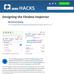
You can try it out now in Firefox DevEdition or join us for its official launch in Firefox 65 on January 29th. The UX challenges of this tool have been both frustrating and a lot of fun for our team. Built on the basic concepts of the CSS Grid Inspector, we sought to expand on the possibilities of what a design tool could be. I’m excited to share a behind-the-scenes look at the UX patterns and processes that drove our design forward. CSS Flexible Box Layout Module Level 1. What Happens When You Create A Flexbox Flex Container? Category "Flexbox" Flexulator. Dive into Flexbox - design, tools and workflow. Advanced Cross-Browser Flexbox. Introduction The CSS Flexible box module level 3 — or Flexbox for short — brings with it a lot of power and some very exciting possibilities for web development, allowing us to put together complex site layouts easily and rapidly, and dispensing with some of the illogical hacks and kludges that we’ve traditionally used.
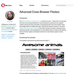
I dealt with the basics of Flexbox in my article Flexbox: fast track to layout nirvana? In this article I will go a bit further, looking at a more advanced example, and using Modernizr to serve different styles to browsers with differing levels of Flexbox support, providing the best level of cross browser support currently available. Introducing the example The example I have built for this article looks like Figure 1: This has multiple levels of Flexboxes contained within it. Flexbox. Read Flexbox Website. Jack in the flexbox. Cousin germain de l'objet Media, qui fait les beaux jours de OOCSS, l'objet “Autogrid” a les particularités suivantes : s'adapte automatiquement au nombre d'éléments enfantschaque enfant est fluide, de même largeur et même hauteur par défautaffichage sur une seule ligne (pas de saut de ligne prévu)des gouttières précises sont possibles Cette configuration est présente dans un nombre impressionnants de gabarits et de designs.

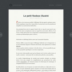
Tutoriels sur Flexbox. Le petit flexbox illustré chez Vincent Valentin. Nantes, le 7 septembre 2015.
Philipwalton/flexbugs: A community-curated list of flexbox issues and cross-browser workarounds for them. Philipwalton/flexbugs: A community-curated list of flexbox issues and cross-browser workarounds for them. Flexboxsheet. CSS Flexible Box Layout Module Level 1. Conformance requirements are expressed with a combination of descriptive assertions and RFC 2119 terminology.
The key words “MUST”, “MUST NOT”, “REQUIRED”, “SHALL”, “SHALL NOT”, “SHOULD”, “SHOULD NOT”, “RECOMMENDED”, “MAY”, and “OPTIONAL” in the normative parts of this document are to be interpreted as described in RFC 2119. However, for readability, these words do not appear in all uppercase letters in this specification. All of the text of this specification is normative except sections explicitly marked as non-normative, examples, and notes. [RFC2119] Examples in this specification are introduced with the words “for example” or are set apart from the normative text with class="example", like this: Informative notes begin with the word “Note” and are set apart from the normative text with class="note", like this: Note, this is an informative note.
The specification will remain Candidate Recommendation for at least six months. Webdesign.tutsplus. Laying Out A Flexible Future For Web Design With Flexbox Best Practices. Flexbox Grid. Flexbox Tester · MadebyMike. Don't use flexbox for overall page layout. When I was building this blog I tried to use flexbox for the overall page layout because I wanted to look cool and modern in front of my peers.
However, like all of my other attempts to look cool and modern, it didn't really work. Why? Well, take my hand and follow me into the next section… Update: Don't let this post scare you off flexbox, it's one of the best layout systems we have on the web today. However, there's a growing problem on the web when it comes to content shifting around during loading. Philipwalton/flexbugs: A community-curated list of flexbox issues and cross-browser workarounds for them.
Flexbox: CSS Flexible Box Layout. Do you remember when tables were the only layout method for a website? At least until people realized that it’s a semantic nightmare to misuse something that’s actually reserved to display tabular data for the structure of an internet site. So a new “tool” needed to be found and soon floats and absolute positioning were discovered as a “proper” replacement. Just like tables, of course, the true purpose of these two methods wasn’t to give websites a shape.
But nevertheless, here we are, over a decade later, and there’s still no reasonable solution for this “problem” – at least one that works a across a wide range of browsers. But the chances are good that Flexbox (or “Flexible Box Layout Module” as the W3C likes to call it) is the next big thing. But be warned: there’s also an older version of Flexbox from 2009, which has pretty decent support, but was dismissed by the W3C late 2011 in favor of a more catchy syntax.
The advantages Let’s flex The order of things. Flexbox and Grids, your layout’s best friends. It took more than six years to have CSS Grids implemented across all browsers. Throughout its history, the spec has always been surrounded by controversy. In 2011, it was met with skepticism as the Microsoft Developer Team announced prefixed support for IE10. Css - What are the differences between flex-basis and width? Take Command of CSS Flexbox - Responsive Tutorial with Bootstrap 4. As a kid I loved playing with toy plastic army men. I would line them up and pretend to be in command giving orders to my soldiers in order to defeat the enemy. Since I was in full command, the soldiers would look to me for their orders. Sometimes a hot shot recruit would overstep my orders and go rogue, He would ignore and override my orders and just do what he wanted. My example demonstrates the basic principle of the CSS display property flexbox which is… Flex items (soldiers) follow the orders given by their flex container (commander).
In addition, an individual flex item has the ability to override the orders given out by the flex container if required. In this post, I will be answering some of the most common questions and show you how to start using flexbox in your projects. Flexbox Game. How Flexbox works — explained with big, colorful, animated gifs. Flexbox Froggy - A game for learning CSS flexbox. Normalizing Cross-browser Flexbox Bugs — Philip Walton. Update: as a follow-up to this article, I’ve created the Github repo Flexbugs: a community curated list of cross-browser flexbox issues and their known workarounds.
The goal is if you’re building a website using flexbox, and something isn’t working as you’d expect, you can find the solution there. Way back in September of 2013, while testing my Solved by Flexbox project, I discovered a bug in Internet Explorer 10 and 11 that was preventing my sticky footer from actually sticking to the bottom of the page. I spent some time trying to work around the issue, but all my attempts failed. At first I was really annoyed. Luisrudge/postcss-flexbugs-fixes: PostCSS plugin that tries to fix all of flexbug's issues. Understanding Flexbox: Everything you need to know – freeCodeCamp. The Ultimate Guide to Flexbox — Learning Through Examples. What’s the best way to understand Flexbox? Learn the fundamentals, then build lots of stuff. And that’s exactly what we’re going to do in this article. A few things to note This article was written with intermediate developers in mind, and assumes you already know a bit about Flexbox.
But…If you know some CSS, but don’t know Flexbox at all, I wrote a comprehensive guide here (free article, 46 minute read).And if you don’t know CSS very well, I recommend taking my Complete (practical) Introduction to CSS (paid course with 74 lessons).You don’t have to follow the examples in this article in the order listed here.Flexbox is only a layout technique. Page Layout With Flexbox – codeburst. Building Mega Menus with Flexbox — SitePoint. As you are probably aware, Flexbox has recently gained momentum with increasing browser support. It allows developers to build complex user interfaces without dealing with unwanted CSS and JavaScript hacks. Understanding Flexbox: Everything you need to know – freeCodeCamp. Doesn’t that look pretty? I’ll get into the inner workings of Flexbox while you learn to build the music app layout.
What The Flexbox?! — A simple 20 video course that will help you master CSS Flexbox. How Flexbox works — explained with big, colorful, animated gifs. Images responsive, flexbox et souci de ratio d'affichage. Philipwalton/flexbugs: A community-curated list of flexbox issues and cross-browser workarounds for them. Oui, Flexbox est buggué – La Tête dans le Flux. À force de promettre monts et merveilles à propos de Flexbox, on finit par croire que ce module de positionnement est parfait et dénué de bugs.
Bah non, sans surprise, Flexbox est buggué. Comme tous les autres. Ce n’est pas la faute à Flexbox hein, mais celle des navigateurs… même si au fond ça ne change pas grand chose pour nous. Bref, aujourd’hui encore je viens de tomber sur un cas de figure où l’on se rend compte avec douleur que certaines parties des spécifications ne sont pas interprétées à l’identique par l’ensemble des navigateurs modernes. Utiliser Grid ou Flexbox ? CSS3 . Info - All you ever needed to know about CSS3. Using Flexbox: Mixing Old and New for the Best Browser Support.
By Chris Coyier On Flexbox is pretty awesome and is certainly part of the future of layout. The syntax has changed quite a bit over the past few years, hence the "Old" and "New" syntax. But if we weave together the old, new, and in-between syntaxes, we can get decent browser support. Especially for a simple and probably the most common use case: order-controlled grids #The HTML. Flexbox — Fast Track to Layout Nirvana? Introduction HTML and CSS is a great content delivery mechanism in many ways — it is easy to learn, flexible and powerful. Flexbox Cheatsheet Cheatsheet. Sans titre. Solved by Flexbox — Cleaner, hack-free CSS. Jack in the flexbox.
Flexibility. CSS Flexbox Please! Flexplorer. Chrome Platform Status. The status of Flexbox in Microsoft Edge is Shipped. GitHub - vadimyer/Ecligrid: Flexible Mobile First Grid System Based on Flexbox. GitHub - philipwalton/flexbugs: A community-curated list of flexbox issues and cross-browser workarounds for them. GitHub - 10up/flexibility: Use flexbox while supporting older Internet Explorers. Advanced Cross-Browser Flexbox. Working with flexbox. Flexy Boxes — CSS flexbox playground and code generation tool. Solved by Flexbox — Cleaner, hack-free CSS.
Flexbox in 5 minutes. GitHub - cjcenizal/flexbox-patterns at webdesignernews.com. Sans titre. A Complete Guide to Flexbox. CSS3 Flexbox Layout module. CSS Flexible Box Layout Module Level 1.