
- productivity tools for developers and designers. Rundown of Must-Have Portable Apps. Portable apps are lightweight versions of applications – either in size, functionality, or both – that don’t use an installer.

These can come in really handy as executables and any files associated with their operation are contained within a single folder, meaning you can run them directly from a USB drive or a cloud folder synced across PCs. Portable apps don't modify the Windows registry or leave behind configuration files on the host computer. This is especially useful in situations where you may not have administrative rights to install software, on public computers at a library, university, or at work. While smartphones allow us to be productive on the go when needed, it’s not always as glamorous as it sounds. Portable apps are available as standalone solutions – meaning you grab only the ones you need – or as part of a bigger platform or suite of apps that offer a variety of software to choose from -- the most popular of which is the PortableApps suite.
A Dark Room Portable. Starting, Stopping and Restarting Web-servers in Linux. Controlling your web servers can typically be done using simple commands like: start, stop and restart – but XAMPP also have a few additional commands that can be used to control the servers independently.
The part you write in front of the command may look something like: /etc/init.d/apache2, the front part of the command should of course correspond to your installation directory. Keep in mind that in Unix-like systems, such as Ubuntu, things are often located somewhat all over the place. You may need to run the commands in this article as root, so either run them with sudo in front, or switch to root with the su command before using them. I.e. sudo /etc/init.d/apache2 start Apache The Apache HTTP Server can be controlled from a terminal with the "standard" start, stop and restart commands. How to change directory permissions in Linux. CSS Circles. I’m Cloud Four’s resident expert on circles.
I didn’t plan to be. A while back, we worked on a project that involved a lot of circles… circular containers, circular thumbnails, circular buttons. Before I knew it, I became the guy to talk to if you were having trouble with circles and CSS. But I’ll let you in on a secret: There’s not a lot to know. By the end of this article, I have a feeling you’ll be an expert, too. There are several techniques for defining dynamic circular shapes in HTML and CSS, each with pros and cons. Web Design Experiments by Jen Simmons. I'm trying to figure out how to best do this layout.
I want hexagons to nest, to be fluid, and I want them to automatically align themselves into different number of columns based on how much space there is. Sometimes 1 column, 2 col, 3col, 4col, 5col, etc. Hexagon 4 does this — alters the number of columns based on how much space there is. But I'm not sure how to get the hexagons to nuzzle up next to each other in Hexagon 4. I'm thinking named lines might help, which is why I used them in Hexagon 5, but that would only help if we could tell auto-placement to figure out what the next named line is in the available space. The CSS Grid versions require a browser that supports CSS Grid. Create a responsive grid layout with no media queries, using CSS Grid - Andy Bell. Embracing the flexible nature of the web gives us powerful, resilient front-ends, where instead of using specific sizes, we give elements sensible boundaries and let them auto-fill where possible. The Alternative Dictionary of Web Design Terms.
It’s a universal truth that there’s more than one meaning to just about every word.
This is doubly true for industry lingo. If you’re just getting started in web design, you need to know what everything really means, if you want to get ahead. So here it is: here’s what the Secret Web Design Illuminati doesn’t want you to know. Read this article, and you’ll be able to dab on the haters with your hip new slang. Isn’t that swell? Web Design Museum. CSS Cheat Sheet.
Hearthstone Style Card Hover. CSS-Only Direction-Aware Cube Links. Learn CSS Grid - A Guide to Learning CSS Grid Layout. CopyChar - ⌘+C – Copy special characters to your clipboard. Getting Hardboiled with CSS Custom Properties. Custom Properties are a fabulous new feature of CSS and have widespread support in contemporary browsers.

But how do we handle browsers without support for CSS Custom Properties? CSS Timeline Examples From CodePen. How to prototype websites quickly with CSS Grid. The CSS Grid module is a fantastic tool for creating mockups of websites.
CSS Grid Starter Layouts. This is a collection of starter templates for layouts and patterns using CSS Grid.
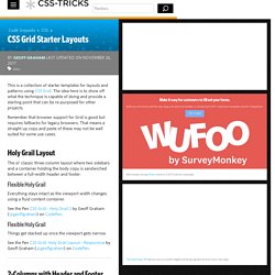
The idea here is to show off what the technique is capable of doing and provide a starting point that can be re-purposed for other projects. Remember that browser support for Grid is good but requires fallbacks for legacy browsers. Feel Homey. Handy Tips For Home Page Design. There’s no place like home, they say.

And in the growing world of websites for all the needs and aims, it actually works the same. Home page has multiple functions: it’s a card of invitation, a starting point of the journey around the website, a storage of the vital links and data, and a strategic asset for marketing goals. In the majority of cases, it is often the first visual and emotional touch to the website. No doubt, design is one of the core ways to make this touch gentle, smart and helpful. Today we are discussing some effective tips for creating user-friendly home pages. One of our previous articles has already given the insights into the definition, types of content such a page usually includes and basic design strategies increasing home page usability.
Firefox DevTools PlayGround. A pure CSS background image as slideshow solution with 2 examples. Ken Burns Effect fullscreen without js. CSS Grid Cheat Sheet. Looks visually better however it does not currently work on all situations.
Turn off if the lines look off. Defines the columns of the grid with a space-separated list of values. The values represent the track size, and the space between them represents the grid line. Defines the rows of the grid with a space-separated list of values. The values represent the track size, and the space between them represents the grid line. Specifies the size of the grid lines. Specifies the size of the grid lines. Aligns the content inside a grid item along the row axis. Aligns the content inside a grid item along the column axis. Box shadow only bottom. CSS Grid Responsive Layout.
CSS Grid PlayGround. Use spread to manipulate the box-shadow. Read me! If an example uses spread it's marked red Hover over the boxes to reveal only the shadow (background: transparent) Supports Chrome 9+, Safari 3.2+, Firefox 3.5+ or InternetExplorer 9 Feel free to fork this website at github.com/conceptboard Don't forget to visit our blog Constant box-shadow box-shadow: 0 0 10px #555. Button (with Click and Hover effect) Real content for all your designs - Lists. Ivan Drinchev's Blog - CSS with only class names. I wanted to make a note to myself and a reference for any co-working front-end colleagues about the good old problem of structuring your stylesheets.
These days we anyway got rid of id selectors and attribute selectors, so the only common selector that left is the tag selector. First let me make some exceptions. If you use a front-end framework similar to React, Vue.js, etc. please use CSS Modules or whatever is the recommended way for styling with that framework.Although these days is controversial, I still use a css reset and on the contrary to the article, there should be mostly tag names selectors there.Styling markup which is not generated by you ( e.g. markdown parsed content or any plugin that adds HTML to your page ) should be an exception and should have a wrapper element around it .markdown h1, .markdown h2 { }.
Now back to the point. What is "CSS with only class names" anyway? Structuring your CSS is a question as old as the job title "Front-end developer". Grid by Example. 11 Shocking Designs Straight Out of the ‘90s. The Internet has certainly been through a lot over the past 20+ years. We’ve watched web design change from the most basic of HTML markups to complex JavaScript, CSS and HTML5 coding. Fullscreen Background Image Slideshow with CSS3. GitHub - kamranahmedse/developer-roadmap at webdesignernews.com.
Practical CSS Grid: Adding Grid to an Existing Design · An A List Apart Article. 10 Rock Solid Website Layout Examples. Keeping It Simple Page layout is equal parts art and science. Creating something that’s visually attractive and unique takes an artist’s eye. CSS Parallax Orbs. Night sky with twinkling stars - CSS3 only. Navigation Bar by Jan Kaděra.