Progressively Enhancing CSS Layout: From Floats To Flexbox To Grid
Advertisement Many companies try to create a great experience for customers. But few are willing to make the changes required to deliver on that promise. In fact most don’t even realize just how bad their experience can be.
Bootstrap, from Twitter
Need reasons to love Bootstrap? Look no further. By nerds, for nerds. Built at Twitter by @mdo and @fat, Bootstrap utilizes LESS CSS, is compiled via Node, and is managed through GitHub to help nerds do awesome stuff on the web. Made for everyone. Bootstrap was made to not only look and behave great in the latest desktop browsers (as well as IE7!)
Fluid Images — Unstoppable Robot Ninja
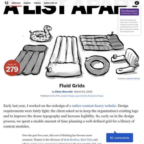
(Hello! If you think this article’s interesting, you might check out my ALA article on responsive web design.) I’ve always hated publishing. I don’t mean the industry, but the act. Hitting “print,” sending an email, pressing that “Publish” button on the CMS: at some point, you relinquish your ability to smooth down some of the sharper edges, fill in the holes of your argument, and just generally fix whatever’s broken.
How To Develop Elastic Grid Layouts In CSS
Flexible layouts are created by using relative measurements as opposed to absolute measurements. The question is relative to what? With elastic layouts the measurements are set relative to something internal to the design, usually the size of the type. We previously talked about fluid layouts, which I defined as using measurements relative to the browser window. Moving from a fluid layout to an elastic layout is actually quite simple.
CSS Box Alignment Module Level 3
Conformance requirements are expressed with a combination of descriptive assertions and RFC 2119 terminology. The key words “MUST”, “MUST NOT”, “REQUIRED”, “SHALL”, “SHALL NOT”, “SHOULD”, “SHOULD NOT”, “RECOMMENDED”, “MAY”, and “OPTIONAL” in the normative parts of this document are to be interpreted as described in RFC 2119. However, for readability, these words do not appear in all uppercase letters in this specification. All of the text of this specification is normative except sections explicitly marked as non-normative, examples, and notes. [RFC2119]
Install the Compass Stylesheet Authoring Framework
Installing Ruby Compass runs on any computer that has ruby installed. For more advanced users you may want to install rvm.
Introduction To The Basics Of After Effects Scripting
To go along with our recent tutorial about script development workflow , we will go over the basic concepts and good practices necessary to start writing After Effects scripts. We will go over usual After Effects actions such as: creating a project, creating a composition, creating a layer, creating shapes, adding effects, changing values and expressions, using text and fonts, adding keyframes, using functions, etc. Writing Your First Script As stated in the After Effects Sublime Text build package installation and usage tutorial, scripts are files which use the Adobe ExtendScript language. ExtendScript is an extended form of JavaScript used by several Adobe applications such as , , and .
Pros And Cons Of 6 CSS Layout Patterns: Part 1
There are a number of css layout patterns you can use when developing a website. Your design could be of fixed-width or it could be fluid or elastic. It might even be a hybrid layout or be responsive to different devices.
Learn CSS Positioning in Ten Steps: position static relative absolute float
1. position:static The default positioning for all elements is position:static, which means the element is not positioned and occurs where it normally would in the document. Normally you wouldn't specify this unless you needed to override a positioning that had been previously set. 2. position:relative
A new micro clearfix hack
The clearfix hack is a popular way to contain floats without resorting to using presentational markup. This article presents an update to the clearfix method that further reduces the amount of CSS required. Demo: Micro clearfix hack Known support: Firefox 3.5+, Safari 4+, Chrome, Opera 9+, IE 6+ The “micro clearfix” method is suitable for modern browsers and builds upon Thierry Koblentz’s “clearfix reloaded”, which introduced the use of both the :before and :after pseudo-elements. Here is the updated code (I’ve used a shorter class name too):
SVG animations, CSS Animations, CSS Transitions
Recently there was a discussion in the SVG working group how SVG Animations (based on SMIL Animations), CSS3 Animations and CSS3 Transitions contribute to the animation sandwich model for SVG presentation attributes. SVG presentation attributes First, what are SVG presentation attributes?
