
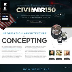
World of 100 – Le monde est un village de 100 personnes. Moritz.stefaner.eu - / Philocarto : un outil de cartographie politique pour les comités. Sg2011. World Wide Web Foundation. Wikipedia Gender. 100 years of world cuisine. Marius watz: unlekker.net. Fi Case Study for Civil War 150. Making History cooler than it already is....
This infographic compares side-by-side statistics of the average Union and Confederate soldiers. From salary to supplies and rations, the numbers are sure to shock you. Showcasing the most critical weapons of the Civil War, this infographic puts an educational spin on the leading weaponry of the time and the turning point of impact these weapons had. Hundreds of thousand lost their lives. Dimensions spatiales des techniques de l'information et de la communication. Media Cloud. Ontology Explorer. Planetary: A Visual Music Player for iPad by Bloom Studio, Inc. [nytlabs] Project Cascade. Ben fry. Bestiario. Homepage for Mark Hansen. Information aesthetics - Information Visualization & Visual Communication. Infographics. Edward Tufte.
Edward Tufte is a statistician and artist, and Professor Emeritus of Political Science, Statistics, and Computer Science at Yale University.
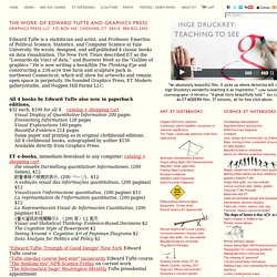
He wrote, designed, and self-published 4 classic books on data visualization. The New York Times described ET as the "Leonardo da Vinci of data," and Business Week as the "Galileo of graphics. " He is now writing a book/film The Thinking Eye and constructing a 234-acre tree farm and sculpture park in northwest Connecticut, which will show his artworks and remain open space in perpetuity.
He founded Graphics Press, ET Modern gallery/studio, and Hogpen Hill Farms LLC. Ideas, issues, concepts, subjects - v. Scientific referencing and hypertext: The necessity of a visual overview. About Frank Molenaar Born in 1986, Frank graduated from Stedelijk Gymnasium Arnhem in 2005. After a year off studying art history at the Vrije Universiteit decided to join the Media and Culture New Media department. For his bachelorproject he worked for Westergasfabriek to create a GPS game based in the Westerpark.
Very sceptical and highly nostalgic, Frank is an avid doomsday specialist, conspiracy theorist and classic nintendo game collector. Also served in the salvation army as m60 machine gun operator. Enjoys: Orwell, Adams, Thompson, Vonnegut This entry is meant as an introduction to the tool my group and I are developing for our Datavisualisation class. In our modern day and age it gets increasingly difficult, with every passing year, to imagine what life must have looked like for traditional scholars. Twitinfo.csail.mit. Visualize Your Taxes: The Finalists. Thinking Machine 4: Play the Game. Gource - software version control visualization. Gource is a software version control visualization tool.
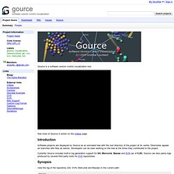
See more of Gource in action on the Videos page. Introduction Software projects are displayed by Gource as an animated tree with the root directory of the project at its centre. Directories appear as branches with files as leaves. Developers can be seen working on the tree at the times they contributed to the project.
Currently Gource includes built-in log generation support for Git, Mercurial, Bazaar and SVN (as of 0.29). Infographic: The History Of Web Browsers. Infographic: What Your State Is Best (and Worst) at Environmentally -... La cartographie, contre-pouvoir du citoyen » Article » OWNI, News Augmented. Devant le déficit de démocratie urbaine en France, quel rôle pour le citadin-citoyen quand les acteurs de la gouvernance urbaine rechignent à déléguer un peu de leur pouvoir ?
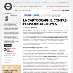
Voyage cartographique militant avec Microtokyo. Le détournement aussi original qu’iconoclaste de la cartographie, opéré par les collectifs Bijari (Brésil) et Los Iconoclasistas (Argentine) vous était présenté récemment sur Microtokyo, dans le cadre de leur travail de sensibilisation contre les projets de gentrification de deux quartiers populaires de grandes métropoles : La Barceloneta à Barcelone et Pinheiros à São Paulo. De telles interventions à la frontière de l’esthétique et du politique sont plus que jamais nécessaires. Qu’en est-il maintenant ? Japan Quake Map. What is Your Water Footprint? Think Quarterly. Civilian Casualties in Afghanistan, 2009 - 2010. Strangely "Digital" Agricultural Landscapes Seen From Space #Inspiration. On daily basis we come across images that are built using various code techniques, whether this be pixelation, glitch, particle fields, swarms, reaction diffusion, looking that these images on Wired Science, it’s amazing to see the similarities between the works we create and the environment we inhabit.
Even more apparent when we consider that they bare no correlation to one another and the large gap in scale that exists between them. Likewise, the images below appear strangely “Digital”… Agriculture is one of the oldest and most pervasive human impacts on the planet. Estimates of the land surface affected worldwide range up to 50 percent. But while driving through the seemingly endless monotony of wheat fields in Kansas may give you some insight into the magnitude of the change to the landscape, it doesn’t compare to the view from above. Vincent van Gogh paintings as pie charts. Immaterials: Light painting WiFi. The city is filled with an invisible landscape of networks that is becoming an interwoven part of daily life.
WiFi networks and increasingly sophisticated mobile phones are starting to influence how urban environments are experienced and understood. We want to explore and reveal what the immaterial terrain of WiFi looks like and how it relates to the city. Immaterials: light painting WiFi film by Timo Arnall, Jørn Knutsen and Einar Sneve Martinussen. This film is about investigating and contextualising WiFi networks through visualisation. It is made by Timo Arnall, Jørn Knutsen, Einar Sneve Martinussen. Visualización y open data: Nuevos Modelos de comunicación e Innovación abierta en la Empresa. Zoomer ou dézoomer? Les enjeux politiques des données ouvertes » Article » OWNI, Digital Journalism. The Challenge: Visualize Your Taxes. Twitter Dots - Beautiful map rendering of realtime Twitter tweets. Paris ouvre ses données publiques pour dynamiser son tissu économique.
Sunlight Foundation. Access Info Europe. Explore European Common Agricultural Policy farm subsidy payments. FishSubsidy.org. Qué es la visualizacion de datos II? Impure Blog. The Evolution of CRM v2 (Social Studies Blog) Look what’s under the tree!
Like Jeff said earlier this week, we grabbed everybody’s feedback and revised the infographic. Compare to previous. Click the image for the full size version: A visual exploration on mapping complex networks. Make People Fall in Love with Your Data: A Practical Tutorial for Data Visualization and UI Design: Strata 2011 - O'Reilly Conferences, February 01 - 03, 2011. Part 1 – Visualization Principles and Best Practices Overview People think visually.
However, most of the tools that today’s information workers use actually confuse our natural visual interpretation skills. In the first part of our tutorial, we will share practical guidance that makes data presentation more effective, engaging, and valuable. Some of the topics we’ll be discussing include information layout and workflow, information visualization, chart selection, and styling. World carbon dioxide emissions data by country: China speeds ahead of the rest. World carbon dioxide emissions by country: click image for graphic and download World carbon dioxide emissions are one way of measuring a country's economic growth too.
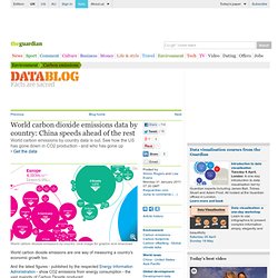
And the latest figures - published by the respected Energy Information Administration - show CO2 emissions from energy consumption - the vast majority of Carbon Dioxide produced. A reduction in global greenhouse gas emissions is not only the goal of environmentalists but also of pretty much every government in the world. Currently 192 countries have adopted the Kyoto protocol.
One fo the aims is to reduce greenhouse gas emissions by 55% of the 1990 levels by 2012 collectively forcountries starred on this list. The map, above (you can get it as a PDF file here) is produced by Guardian graphic artists Mark McCormick and Paul Scruton. Data Visualization. The Croopier. Barcamp: Periodismo de datos. Visualización y Open Data: Nuevos Modelos de comunicación y Innovación abierta en la Empresa - EOI. Visualizar'11: Comprender las infraestructuras. Convocatoria abierta. > Introduction > Visualizar'11: Understanding Infrastructures > Call for Projects: Guidelines and submissions> Call for Papers: Guidelines and submissions > Links and references > Links to available data sources Introduction During the last years, the increasing availability of massive volumes of data in unprecedented numbers has opened new horizons in fields like scientific research, institutional governance, journalism and communication, or civic participation and activism.
The Popular Science Archive Explorer. Envisioning life. Many Eyes. Aaron Koblin on visualizing humanity. Aaron Koblin. Data.gouv.fr : Plateforme française d'ouverture des données publiques (Open Data)