
Mapline Blog How to Make an Awesome Data Visualization with Pin Map What is a Pin Map? 1 location = 1 pin Got the idea? Therefore, a pin map contains pins that each represent a geographical location. M.A. Thesis Visual tools for the socio–semantic web This thesis contributes to a new discipline of science: web science, as introduced by Tim Berners-Lee and others in 2006. Designers, computer scientists, sociologists, cognitive scientists, psychologists etc. have individual perspectives on the complex and rapidly evolving interplay of technological and social infrastructure and human society. However, a well-defined discipline — unifying the scientific analysis of social and human factors to understand, but also to shape and steer web developments by informed design and engineering —is not established yet.
Let's Be Frank I keep coming back to this notion that design, in its rawest form, has no boundaries. Thus, sequestering one’s thoughts and ideas to a narrow set of disciplines, such as interaction design or UX design, does a disservice to ideation and inspiration. Our history as a creative culture is vast, and the people I’m interested in are those who tinker with our world and challenge perception with theories and crazy ideas that often go against conventional wisdom of the day—those who sit on the fringe of possibilities to keep our businesses, communities, lives, world, and imaginations moving forward. Architect, designer, and living legend Ephraim Goldberg, better know as Frank Gehry, is one such individual. His explorations in light, sound, movement, and materials, as well as his innate ability to understand the psychology of human behavior, set him apart in the fields of architecture and design.
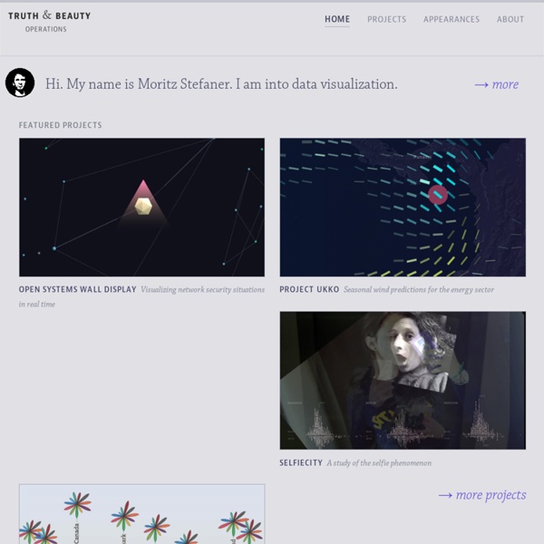
revisit revisit is a real–time visualization of twitter messages (tweets) around a specific topic. You can create your own twitter wall at a conference or an ambient display at your company or whatever use you come up with. In contrast to other twitter stream tools, it provides a sense of the temporal dynamics in the twitter stream, and emphasizes the conversational threads established by retweets and @replies. Szűcs Krisztina grafikus portfólió Krisztina Szucs ( szűcs pronounced like ?Sootch? or [sy:tS] ). 2010-2012 MA in Graphic Design Moholy-Nagy University of Art and Design (MOME), Budapest, HUNGARY 2011 ERASMUS programme ELISAVA Escola Superior de Disseny, Barcelona, SPAIN
The Geotagger's World Atlas Every city has something unique about it, whether it’s a memorial statue, a cool coffee shop, a world-renowned museum or a local pizza parlor. These places are visited by hundreds or maybe even thousands of people a year, which translates to dozens of photos, many of which are geotagged to show the location of these popular and special places. So, what would happen if you took all of those photos and created a map, linking the photos to show individual journeys and locations? Well, you would end up a neat sketch-like image of the location, filled with individual travels and popular locations. You’d get the Geotagger’s World Atlas.
Phylogenetic tree In a rooted phylogenetic tree, each node with descendants represents the inferred most recent common ancestor of the descendants, and the edge lengths in some trees may be interpreted as time estimates. Each node is called a taxonomic unit. Internal nodes are generally called hypothetical taxonomic units, as they cannot be directly observed. Dieter Rams / Selector for 25/25 - Celebrating 25 Years of Design Dieter Rams Industrial Designer (1932-) Selector for 25/25 - Celebrating 25 Years of Design 29 March - 22 June 2007 As head of design at Braun, the German consumer electronics manufacturer, DIETER RAMS (1932-) emerged as one of the most influential industrial designers of the late 20th century by defining an elegant, legible, yet rigorous visual language for its products. Good design is innovative. Good design makes a product useful.
Graphic Sociology » Seeing Social Data Cairo, Alberto. (2013) The Functional Art: An introduction to information graphics and visualization. Berkeley: New Riders, a division of Pearson. Overview A functional art is a book in divided into four parts, but really it is easier to understand as only two parts. The first part is a sustained and convincingly argument that information graphics and data visualizations are technologies, not art, and that there are good reasons to follow certain guiding principles when reading and designing them.
Future Insights Live 2013 A conference for thinkers, Explorers, & Pioneers of the web. Red Hot Topics Covering all the hottest topics. I-Map: Common Outputs Interactive Map of Irregular and Mixed Migration Routes in the Budapest Process, Mediterranean Transit Migration Dialogue and Prague Process Regions This interactive map is a common output of the BP, MTM and PP. It was elaborated on the basis of the 2012 MTM Map on Irregular and Mixed Migration Routes, the 2010 Prague Process "Building Migration Partnerships" Map on Illegal Migration Routes and the 2013 Mapping of Migration Routes in the Silk Route Region.
Tree structure A tree structure showing the possible hierarchical organization of an encyclopedia. The original Encyclopédie used a tree diagram to show the way in which its subjects were ordered. A tree structure is a way of representing the hierarchical nature of a structure in a graphical form. Infographic: 50 People Shaping The Future Of Design In our design issue last year, the Co.Design 50 laid out 50 of the most influential designers in America. This year, as a sequel, we took it upon ourselves to highlight 50 people who are shaping the future of design. That sounds like a funny task. But our staff was after people pushing the boundaries of their discipline into promising new directions.
“Drug Deal” Network Analysis with Gephi (Tutorial) Via a trackback from Check Yo Self: 5 Things You Should Know About Data Science (Author Note) criticising tweet-mapping without further analysis (“If you’re making Gephi graphs out of tweets, you’re probably doing more data science marketing than data science analytics. And stop it. Please. I can’t take any more. … what does it gain a man to have graphs of tweets and do jack for analysis with them?”), I came across John Foreman’s Analytics Made Skeezy [uncourse] blog: