
How do You Design Good Infographics? Infographics are an interesting breed of dense information crammed into colorful cartoons and illustrations.
This trend started a few years back on the Internet and has grown into a steady resource for learning. People all around the world are consuming knowledge via these graphics – and they’re perfect for nearly any situation. But how did these things get so popular? The Anatomy of Well-Designed Successful Infographics. You will find tons of great examples showcasing beautiful infographics all over the web.
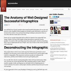
However only a handful of these graphics are actually useful, informative, and draw in attention from visitors. You can learn these design techniques and practice them on new ideas. But how exactly does it all work? Check out our example infographic below which I’ve linked to the original full-view image. The Anatomy Of An Infographic: 5 Steps To Create A Powerful Visual.
Information is very powerful but for the most bit it is bland and unimaginative.

Infographics channel information in a visually pleasing, instantly understandable manner, making it not only powerful, but extremely beautiful. Once used predominantly to make maps more approachable, scientific charts less daunting and as key learning tools for children, inforgraphics have now permeated all aspects of the modern world. I designed a couple of infographics back in college, the need arising especially around the time Soccer World Cup fever spiked. It was a fun process representing the different groups, predicting winners in each group at each stage and creating a mock pairing of teams that would clash all the way leading upto the finals. I was a devout Argentinian supporter at the time. Infographics can appear daunting to some with the sheer amount of data they present, but designed in the right manner and step by step, they can actually be one of the most fun things you will ever create.
10 Fun Tools To Easily Make Your Own Infographics. People love to learn by examining visual representations of data. That’s been proven time and time again by the popularity of both infographics and Pinterest. So what if you could make your own infographics ? What would you make it of? It’s actually easier than you think… even if you have zero design skills whatsoever.
Below are my two favorite infographic-making web 2.0 tools that I highly recommend. 10 Awesome Free Tools To Make Infographics. Advertisement Who can resist a colourful, thoughtful venn diagram anyway?

In terms of blogging success, infographics are far more likely to be shared than your average blog post. A Carefully Selected List of Recommended Tools on Datavisualization.ch. When I meet with people and talk about our work, I get asked a lot what technology we use to create interactive and dynamic data visualizations.
At Interactive Things, we have a set of preferred libraries, applications and services that we use regularly in our work. We will select the most fitting tool for the job depending on the requirements of the project. Sometimes a really simple tool is all you need to create something meaningful. On other occasions, a more multifaceted repertoire is needed. But how does one choose the right thing to use? That’s why we have put together a selection of tools that we use the most and that we enjoy working with. Let me answer the most likely questions right away: No, not everything find its’ way into this list, so you might not find your personal favorite. Make Your Own Infographic. Infographics are to data what storytelling is to an annual report: a more engaging way to help bring attention and understanding to your nonprofit’s cause.
Yesterday we looked at an interesting infographic that suggested a new way to view your volunteers. Today, let’s look at infographics in general – and resources to help your nonprofit get started on making your own. As Wikipedia explains, “Information graphics are visual devices intended to communicate complex information quickly and clearly”: Information graphics or infographics are visual representations of information, data or knowledge.
These graphics are used where complex information needs to be explained quickly and clearly, such as in signs, maps, journalism, technical writing, and education. ... For example, compare the Portrait of a Volunteer infographic we talked about yesterday with Pew Internet’s more conventional Portrait of a Twitter User, where a similar type of data is presented in a simple table. How To Create Outstanding Modern Infographics. In this tutorial you will learn that data doesn't have to be boring, it can be beautiful!

Learn how to use various graph tools, illustration techniques and typography to make an accurate and inspiring infographic in Adobe Illustrator. Start by using the Rectangle Tool (M) to draw a shape. Give it a subtle radial gradient too. The entire design is based on a grid of four columns. To make the columns first select the rectangle and drag a guide onto the centre of the shape. Condense the shape so it fits within the left-most guide and centre guide. Move the shape over to the right and add another guide to the centre here. Using the Rectangle Tool (M) draw a thin white box on the centre line that will be the width of the gap between the columns. Repeat the process for the other columns with your final result being below. I like to place the most important graphics first and work-in the ancillary charts and graphs afterwards. How to Make an Infographic (Even When You’re Not a Designer) - SocialMouths.