A Carefully Selected List of Recommended Tools on Datavisualization
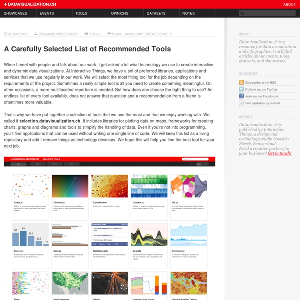
When I meet with people and talk about our work, I get asked a lot what technology we use to create interactive and dynamic data visualizations. At Interactive Things, we have a set of preferred libraries, applications and services that we use regularly in our work. We will select the most fitting tool for the job depending on the requirements of the project. Sometimes a really simple tool is all you need to create something meaningful. On other occasions, a more multifaceted repertoire is needed. But how does one choose the right thing to use? That’s why we have put together a selection of tools that we use the most and that we enjoy working with. Let me answer the most likely questions right away: No, not everything find its’ way into this list, so you might not find your personal favorite.
https://datavisualization.ch/tools/selected-tools/
» My new WebGL games
I was playing with JavaScript and decided to create my own small framework for 2D games, based on WebGL. I have alredy made 2 small games on top of it. Crazy Bugs This game is based on Graph Theory (subfield of math), specifically on planar graphs.
Jim Vallandingham
Update: I moved the code to its own github repo - to make it easier to consume and maintain. Update #2 I’ve rewritten this tutorial in straight JavaScript. So if you aren’t that in to CoffeeScript, check the new one out!
Part 1: The essential collection of visualisation resources
This is the first part of a multi-part series designed to share with readers an inspiring collection of the most important, effective, useful and practical data visualisation resources. The series will cover visualisation tools, resources for sourcing and handling data, online learning tutorials, visualisation blogs, visualisation books and academic papers. Your feedback is most welcome to help capture any additions or revisions so that this collection can live up to its claim as the essential list of resources.
List of information graphics software
This is a list of software to create any kind of information graphics: either includes the ability to create one or more infographics from a provided data seteither it is provided specifically for information visualization Vector graphics[edit]
4 Lessons The Classroom Can Learn From The Design Studio
Earlier this year, we peered into the work spaces of some of the most inspiring companies working in the creative economy to glean design ideas for learning spaces. Instead of the tyranny of cubes and boardrooms, we found spaces for serious play, dynamic cross-pollination, and cultivated serendipity. It was easy to find inspiration from the Googles, Pixars, and IDEOs of the world; the grass is always greener.
Jim Vallandingham
Sentence Drawings Stefanie Posavec is known for her manually curated and hand drawn visualizations that illuminate variations of structure and form in great works of literature. In this remix, automation is used in place of thoughtful analysis to recreate a selection of her First Chapters, in which a layout technique she calls "sentence drawings" is used to display the first chapters of classic books.
Big Data means Advanced Data Visualization
The last few years have been particularly exciting for data visualizations. We’ve witnessed a boom in the popularity of infographics and in tools to help create everyday visualizations for practical purposes. With all these exciting developments it’s difficult not to wonder what the future of this field will look like. Industry-renowned data visualization expert, Edward Tufte once said “The world is complex, dynamic, multidimensional; the paper is static, flat. How are we to represent the rich visual world of experience and measurement on mere flatland?” Tutfe brings up a valid point.
Data Visualization: 20+ Useful Tools and Resources
There are plenty of cool technologies available to collect and examine data. Both web and desktop applications have provided some really great interfaces to fall in love with data mining, and with the rise in popularity we have noticed an increased number of infographics created over the past few years. Today we’ll be looking into some really cool and popular online resources for data visualization. You can see all kinds of data like human population, world condition and even human emotion presented via the visualization. While some of the visualization might be experimental, all of them have one similarity: they help you understand the data better, and this is exactly what visualization is for.
Infographic: How The Poor Spend Their Money Vs. The Middle Class
The rich get richer. It’s one of those old mantras that’s tough to really calculate. After all, didn’t everyone’s 401k tank in the last few years?
Mike Bostock
December 27, 2014Mapping Every Path to the N.F.L. Playoffs December 20, 2014How Each Team Can Make the N.F.L. Playoffs November 5, 2014The Most Detailed Maps You’ll See From the Midterm Elections November 3, 2014How To Scroll
Related:
Related: