
Nobel prize winners demo. 40 Maps They Didn’t Teach You In School. By the time we graduate high school, we learn that they never taught us the most interesting things in there.
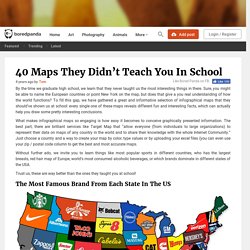
Sure, you might be able to name the European countries or point New York on the map, but does that give a you real understanding of how the world functions? To fill this gap, we have gathered a great and informative selection of infographical maps that they should’ve shown us at school: every single one of these maps reveals different fun and interesting facts, which can actually help you draw some pretty interesting conclusions. Show Full Text What makes infographical maps so engaging is how easy it becomes to conceive graphically presented information. The best part, there are brilliant services like Target Map that “allow everyone (from individuals to large organizations) to represent their data on maps of any country in the world and to share their knowledge with the whole Internet Community.”
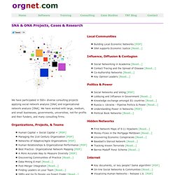
10 Amazing Visualizations of Social Networks. Social networks are dynamic and constantly evolving.

While we can easily identify our friends and acquaintances within a network, it’s much harder for us to comprehend how members in a social network are connected and how those connections influence a particular network. Fortunately, there are now a number of people that have taken the time to create stunning visualizations of various social networks that give us a better understanding of how networks function. We take a look at our ten favourite visualizations of social networks.
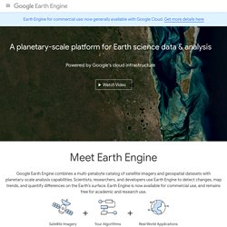
A year of ships. SNA & ONA Projects, Cases & Research by Orgnet, LLC. We have participated in 500+ diverse consulting projects applying social network analysis [SNA] and organizational network analysis [ONA].
We have worked with large, medium, and small businesses, governments, universities, not-for-profits and their funders, and many consulting firms. Organizations, Projects, & Teams Human Capital + Social Capital = [PDF] Managing the 21st Century Organization [PDF] Networks of Adaptive/Agile Organizations [PDF] Human Relationships & Organizational Performance [PDF] Best Practice: Organizational Network Mapping [PDF] A More Accurate Way to Measure Diversity [PDF]Discovering Communities of Practice [Read...] A Handsome Atlas: Wildly Awesome Data Visualizations from the Nineteenth Century. World debt comparison: The global debt clock. The Internet map. Shape of Song. Editorial: Visualisation Tools for Understanding Big Data. Welcome to Moviegalaxies - Moviegalaxies. Worldmapper: The world as you've never seen it before.
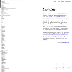
Earth Engine. Earth Engine Access Develop, access and run algorithms on the full Earth Engine data archive, all using Google's parallel processing platform.
Access to Earth Engine is currently available as a limited release to a small group of partners. If you are interested in developing on the Earth Engine platform, let us know. Google Earth Engine brings together the world's satellite imagery — trillions of scientific measurements dating back almost 40 years — and makes it available online with tools for scientists, independent researchers, and nations to mine this massive warehouse of data to detect changes, map trends and quantify differences on the Earth's surface. Applications include: detecting deforestation, classifying land cover, estimating forest biomass and carbon, and mapping the world’s roadless areas. New! Explore different views into this global timelapse built from global, annual composites of Landsat satellite images. Growth of Las Vegas, Nevada Amazon Deforestation, Brazil. Lostalgic. Lostalgic This project is based on the entire ABC's LOST TV show scripts, 115 episodes in 7 seasons, that I managed to parse from Lostpedia.
Lives on the Line: Life Expectancy and Child Poverty as a Tube Map. Tenyearstenartists-01.jpg (Obrazek JPEG, 1130x1600 pikseli) - Skala (39. No upside. A map of American state stereotypes, generated by Google autocomplete.
In the months before a US Presidential election, the quality of political discourse hits new lows. Blue State/Red State tropes dominate the news cycle as the media gins up outrage over perceived injustices in the culture wars. It’s all about our differences. Galerie de jose.duarte. Galerie de mkandlez. The Civil War. Interactive Art and Computational Design, Spring 2012 » Eli Rosen – Final Project – Civil War. This interactive data visualization allows for self-directed exploration of the battles of the American Civil War.

The aim was to facilitate an understanding of the conflict on multiple scales from the entire war to a single battle. Cool Charts & Timelines. PathsofTimeTravelinFuturisticFilms_4f9fe540bfffb.jpg (Obrazek JPEG, 2000x1191 pikseli) - Skala (51. Quakes. Gay rights in the US, state by state. The UK Energy Consumption Guide from Evoenergy. OECD – Your Better Life Index. Average personal index for Germany, men, 15–24 How’s life?
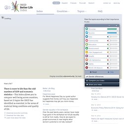
There is more to life than the cold numbers of GDP and economic statistics – This Index allows you to compare well-being across countries, based on 11 topics the OECD has identified as essential, in the areas of material living conditions and quality of life. Download executive summary Download the index data Learn more about the index. The Historical Evolution of Europe's Borders. The movie "Epic time-lapse map of Europe" fast forwards a map from the year 1000 AD until 2003 to reveal the dynamic nature of Europe's borders, alliances, unions, territories, and occupied lands.
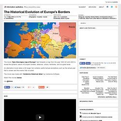
An alternative movie takes a bit longer, but contains useful textual annotations such as the actual year that is shown and the events that occurred. The movie was made with "Centennia Historical Atlas" by Centennia Software. Watch the movies below. The Civil War. Population - Estimations de population - Pyramide des âges régionales et départementales. Google Exodus - Passover movie. SFMOMA ArtScope. Victorian Infographics. A time table indicating the difference in time between the principal cities of the World and also showing their air-line distance from Washington.
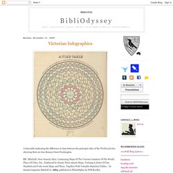
IN: 'Mitchell's New General Atlas, Containing Maps Of The Various Countries Of The World, Plans Of Cities, Etc., Embraced In Ninety-Three Quarto Maps, Forming A Series Of One Hundred and Forty-seven Maps and Plans, Together With Valuable Statistical Tables..' by Samuel Augustus Mitchell Jr, 1883; published in Philadelphia by WM Bradley. Tableau d'Astronomie et de Sphère IN: 'Atlas Universel d'Histoire et de Geographie Anciennes et Modernes, de Mythologie, des Religions, d'Astronomie, de Physique, de Geologie, de Histoire Naturelle, de Grammaire, de Rhetorique..' by Henri Duval, 1834; published in Paris by L Houbloup. Tableau d'Astronomie et de Sphère [detail] ReMap. Interactive Infographic of the World's Best Countries.
Peoplemovin - A visualization of migration flows. 12. Koordinierte Bevölkerungsvorausberechnung. Welcome to the Anthropocene. 15 Stunning Examples of Data Visualization. Data Visualization is a method of presenting information in a graphical form. Good data visualization should appear as if it is a work of art. This intrigues the viewer and draws them in so that they can further investigate the data and info that the graphic represents. In this post there are 15 stunning examples of Data Visualization that are true works of art. Click on the title or image for a larger view of each visualization. Information is Beautiful Challenge #3 - FilmStrips. Massive Health. The 21 Heroes of Data Visualization: Dave Bowker. Aaron Koblin - Flight Patterns. The Whale Hunt / A storytelling experiment / by Jonathan Harris. Pay Gap Between Women and Men. 25 Best Infographics Of 2011 That Are Still Relevant Today.
The year of 2011 went very fast for us in the development world and I am sure some of you accomplished important things for your career during this year. But besides our personal achievements, the whole industry managed to reach something that was unthinkable around 10 years ago. To show you how the web progressed during the past year, I collected a series of infographics from the internet and hope, by the end of this article, you will realize what huge potential this year of 2012 has. Most of the images are not in full here, so you might want to click on them and read the whole infographic for an overall understanding of the presentations. 1. 60 seconds on the web This one shows what happened on the web during 2011 in a timeframe of 60 seconds, if we minimize the whole year to it. 600 new YouTube videos, almost 700,000 search queries on Google and Facebook status updates and close to 100,000 tweets should say enough about what power the internet holds nowadays.
Source. Intelligent Transportation Systems. LIVE Singapore! A Time-Lapse Map of Every Nuclear Explosion Since 1945 - by Isao Hashimoto. Untitled. Wind Map. Visualizing Data: Die Bürgschaft. 50 Great Examples of Data Visualization. Wrapping your brain around data online can be challenging, especially when dealing with huge volumes of information. And trying to find related content can also be difficult, depending on what data you’re looking for. But data visualizations can make all of that much easier, allowing you to see the concepts that you’re learning about in a more interesting, and often more useful manner.
Below are 50 of the best data visualizations and tools for creating your own visualizations out there, covering everything from Digg activity to network connectivity to what’s currently happening on Twitter. Google NGram Experiments. With Google’s new tool Ngram Viewer, you can visualise the rise and fall of particular keywords across 5 million books and 500 years! Web Trend Map 2007 Version 2.0. Moda na Sukces. EUA University Autonomy in Europe. Personal messages from Japan. Data Visualization: Journalism's Voyage West. Posted: Visualizing US expansion through post offices. Research flow. A Day in the Life of NYTimes.com. The New York Times R&D LabsA snapshot of site traffic to NYTimes.com on June 25, 2009. Sightsmap. Hollywood Visualisation Challenge - Design shortlist. We offered a massive dataset on Hollywood budgets, genres, review scores for every film from 2007-2011.
Hollywood Loves Action (launched) Hollywood Cinemetrics (launched) Hollywood Data 2007-2011 (launched) Map your moves. A World of tweets (launched) Main Page. DataMaps.eu » map your data. Exports Radar - Key figures. DataMaps.eu » map your data.