
James Bond: Cars, catchphrases and kisses. 25 October 2012Last updated at 03:05 ET With the 23rd official film Skyfall hitting cinema screens, and the franchise marking its 50th anniversary, we look back at how the films have differed over the years, and how much they have earned.

Skyfall is the third outing for Daniel Craig as 007 - but how does he match up against previous Bonds? We totalled up how much each film is estimated to have made at the box office worldwide, and our intrepid reporters sat through all 23 films to draw up definitive data on women kissed, villains dispatched and catchphrases uttered. Keep scrolling down the page to find out more. Continue reading the main story All figures are for global box office revenue, adjusted for inflation.
Visualisation. Grand Reductions: 10 Diagrams That Changed City Planning. In 1902, Ebenezer Howard, an unassuming stenographer and amateur inventor, published one of the most influential visions in the history of city planning, called Garden Cities of To-morrow.

In it, Howard created a series of diagrams that helped to establish the orthodoxy of 20th-century city planning. The crisis behind what Howard called the “Garden City idea” — the pollution and overcrowding of the industrial city — is encapsulated in one diagram’s title: “A Group of Smokeless, Slumless Cities.” Howard proposed decentralizing industrial cities by constructing a regionally coordinated series of smaller Garden Cities in the countryside. Poster_rappers_1300.jpg (1300×1733) Tapestry: Weaving Stories and Data.
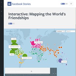
Tree of Life. Minjeong An. Viz-carbontool.appspot.com. Below the Boat - Welcome. The Evolution of Western Dance Music! Interactive: Mapping the World's Friendships. Technology bridges distance and borders.

Individuals today can keep in touch with their friends and family in completely new ways — regardless of where they live. Articles – Data Pointed. Literally Billions April 8, 2013 – Last year, according to the U.S.

Census Bureau, the world’s population topped seven billion, and now stands at approximately 7,077,490,000 as of noon Eastern, April 8, 2013. Above Sea Level November 14, 2012 – Welcome to Moviegalaxies - Moviegalaxies. Numbers. Evo_large.gif (2420×915) EdgeMaps: Philosophers - Timeline - Martin Heidegger.
Laconic History of the World on HUGEpic. Powered by HUGEpic.io Link to right here with positionwithout position.

NodeXL: Network Overview, Discovery and Exploration for Excel - Home. Aerobot - Machine Learning for Marketing and Social Media. When we started taking a look at their customer’s behavioral patterns, we noticed that each one of those customers tended to buy a specific set of products.

We found movie fans, who love the 2x1 discount in tickets, a lot of foodies, who tend to pick some specific foods from sushi to barbecue, and others who love shopping, enjoying some great discounts in clothing and accesories. This caused an interesting problem: As the number of users and products grew, the brand started feeling generic and not really tailored to anyone in particular.
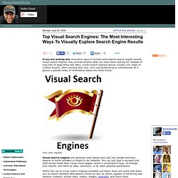
Top Visual Search Engines: The Most Interesting Ways To Visually Explore Search Engine Results. 1.

Grokker Grokker is a web-based search engine that allows you to explore your results in a visual fashion. Your results are displayed both in a standard outline and in a dynamic map you can interact with. Grokker takes advantage of Yahoo! , Wikipedia, and Amazon Books search engines to perform its queries. Regressive Imagery Dictionary - Provalis Research. Download WordStat Versions of the RID English version (created by Colin Martindale) French version (translated by Robert Hogenraad) Portuguese version (translated by Tito Cardoso e Cunha, Brigitte Detry, and Robert Hogenraad) Swedish version (translated by Torsten Norlander, Moira Linnarud, Marika Kjellén-Simes, and Robert Hogenraad) German version (translated by Renate Delphendahl)Hungarian version (translated by Tibor Pólya and Levente Szász) Latin version (translated by Ron Newbold) Russian version (translated by Leonid Dorfman) - Under development!

Installation Instruction Extract the content of the zip file into the WordStat Dictionary folder (by default: c:\Program files\Provalis Research\Dictionaries). Most versions of the dictionary come in two files, the main .CAT file includes the various categorization of words, while the .EXC dictionary handles exceptions by excluding specific word forms. GAFFTA. Stamen Turns Facebook Sharing Into Intricate Digital Art.
We’ve all heard the term “viral.”

And no one knows the term better than George Takei, a former crew member on the Enterprise who has found a whole new, outspoken identity on Facebook. Whether it’s gay rights or silly meme-riffic photos, his posts sit at the epicenter of hundreds of thousands of shares. But what does all this sharing look like beyond the like button? Facebook tapped data visualization specialists at Stamen to answer that exact question.
World History : HyperHistory. Www.cogsci.northwestern.edu/cogsci2004/papers/paper470.pdf. Www.medien.ifi.lmu.de/lehre/ws0809/hs/docs/meyer.pdf. Real Time Social Search and Related Problems, Ashish Goel, Stanford University. The Evolution of the Web. Does Visualization Really Work? Here’s Evidence That It Does. Do you remember a scene in The Matrix when Neo opens his eyes and says “I know Kung Fu”?

I bet you wished you could learn that fast. I know I did. I have wonderful news for you. You can become an expert in a similar way, just not as fast, by using the power of your mind. You just need to learn a technique called visualization. Hcil2.cs.umd.edu/trs/2010-22/2010-22.pdf. Message Machine. Envisioning life. Www.eurecom.fr/~troncy/Publications/Khrouf_Troncy-iswc11pd.pdf. Event visualization in a 3D environment. Semantic event tracker (SET) is an interactive visualization tool for analyzing events (activities) in a three-dimensional environment. We model an event as an object that describes an action, its location, time, and relations to other objects.
Real world event information is extracted from Internet sources, then stored and processed using Semantic Web technologies that enable us to discover semantic associations between events. We use RDF graphs to represent semantic metadata and ontologies. SET is capable of visualizing as well as navigating through the event data in all three aspects of space, time and theme. Temporal data is illustrated as a 3D multi-line in the 3D environment that connects consecutive events. Visualizing Emancipation. Www.public.iastate.edu/~dicook/Tufte/review.pdf. Information Visualization for Knowledge Discovery – MAT 595M Seminar Series. Speaker: Ben Shneiderman, University of Maryland–College Park Abstract Interactive information visualization tools provide researchers with remarkable capabilities to support discovery.
These telescopes for high-dimensional data combine powerful statistical methods with user-controlled interfaces. Users can begin with an overview, zoom in on areas of interest, filter out unwanted items, and then click for details-on-demand. With careful design and efficient algorithms, the dynamic queries approach to data exploration can provide 100msec updates even for million-item visualizations that can represent billion-record databases. This talk reviews the growing commercial success stories such as www.spotfire.com, www.smartmoney.com/marketmap and www.hivegroup.com. and research tools for time series data such as (www.cs.umd.edu/hcil/timesearcher ). Main Page. Bloomin' Apps. This page gathers all of the Bloomin' Apps projects in one place.Each image has clickable hotspots and includes suggestions for iPad, Android, Google and online tools and applications to support each of the levels of Bloom's Revised Taxonomy.I have created a page to allow you to share your favorite online tool, iOS, or Android app with others.
Cogs of the Cognitive Processes I began to think about the triangular shape of Bloom's Taxonomy and realized I thought of it a bit differently.Since the cognitive processes are meant to be used when necessary, and any learner goes in and out of the each level as they acquire new content and turn it into knowledge, I created a different type of image that showcased my thoughts about Bloom's more meaningfully.Here is my visual which showcases the interlocking nature of the cognitive processes or, simply, the "Cogs of the Cognitive Processes".
IPAD APPS TO SUPPORT BLOOM'S REVISED TAXONOMYassembled by Kathy Schrock 45 Ways to Communicate Two Quantities. Back in 2010, I was giving a workshop on interactive data visualization in Lima, Perú, discussing whether a dataset has a unique or at least an ideal way to be visualized. For a simple data structure — a list of some hundreds of numbers, for instance — around half of 20 participants were convinced that there’s one way that is clearly better in communicating the data, regardless of the unit of the values, their range, meaning, context and possible aim of the visualization. This discussion actually came out as a consequence of another idea, which resonated with most participants, as well: that there should be a guide that indicates the best way to visualize each possible dataset. Gradient Labs. Synchronoptic: World History Chart. Interactive Dynamics for Visual Analysis. Graphics Jeffrey Heer, Stanford University Ben Shneiderman, University of Maryland, College Park The increasing scale and availability of digital data provides an extraordinary resource for informing public policy, scientific discovery, business strategy, and even our personal lives.
To get the most out of such data, however, users must be able to make sense of it: to pursue questions, uncover patterns of interest, and identify (and potentially correct) errors. In concert with data-management systems and statistical algorithms, analysis requires contextualized human judgments regarding the domain-specific significance of the clusters, trends, and outliers discovered in data. 3 Trends That Will Define The Future Of Infographics. Now that everyone loves them, early adopters and forward thinkers want to know what is next for the infographic. Designing Data Visualizations Workshop: Strata 2012 - O'Reilly Conferences, February 28 - March 01, 2012. Taxonomy for interactive visual analysis. Interactive visualization continues to grow more useful and prominent in every day analysis. Data Visualization for Human Perception. Eight Principles of Data Visualization.
Why Is Data Visualization So Hot? "Visualizing 'Big Data' in the Arts and Humanities. On Wednesday, September 26, 2012 from 3:00pm to 4:30pm in 150A Thompson Library, the Humanities Institute and the Digital Arts and Humanities Working Group will host a panel discussion on "Visualizing 'Big Data' in the Arts and Humanities.” Panelists David Staley (History), Jessie Labov (Slavic & East European Languages & Cultures), and H. Eagereyes. Visualize this: Is it information or is it art?
By John Grimwade. Fast Thinking and Slow Thinking Visualisation. Last week I attended the Association of American Geographers Annual Conference and heard a talk by Robert Groves, Director of the US Census Bureau. Big Data means Advanced Data Visualization. Editorial: Visualisation Tools for Understanding Big Data. @ Ars Electronica: The Big Picture. Texas drought maps and photos. Various plans for dealing with future droughts and growing demand for water in Texas exist, but most comprehensive — and accepted — is the state Water Plan. A visual exploration on mapping complex networks. Part 1: The essential collection of visualisation resources.
A Carefully Selected List of Recommended Tools on Datavisualization. Allen Brain Atlas - Welcome. Data Visualization Network of Resources. Biological Sciences (BIO) News - Assembling, Visualizing and Analyzing a Tree of All Life - US National Science Foundation (NSF) Proceedings of the 12th International Conference on Knowledge Management and Knowledge Technologies. Visual Ontology Languages. Amazon Mechanical Turk - Welcome. Prefuse: A Toolkit for Interactive Information Visualization. The library for professional-quality creative coding in C++ 22 free tools for data visualization and analysis.
Bloom Blog. Visualising Data. Junk Charts. Data and visualization blogs worth following. Scaling The Universe - The Official Uniview Site. Spaceengine - Home page. Visualizing space–time dynamics in scaling systems. Eyes on the Solar System. Eric Berlow: Simplifying complexity.
Aaron Koblin: Artfully visualizing our humanity. JP Rangaswami: Information is food. DIVA: Dynamic Interactive Visualization. The Forrester Wave™: Advanced Data Visualization (ADV) Platforms, Q3 2012. Jon Nguyen: Tour the solar system from home.