

Ico Design - Single Work. 18 Of Canada's Best Logos. Medium Brand Development on Behance. Branding Mozilla's New Mobile OS By Setting The Firefox Free. No matter where your allegiance in the browser wars lies, you have to admit that the House of Firefox flies the best banner.
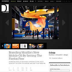
The browser’s logo--a vibrant orange fox curled up around a blue globe--is playful and peppy and instantly recognizable. About this project « A Brand for London. London is having an identity crisis.
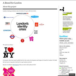
See below. It’s up to all of us to fix it. We need one of these: Fortunately, Boris has issued a public brief for the creative development and design of a brand for London. More4 Rebrand. After winning a competitive pitch, Channel 4 commissioned ManvsMachine to create a new brand identity and on-air look for More4.
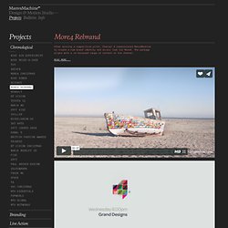
The package aligns with a re-focussed range of content on the channel. The re-brand is centred round a bold, flexible logo that morphs through a series of flips, folds and reveals. The colour palette reflects the vibrant nature of interiors, food culture, fashion and other contemporary lifestyle programming. More4. D-zign & Foto.
Authenticity Is King Because Branding Bores Everyone. Today, any brand has a potential army of credible, unpaid spokespeople that are willing to work on its behalf.
And this army is the exact same group of people who are willing to work against it. This is the new world of what I call the "post-positioning era" of branding. In the post-positioning era of branding, what you say about your product or service matters almost nothing at all, and what I, the consumer, can do with it matters completely. The new conditions of brand success: 1. Our ability as advertisers to contrive and disseminate an emotional response through advertising is diminishing rapidly.
13 Branded Apps That Got it Right. Creating a branded app seems like an obvious move towards engaging potential customers.
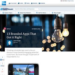
But even though 70 percent of respondents in a October 01, 2010 Creating a branded app seems like an obvious move towards engaging potential customers. But even though 70 percent of respondents in a 2009 survey said that they downloaded branded apps, it's often unclear how effective those apps really are at driving purchases. And there's always a fear that too few people will download the app to make it worth this risk. Apps that are successful as branded content tend to be either useful to the company's core demographic, to be entertaining, or to enhance the company's product in some way.
Useful Branded Apps 1. ifood assistant by Kraft Since the iFood Assistant launched in 2008, it has reached the second spot in iTunes’ Lifestyle section and has been included in iTunes’ list of top 100 paid apps. There's also a recipe box option so that users can easily access their favorite recipes. Blog Archive » Wikipedia in 3D. (Update: We’ve received a lot of feedback about how the new Wikipedia identity functions in different browsers, and we’re working on some minor improvements over the next few days.
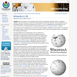
We’ve captured much of the feedback below, and now encourage users to visit this thread on Wikimedia Commons where you can further comment on a revised version, currently being tested on our prototype Wikipedia. Thanks!) Later today you’ll be reading about one of the first major changes to Wikipedia’s user interface. A significant part of that change is a minor, but noticeable refinement to one of the most-recognized logos on the internet: the Wikipedia puzzle globe.
Our puzzle globe has an amazing story, and its creation and localization across more than 250 distinct language versions of Wikipedia is a collaborative design achievement. Boring Green Logo Redesigns Are a Color Cliche « Merriam Associates, Inc. Brand Strategies. Green–it’s the new blue.
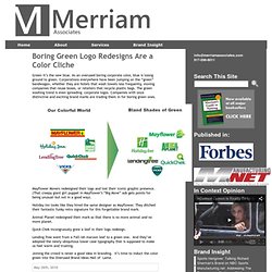
As an overused boring corporate color, blue is losing ground to green. Corporations everywhere have been jumping on the “green” bandwagon, whether they are hotels that wash towels less frequently, moving companies that reuse boxes, or retailers that recycle plastic bags. The green washing trend is even spreading corporate logos. Companies with once distinctive and exciting brand marks are trading them in for boring green ones. Mayflower Movers redesigned their logo and lost their iconic graphic presence. Holiday Inn looks like they hired the same designer as Mayflower. Opinions on Corporate and Brand Identity Work. UnderConsideration is a graphic design firm generating its own projects, initiatives, and content while taking on limited client work.
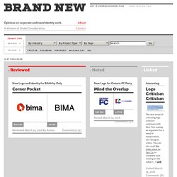
Run by Bryony Gomez-Palacio and Armin Vit in Austin, TX. More… Branding firefox. Shortly before Christmas, I had an email from a chap called Steven Garrity, who works for Silverorange, and runs a blog called ‘Acts of Volition’, in which he publishes a radio show on regular basis.
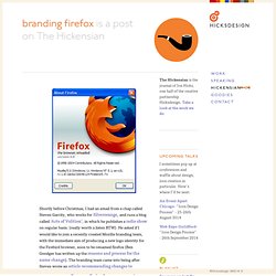
(really worth a listen BTW). He asked if I would like to join a recently created Mozilla branding team, with the immediate aim of producing a new logo identity for the Firebird browser, soon to be renamed firefox (Ben Goodger has written up the reasons and process for the name change). The branding team came into being after Steven wrote an article recommending changes to Mozilla’s existing branding. I jumped at the chance, and today Firefox 0.8 is finally released, and the work is no longer confidential. Over Christmas (thanks Steven!) City of Melbourne on the Behance Network. Creating a Corporate Identity: Virgin`s Branding Strategy. Have Their Story be Your Story. Insignias y Uniformes del Narco. Luke Elliott. Nation Branding » Australia launches new ‘Brand Australia’ concept. First of all, let’s do some recap.
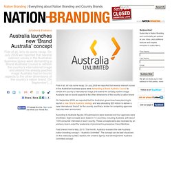
On July 2009 we reported that several relevant voices in the Australian business space were demanding a Brand Australia Council to refresh the country’s international image and extend the already positive image Australia had on tourist aspects to the other dimensions of the country’s nation brand. On September 2009, we reported that the Australian government was planning to launch a new ‘Brand Australia’ strategy and was allocating $20 million to deliver a new international “brand” for the country, and that a tender for competing agencies had also been announced. According to Austrade figures, 60 submissions were received and four agencies were shortlisted. Eight concepts were tested in 14 countries, including Australia, with about 1000 consumer interviews in each country. New Microsoft brand logos, company tagline revealed at MGX event? (update: no new logos, tagline is a go)
It looks like Microsoft may have revealed something big at its annual MGX (Microsoft Global Exchange) event, namely... new logos for its main brands and a fresh brand motto. "Be What's Next" touts a teaser which has been posted on YouTube, along with a fast moving sequence of morphing logos, shuffling from Windows, to Windows Phone, Xbox, Bing, and finally the familiar Office logo that's been kicking around for a little longer. It's unclear if these are just treatments used for a promo at the event, or if this is a signal that Redmond is dumping its familiar (and frankly dated) iconography for something a little looser, leaner, and hipper, but we can't say it would be a bad thing. It would certainly make sense against a backdrop of potential comeback in the mobile space, gains in search, and the seemingly successful (or at least satisfying) Windows 7 launch.
Update: So... the YouTube video has been pulled. Museum of Arts and Design. Go MAD. This weekend the Museum of Arts and Design opens the doors of its new home at 2 Columbus Circle following an extensive redesign of the building by Brad Cloepfil of Allied Works Architecture. The museum’s new graphic identity can already be seen throughout the city, on the sides of buses, on street banners, in print ads and in the subways. One Laptop per Child (OLPC): Video > Brand. Paula Scher + Dana Arnett. San Diego Zoo Gets Funky. Founded in 1916 the San Diego Zoo is one of the largest in the world, with “over 4,000 rare and endangered animals representing more than 800 species and subspecies” including a delicious (looking not tasting) panda. The San Diego Zoo, as a parent brand and non-profit organization, also operates the San Diego Zoo’s Wild Animal Park, and San Diego Zoo’s Institute for Conservation Research, and counts with more than 250,000 member households and 130,000 child memberships.
Despite being all part of the same family, each entity had its own identity and it wasn’t clear that they were all fighting the same fight: Conservation. The San Diego Zoo has just introduced a new identity created by Landor that unifies the full San Diego Zoo organization under one visual identity and brand idea, “Ambassadors for Wildlife,” which grew out of the new tagline, “Wild at Heart.” For the identity we drew from our insight that different animals use a variety of unique expressions. The Brand Gap. The Meaning of Colour in Web Design. Walter Landor on design, branding, and Landor (1977) ÉñÂí¶¼ÊǸ¡ÔÆ£¡ÉîÛÚ×î¸øÁ¦µÄ´´ÒâºÍÉè¼Æ°¸Àý-ad110¡¤aLife. 南山区首个创意产业总部园区:花样年.美年国际广场,整合传播推广:风火广告 花样年.美年国际广场定位为时尚创意办公街区和创意产业园区。 通过创意文化的外在包装,将园区打造成集艺术、设计、商业于一体的新兴商务集聚地。 因为“花样年.美年国际广场”的杰出设计很给力(请注意,其实风火广告间接的用了朗涛(Landor)澳大利亚公司的国际团队,所以这个广场也就很正统的叫“XX国际广场”),也因此ad110界定其为“深圳最给力的创意和设计!”
,本着娱乐的精神! Ad110不发表此界定的理由!