
Css3. Foundation: Rapid Prototyping and Building Framework from ZURB. Beyond the Hype: Understanding HTML5 and its Potential for e-Learning and mLearning by Judy Unrein. What does HTML5 mean to us as e-Learning and mLearning designers and developers?

What – if anything – does HTML5 add to our capabilities? What are its limitations? What will have to happen for it to be truly useful to our industry? And what don’t we know yet? The Internet is on fire. There has been considerably less controversy in the e-Learning world – at least in the part of our discourse that gets published on the Internet.
According to the e-Learning Guild’s 2009 report, Getting Started in e-Learning: Technologies, Tools, and Media for e-Learning, among the top 15 development tools used by their members, only two of the actual authoring tools don’t output to Flash formats at all, and those are pretty far down on the list. And it’s easy to see why Flash delivery is popular: Some version of Flash Player, the plugin needed to play Flash content in a Web browser, is on just about every computer in the world. What is HTML5? BluCSS. Inuit.css—cooler than a polar bear’s toenails… The Goldilocks Approach to Responsive Web Design. Skeleton: Beautiful Boilerplate for Responsive, Mobile-Friendly Development.
A responsive CSS grid system helping desktop and mobile browsers play nicely together. Fluid Baseline Grid - A sensible HTML5 and CSS3 development kit. Golden Grid System. GGS was my next step after Less Framework.
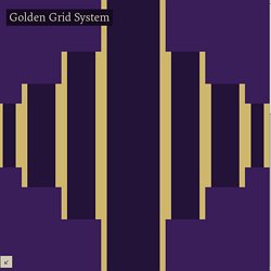
Instead of a fixed-width grid, it used a fully fluid-width one, without even a maximum width. The resources it was published with are still available on GitHub. The idea was to take a 18-column grid, use the outermost columns as margins, and use the remaining 16 to lay elements out. On smaller screens the 16 columns could be folded into 8, 4 and 2. This behaviour was inspired by Massimo Vignelli's Unigrid system. While the grid's columns were fluid — proportional to the screen's width — the gutters (spaces between the columns) were proportional to the font-size being used. GGS also contained a set of typographic presets, strictly to a baseline grid. Correctly setting all of these measurements is difficult, of course. Gridless - An awesome HTML5 & CSS3 boilerplate for mobile first responsive, cross-browser websites. MooTools - a compact javascript framework.
Grid and Column Designs. If you are looking for inspiration for grid and column design, here is a nice collection of 32 column-based websites.
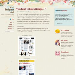
These sites show how grid layout can be applied on various type of sites — whether a massive content editorial site or just a personal blog. Check out how the layout can be divided into 3 columns, 4 columns, a mixture of narrow and wide columns. Editorial Sites First let's check out some of the famous editorial sites. Can you imagine how these sites would be organized without a grid system due to their massive content? The New York Times National Post Guardian Times Online Frieze Magazine Wired News The Morning News Porfolio We Are Survival Machines UX Magazine Grid in blog design Here are some of the blogs that adapted the grid style. AI Alex 5 Thirty One Subtraction Astheria Jeff Croft Hell Yeah Dude Jon Tangerine Mark Boulton Design The Technology Herald Gapers Block. Grid Computing… and Design.
The layout grid I used for Subtraction Six.5 was improvised and inconsistent — I hobbled it together without much consideration or foresight, more interested in getting something finished than building something that would continue to make sense as I got more and more serious about the writing I post here.
Over time, by virtue of repeated use, I became increasingly and lamentably invested in its tremendous shortcomings. When you make fairly liberal use of illustrations in your posts, you essentially wed yourself to the particulars of the CSS you’ve established, creating graphics of a certain width or ordering content in a particular method. It works in the short term, but it presents problems when you sit down to redesign. Boxed In. Assigning property values, Cascading, and Inheritance. 6.1 Specified, computed, and actual values Once a user agent has parsed a document and constructed a document tree, it must assign, for every element in the tree, a value to every property that applies to the target media type.
The final value of a property is the result of a four-step calculation: the value is determined through specification (the "specified value"), then resolved into a value that is used for inheritance (the "computed value"), then converted into an absolute value if necessary (the "used value"), and finally transformed according to the limitations of the local environment (the "actual value"). 6.1.1 Specified values.
jQuery: The Write Less, Do More, JavaScript Library. How to Make All Browsers Render HTML5 Mark-up Correctly - Even IE6. HTML 5 provides some great new features for web designers who want to code readable, semantically-meaningful layouts.
However, support for HTML 5 is still evolving, and Internet Explorer is the last to add support. In this tutorial, we'll create a common layout using some of HTML 5's new semantic elements, then use JavaScript and CSS to make our design backwards-compatible with Internet Explorer. Yes, even IE 6. Tutorial Details. Tools of the Trade: Web Development Frameworks that the Pros Use. New web development frameworks, promising rapid development and easy deployment, are sprouting out at a more rapid pace than you can keep up.
In the last article, we looked at the various factors you'd have to consider when deciding on a framework. Today, we are going to look at the various frameworks available for each facet of web development.