

INTERFACE SKETCH. 10 Amazing Uses for Wolfram Alpha. You may have heard of Wolfram Alpha, which is a “computational knowledge engine.”
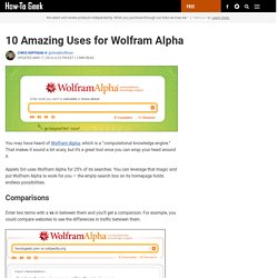
That makes it sound a bit scary, but it’s a great tool once you can wrap your head around it. Apple’s Siri uses Wolfram Alpha for 25% of its searches. You can leverage that magic and put Wolfram Alpha to work for you — the empty search box on its homepage holds endless possibilities. Comparisons Enter two terms with a vs in between them and you’ll get a comparison. You can compare cities, books, foods and almost anything else you can think of. Nutrition Information Enter a type of food and Wolfram Alpha will provide you with its nutrition information.
Complicated Math Wolfram Alpha is ideal for the sort of math that Google’s calculator and most other calculator websites will choke on. Where Am I? Ask where you are and Wolfram will use your IP address to track you down. Days Until Something. Don’t Use Automatic Image Sliders or Carousels, Ignore the Fad. 553inShareinShare I’m sure you’ve come across dozens, if not hundreds of image sliders or carousels (also called ‘rotating offers’).
You might even like them. But the truth is that they’re conversion killers. So if they’re not effective, why do people use them? 2 reasons: Some people think they’re cool. What the tests say I’m not alone. We have tested rotating offers many times and have found it to be a poor way of presenting home page content. Chris Goward, Wider Funnel Rotating banners are absolutely evil and should be removed immediately. Tim Ash, Site Tuners Jakob Nielsen (yes, the usability guru) confirms this in tests. Notre Dame university tested it too. Product design guru Luke Wroblweski summed it up like this: . There’s a discussion about automatic sliders on StackExchange UX. Here are some of the things different people who tested them said: Almost all of the testing I’ve managed has proven content delivered via carousels to be missed by users. Adam Fellows. UX Archive. Showcase of Landing Page Design. Effective landing pages are critical to growing an online business.
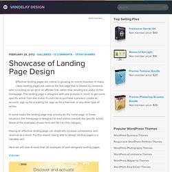
In many cases landing pages are used as the first page that is viewed by someone who is clicking on an ad or an affiliate link, rather than sending the visitor to the homepage. The landing page is designed with one purpose in mind, to get some specific action from the visitor. It could be to purchase a product, create an account, sign up for a mailing list, sign up for a free trial, or any other type of action. In some cases the landing page may actually be the home page. In these situations the homepage is designed to lead visitors towards the specific action.
Having an effective landing page can drastically increase conversions, and revenue as a result. Here we will look at more than 20 examples of well-designed landing pages. Full_preview.png 1'612 × 2'264 pixels. Login Screen – behind the scenes. Here at GoSquared, we love to obsess over the little details that make the real difference in your experience of the site and Dashboard.
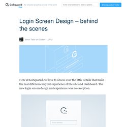
The new login screen design and experience was no exception. We wanted the login screen to feel personal and for our customers to feel comfortable and familar with signing in. It’s something that our most loyal customers see very regularly too, so it had to be streamlined and quick to understand and submit. At the end of the day, people don’t want to stay staring at a login form – they want to use GoSquared – they want to find out more about their website. Getting personal. We decided to use Gravatar to show an image relating to the users email – which updates every time the email changes.
Quick fades between the GoSquared logo and the Gravatar, depending on whether a Gravatar is found or not, make the transition natural. Why Your Links Should Never Say “Click Here” By anthony on 06/20/12 at 10:39 pm Have you ever wanted your users to click your links, but didn’t know how to get them to act?
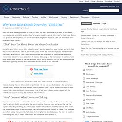
When some designers run into this problem they’re tempted to use the words “click here” on their links. Before you give in to the temptation, you should know that using these words on a link can affect how users experience your interface. “Click” Puts Too Much Focus on Mouse Mechanics Using the word “click” on your links takes the user’s attention away from your interface and on to their mouse. “view” relates to the users task, while “click” puts the focus on mouse mechanics Instead of using the word “click”, look for a different verb you can use that relates to the user’s task. “Here” Conceals What Users are Clicking Some links don’t use the word “click”, but instead they use the word “here”. When your link doesn’t just say “here”, users can skip the verbose text and go right to the link when each link is labeled, they’re a lot easier for the user to distinguish.