

Pattern Library. The MailChimp Pattern Library is a byproduct of our move to a responsive, nimble, and intuitive app.

Constant iteration requires both an efficient workflow and a well defined collection of atomic elements that can assemble new UIs quickly without accruing new technical or design debt. We’re also solving an internal communication problem by documenting and assembling a reference site of our patterns. A common lexicon of code and UI elements benefits us in a few ways: We can build consistently and focus on workflows and logic, not web forms and list items We can reuse code instead of roping in a developer We can maintain our code by seeing our patterns in one place, define elements in our application, and keep redundancy to a minimum We guard our pattern library jealously, and add new patterns only when the case for doing so is sound.
Embedresponsively.com. Don’t Squash Me: Using min-width on Fluid Images. Tips, Resources and Patterns for Responsive Web Design. 5 Useful CSS Tricks for Responsive Design. Making the design to be responsive is very easy as shown in my Responsive Design in 3 Steps tutorial, but maintaining the elements to look aesthetically balanced on all breakpoint layouts is an art.
Today I’m going to share 5 of my commonly used CSS tricks along with sample cases for coding responsive designs. They are simple CSS properties such as min-width, max-width, overflow, and relative value — but these properties play an important part in responsive design. View Demos 1. Responsive Design: Streamlining Your Process. How to use src.sencha.io. This Guide is most relevant to Sencha Touch, 1.x. Sencha.io Src helps you dynamically resize images for the ever increasing number of mobile screen sizes.
We’ve previously done a lot of work in Sencha Touch to make your UI resolution independent, and Src expands this to include your image assets. It’s easy to use, and in this guide, we run through the main API options for the service. Sencha.io Src is essentially a proxy that lies between image assets (hosted either on your own server or by a third party) and the browser or application requesting them via HTTP. The API is accessed entirely via placing a prefix before the original image URL. Let's start with a quick example. To use Sencha.io Src in its default mode, you simply prefix your absolute src attribute with Add that into the tag and your image will be magically resized for a smaller, mobile screen: In this particular case, the image is of landscape orientation, and so width becomes the constraining dimension.
Defined sizing. Foodsense. Initializr - Start an HTML5 Boilerplate project in 15 seconds! Golden Grid System. GGS was my next step after Less Framework.

Instead of a fixed-width grid, it used a fully fluid-width one, without even a maximum width. The resources it was published with are still available on GitHub. The idea was to take a 18-column grid, use the outermost columns as margins, and use the remaining 16 to lay elements out. On smaller screens the 16 columns could be folded into 8, 4 and 2. This behaviour was inspired by Massimo Vignelli's Unigrid system. While the grid's columns were fluid — proportional to the screen's width — the gutters (spaces between the columns) were proportional to the font-size being used. Gridpak - The Responsive grid generator.
PhoneGap. Skeleton: Beautiful Boilerplate for Responsive, Mobile-Friendly Development. A fix for iPhone viewport scale bug. Jeremy first raised his concern (about iPhone viewport scaling) and later by Andreas.
My early view was stated here. Since this issue was raised, I have been trying to find ways to work around this problem. Below is a proof of concept of how to preserve the accessibility (scaling) without affecting the usability for the majority. How to Build a Responsive Thumbnail Gallery. FitText - A plugin for inflating web type. 8 Responsive jQuery Slider Plugins. Whether you’re already a pro at creating responsive web sites or your just learning what it’s all about, it’s good to have some scripts handy that you can easily integrate into your site.
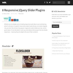
We all know how popular image and content sliders are now, and for good reason. So we decided to round up some jQuery slider plugins that are already responsive – meaning they will adapt to the size of their container. Flexslider FlexSlider is an awesome, fully responsive jQuery slider plugin. In other words, it resizes to fit the screen on which it is displayed, and looks good doing it. Blueberry Blueberry is an experimental opensource jQuery image slider plugin which has been written specifically to work with fluid/responsive web layouts. unoslider unoslider is a fully responsive, touch enabled, mobile optimized jQuery slider plugin.
Responsive Thumbnail Gallery Plugin jQuery Plugin for creating image galleries that scale to fit their container.
Screenfly by QuirkTools — Test Your Website at Different Screen Resolutions. Navigation. Responsive Web Design. Foreword by Jeremy Keith From mobile browsers to netbooks and tablets, users are visiting your sites from an increasing array of devices and browsers.
Are your designs ready? Learn how to think beyond the desktop and craft beautiful designs that anticipate and respond to your users’ needs. Ethan Marcotte will explore CSS techniques and design principles, including fluid grids, flexible images, and media queries, demonstrating how you can deliver a quality experience to your users no matter how large (or small) their display. Contents. Adaptive Images in HTML. CSS: Elastic Videos. While I was coding the Elemin Theme (a responsive WordPress theme that I recently designed), one of the challenges that I faced was to make the embedded videos elastic.
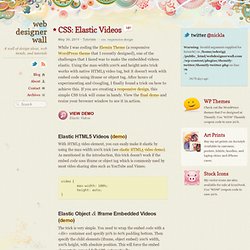
Using the max-width:100% and height:auto trick works with native HTML5 video tag, but it doesn't work with embed code using iframe or object tag. After hours of experimenting and Googling, I finally found a trick on how to achieve this. If you are creating a responsive design, this simple CSS trick will come in handy. View the final demo and resize your browser window to see it in action. View Demo Elastic Videos Elastic HTML5 Videos (demo) With HTML5 video element, you can easily make it elastic by using the max-width:100% trick (see elastic HTML5 video demo).
Elastic Object & Iframe Embedded Videos (demo) The trick is very simple. Joshje/Responsive-Enhance - GitHub.