
Cloudinary - Cloud-based image management & upload. ResponsiveImages: A Ruby Gem for Server and Client-Side Responsive Images. A simple, flexible and elegant solution for responsive images in rails applications.
Responsive images seems to be an ongoing problem without any great solutions yet. As we continue to develop responsive front-ends, we continue to develop better way to address the problem. The Problem Most solutions tend to be either client-side implementation like HiSRC or rwdImages or occasionally, there are server-side solutions for Apache that require .htaccess. Which responsive images solution should you use? There are a bunch of techniques going around for dealing with responsive images lately.
That is, solutions to help us serve the right image for the occasion (e.g. size of screen and bandwidth available). They all do things a bit differently. To keep track, Christopher Schmitt and I have created this spreadsheet of techniques. The spreadsheet has the data, but let's digest it through thinking about it through the lens of practical questions. Johnkoht/responsive-images.
Scottjehl/picturefill. How to use src.sencha.io. This Guide is most relevant to Sencha Touch, 1.x. Sencha.io Src helps you dynamically resize images for the ever increasing number of mobile screen sizes. We’ve previously done a lot of work in Sencha Touch to make your UI resolution independent, and Src expands this to include your image assets. It’s easy to use, and in this guide, we run through the main API options for the service. Sencha.io Src is essentially a proxy that lies between image assets (hosted either on your own server or by a third party) and the browser or application requesting them via HTTP. The API is accessed entirely via placing a prefix before the original image URL. Imgix - Image Processing On-Demand, Served By CDN. » Responsive IMGs Part 2 — In-depth Look at Techniques Cloud Four Blog. » Responsive IMGs — Part 1 Cloud Four Blog. In my post “Where are the Mobile First Responsive Web Designs”, I noted that one of the first things I look for when trying to determine whether or not a responsive web design is “mobile first” is whether or not it has a strategy for handling the IMG tag.
A recent Smashing Magazine round up of responsive web design techniques included several new approaches for handling IMG tags which makes it the perfect time to dig into this problem and the potential solutions in more depth. Why IMG Tags Suck for Responsive Web Design If you want your site to load as quickly as possible, you do not want to deliver larger files than are needed.
Many responsive web design sites provide mobile devices images at sizes appropriate for desktop and ask the mobile device to resize the image. In my research, I found nearly 80% decrease in file size by delivering images at the actual size they were going to be used on a mobile device. So what’s the problem with the IMG element in responsive designs? ResponsiveImages.org. A Pixel Identity Crisis. A note from the editors: This article was augmented post production with vendor prefix information to cover Webkit-based and Opera browsers.
The pixel has always been the smallest unit in screen-based design. Because it’s been indivisible, it is the concrete unit of measurement among screen-based designers. The phrase “a pixel is a pixel is a pixel” has been adopted to help print designers not used to fixed-screen density understand the concept. Because of this consistency, web designers have adopted pixels over points and other units to build websites. Article Continues Below Now that hardware is changing and pixel densities are growing, pixels are struggling to find relevance as the stable unit they once were. The hardware pixel#section1 Most of us are familiar with the hardware pixel.
The reference pixel and splitting atoms#section2. Choosing a viewport for iPad sites - Allen Pike. The iPad has made choosing a good viewport tag for your site more challenging.
You now need to specify something that looks good with your content for screens that are 320px, 480px, 768px, and 1024px wide. Viewports Mobile Safari presents desktop-sized sites on small screens by rendering to a virtual browser screen that is 980px ((Of course, when the iPad is in landscape orientation of 1024px wide, it will use 1024px.)) wide, and letting you pan and zoom that page. Viewport tags let you tell Mobile Safari that your site displays properly narrower than 980px, and set other preferences for scaling your page. Craig Hockenberry famously determined the ideal viewport tag for content sites in the iPhone era.
Adaptive Images for Responsive Designs. So you’ve been building some responsive designs and you’ve been working through your checklist of things to do: You started with the content and designed around it, with mobile in mind first.
You’ve gone liquid and there’s nary a px value in sight; % is your weapon of choice now. Adaptive Images in HTML. SVG Icons FTW. Despite the growing popularity of SVG, its time around and excellent browser support, we have a lack of good vector icon approaches.
It's time to fill this gap and use SVG as icons in our web projects. A lot of great methodologies and principles arose making our CSS more and more modular, structured and flexible. But think about your icons. Using raster graphics for icons means that they are not manageable in CSS. Using SVG. Learn Development at Frontend Masters SVG is an image format for vector graphics.
It literally means Scalable Vector Graphics. Basically, what you work with in Adobe Illustrator. You can use SVG on the web pretty easily, but there is plenty you should know. Why use SVG at all? Small file sizes that compress wellScales to any size without losing clarity (except very tiny)Looks great on retina displaysDesign control like interactivity and filters. Creating Retina Images for Your Website. July 6th, 2012 by Kyle Larson Apple’s newest devices feature the Retina Display, a screen that packs double as many pixels into the same space as older devices.
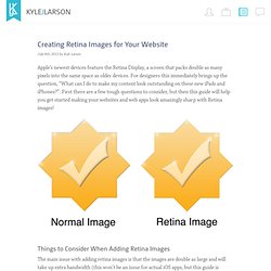
For designers this immediately brings up the question, “What can I do to make my content look outstanding on these new iPads and iPhones?”. Retina Display for Mobile Web. As of late, I’ve been tasked with optimizing images for the iPhone4′s Retina Display.
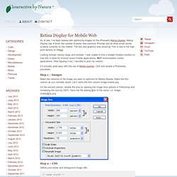
Retina Display has 4 times the number of pixels than previous iPhones and all other smart phone screens currently on the market. The text and graphics look amazing! 5 Ways to Support High-Density Retina Displays. An interesting point was raised by Brendan Davis in my recent post “Responsive Web Design and Scrollbars: Is Chrome’s Implementation Better?” : are RWD breakpoints affected by high pixel-density screens? The short answer is: no — but we need to delve a little deeper and look at the problems they can cause.