
The Sparkbox Responsive Design Process. Responsive and Mobile-Friendly Tooltip · Osvaldas Valutis. Free Responsive Wireframe [PSD File] The web is a wonderfully-mysterious thing, full of strangeness and entertainment and actual resources at times.
![Free Responsive Wireframe [PSD File]](http://cdn.pearltrees.com/s/pic/th/responsive-thetorquemag-85029516)
It’s the latter that is the most impressive as it’s chock-full of people willing to give their time and energy to others via their own work. That’s why I like covering the “freebies” the most as it plays nicely with our open source philosophy around WordPress, you know what I mean? So when I saw Chris Bannister’s free responsive wireframe photoshop file I knew that I needed to make sure that our community had an opportunity to get a copy for their own use as well as give credit where credit is due. First posted on Dribbble it’s a photoshop file that showcases a mobile phone layout, tablet, and desktop. You may find it helpful for some of your design creations today or in the future.
Responsive Web Design Patterns. Responsive Patterns A collection of patterns and modules for responsive designs.

Submit a pattern Layout Reflowing Layouts Equal Width Off Canvas Source-Order Shift Lists Grid Block Navigation Single-Level Multi-level Breadcrumbs Pagination Images. Responsive Web Design Guidelines and Tutorials - Smashing Magazine. In this overview you will find the most useful and popular articles we have published on Smashing Magazine on Responsive Web Design.

Quick Overview Design Process In The Responsive Age11 You cannot plan for and design a responsive12, content-focused13, mobile-first14 1 website the same way you’ve been creating websites for years—you just can’t. If your goal is to produce something that is not fixed-width and serves smaller devices just the styles they require, why would you use a dated process that contradicts those goals? I’d like to walk you through some problems caused by using old processes with responsive design. Read more…17. Responsive Design Test Bookmarklet - BenjaminKeen.com. Tutorial: Create fluid layouts with HTML5 and CSS3. Five steps to gettin’ flexy in responsive web design.
Beginner’s Guide to Responsive Web Design. Whether you’re a beginner or a seasoned web professional, creating responsive designs can be confusing at first, mostly because of the radical change in thinking that’s required.

As time goes on, responsive web design is drifting away from the pool of passing fads and rapidly entering the realm of standard practice. In fact, the magnitude of this paradigm shift feels as fundamental as the transition from table based layouts to CSS. Simply put, this is a very different way of designing websites and it represents the future. Interaction Design and Design Strategy. Off Canvas What Now?

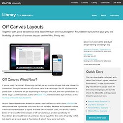
If you've used Facebook's iPhone app (or Path, or any number of apps that now follow this convention) then you've seen an off canvas panel in a native app. You hit a button and a panel slides in from the left (or depending on how you look at it, the main panel slides out of the way). Luke Wroblewski, author of Mobile First, mentioned this style of layout in his roundup of mobile layout patterns.
He and Jason Weaver then worked to create a batch of layouts, which they published to demonstrate how layouts like this could work on the Web. We were so impressed that we wanted to make that style of layout available for Foundation users, and the four layouts below are a few different examples of off-canvas layouts created specifically for Foundation. Four Layouts, No Waiting We've put together four different layouts, each with specific functionality and code for you to check out and download. How to Use These Layouts Foundation 3.2, the release version of Foundation 3.
Adapting Ourselves to Adaptive Content. For years, we've been telling designers: the web is not print.

You can't have pixel-perfect layouts. You can't determine how your site will look in every browser, on every platform, on every device. We taught designers to cede control, think in systems, embrace web standards.
Tools. Responsive Web Design: 50 Examples and Best Practices. Responsive web design term is related to the concept of developing a website design in a manner that helps the lay out to get changed according to the user’s computer screen resolution. More precisely, the concept allows for an advanced 4 column layout 1292 pixels wide, on a 1025 pixel width screen, that auto-simplifies into 2 columns.
Also, it suitably fixes on the smartphone and computer tablet screen. 20 Amazing Examples of Using Media Queries for Responsive Web Design. Responsive web design is one of the hottest topics among designers and developers right now.

If you’re not quite sure what it’s all about, we’ll walk you through what it is, how it works and how CSS media queries are something you need to start incorporating into your own designs. To top it all off, we’ll finish with twenty seriously impressive of responsive designs that use media queries to present experiences specifically catered to different visitors. What Are Media Queries? CSS3 has brought about a ton of fancy visual effects such as shadows and animations, but what about practical improvements? Is there anything about CSS3 that actually improves the way you can build websites from a usability standpoint? The answer is a resounding “yes” and is due largely to the inclusion of media queries.