
Evaluating Your Images—Basics. Click for a movie on adjusting tonal ranges.
Cropping (top) is one way to emphasize the key parts or make it fit a format, perhaps in a magazine layout. One way to evaluate the tonal range is with a histogram that charts the various levels of brightness in the image. Hues can be arranged on a color circle or wheel. Click for a movie on adjusting hue, saturation and brightness. As you point Lightroom's white balance selector tool at a pixel in an image, the pixel's color mix is displayed. Click for a movie on sharpening an image. Noise can significantly degrade smooth tones. When you open an image on the computer, you really get to see it for the first time. Without you even being aware of it, your camera is making changes to your JPEG images that cannot be undone. To properly evaluate images your system should be color managed, as we discuss later. As you examine your images, here are some things to look for.
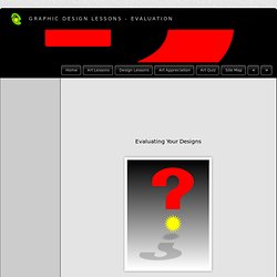
Evaluating Image Size and Orientation Evaluating the Tonal Range Evaluating Colors. Tips for Objective Evaluation of Composition. Composition is one skill within photography that we can probably never master, but just continually develop.
The composition we choose when taking a photograph, i.e. where we choose to place the boundaries of the frame, the perspective we choose to employ from the chosen focal length, how we choose to arrange objects within a scene etc, all influence the way a viewer interacts with the image, and so are all crucial to the success of any given image. When a composition of an image is broken down to the most basic level, it can almost always be considered as the balance and interaction between different shapes, patterns and light within the scene. It is very easy to critically assess the photographs of others in this way within a couple of seconds of laying eyes on them, however, how often do we apply that objective critique to our own images?
Another method I find very useful is to rotate the image by 180°, i.e. turn it upside down, during post processing. Graphic Design Lessons - Evaluation. What is Evaluation?
Evaluation is the skill of being able to look at a piece of work and know what is right or wrong with it. It is an instinctive skill but one that you can develop by increasing your knowledge and understanding of art and design through studying the work of other artists and designers. Why do you evaluate your work? You evaluate your work to find out what works and what doesn't. It is also important to understand what you have learned from doing the work.
How do you evaluate your work? When you are evaluating your designs you should consider the following: Images Fonts Layout Target Audience Technique Your Images: Consider their suitability for the subject, their style, proportion, arrangement and colour. Your Fonts: Consider their suitability for the subject, their legibility, style, proportion, arrangement and colour. Your Technique: does your use of media, quality of finish and presentation need to be improved upon? Basic design principles explained. I work in the web design industry and I’m amazed every single day by the lack on knowledge, respect and understanding of the basic design principles that I take for granted.
I trained for 4 years in Graphic Design by some of the best, or more accurately traditional, designers in the business where I had these principles drilled into me. Taking these basic design principles and any talent for design and creation, I have forged another 7 successful years in the industry. My aim with this post is to lightly guide those of lesser experience in the right direction with a series of examples and explanations, gliding over some pretty basic teachings so that we can approach our next job with a real educated grounding in the why’s, how’s and when’s of design.
Principles Of Graphic Design Basics. 70 Creative Advertisements That Make You Look Twice. It’s quite true about the saying – There’s no second chance at making a good first impression.
Advertisement, regardless online or offline, if they don’t catch your attention within seconds they are considered failed. Agencies and big corporations do not believe in ‘cool factors’ in advertisement anymore. Instead, to really stand out of the crowd, the idea has to be really out of the box, something that makes you laugh, talks about it or at least make you look twice. Here’s 70 really creative advertisement that will make you look twice. Well, at least for me. Looking for more? FedEx Kinkos – Office Products now at fedexkinkos.com The Naval Museum of Alberta Nothing can replace a tree. FedEx Australia Post - If you really want to touch someone, send them a letter.
Australia Post – Personalized your post Starwars III – Return of the Sith The Fitness Company Sprite Ice Blue Condomshop.ch – Don’t be stupid, protect yourself. Eurostar.com – London for lovers Clorets – Eliminate bad breath Mini Cooper.