
Beautiful HTML5 Websites from Around the World. How do you say "beautiful website" in different languages?

You can just say "Wix"! Check out these great International HTML5 websites HTML5 is the new international language of love! Wix users from all corners of the world are building beautiful websites with no web design experience, no coding skills and no overblown budgets. From Greece to Sri Lanka and Australia – Wix is happy to spread the word and bring HTML5 to people around the globe. Worship For Everyone | UK Arugambay Sandy Hotel | Sri Lanka Ignasi Monreal | Spain Kesten Brooms | Malaysia Carola Caye | Austria. Wix HTML5 Drag & Drop Editor. Baker Ebook Framework 3.0. Web-designer workshop. LimeJS HTML5 Game Framework. Make an HTML5 Mobile App for iPhone & Android in Minutes. SproutCore. Mobile JavaScript Framework for Developing HTML5 Web Apps. Jo HTML5 Mobile App Framework.
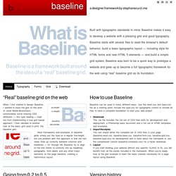
The premier platform for rich internet applications. Baseline - a designer framework by ProjetUrbain.com. “Real” baseline grid on the web When I first started to design Baseline, I wanted to base the grid on the work of Josef Müller-Brockmann, unfortunately some missing CSS attributes — like type leading — kept me from implementing a true grid based approach.

I then decided to another look at the basic grid used in print: the baseline grid. Most frameworks and examples of baseline grids simply put the type on a regular line-height, but one problem with this approach is that the text rarely lines up correctly between columns and headlines — H1 through H6. Baseline try to align to the font metric to correctly line up headlines, paragraphs, form labels and any other major elements on the page baseline, creating a harmonious layout. How to use Baseline Baseline can be used in many different ways. Download The .zip file includes the full set of CSS files both for development and deployment, a Photoshop base document and a full set of HTML templates and examples. Going from 0.2 to 0.5 Version 0.5.1. Less Framework 4.
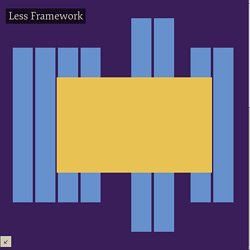
I called Less Framework "a CSS grid system for designing adaptive websites".

It was basically a fixed-width grid that adapted to a couple of then popular screen widths by shedding some of its columns. It also had matching typographic presets to go with it, built with a modular scale based on the golden ratio. The resources it was originally published with are still available on GitHub. Contrary to how most CSS frameworks work, Less Framework simply provided a set of code comments and visual templates, instead of having predefined classes to control the layout with. This is how I still work today and definitely a method I advocate. /* Default Layout: 992px. Less Framework was popular in the early days of responsive design. Eventually, I moved on from fixed-width grid systems and worked on a fully fluid-width one, in the form of Golden Grid System. Less Framework's popularity was helped by the following contributions and the lovely people behind them (dead links crossed off):
52 Framework: The First Ever HTML5 and CSS3 Framework. Today we’re going to look at a new project from the Enavu Network called 52 Framework.

It claims to be the first framework built specifically for HTML5 and CSS3. Below we’ll look at some of the basic features and dig into the code to see what we can find. Regarding Frameworks Frameworks are an interesting topic. Some developers absolutely swear by them and even go so far as to say that no web page should ever be started without one, other developers see them as unnecessary complications that add a lot of superfluous weight to what would otherwise be fairly simple code.
I’m personally somewhere in between. The key is customization. When you borrow someone else’s car, you don’t just hop in and drive.