
A Periodic Table of Visualization Methods. Maps and Atlases. Maps And Mapping. Hive Plots - Linear Layout for Network Visualization - Visually Interpreting Network Structure and Content Made Possible. Dataviz Art. Dear Data: A Fascinating Year-Long Hand-Drawn Data Visualisation Project. Designers Giorgia Lupi (New York) and Stefanie Posavec (London) recently launched a fascinating postcard project called Dear Data.
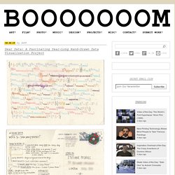
Each week the two data artists measure one aspect of their daily lives and then represent that information with a drawing on a postcard. Every Monday they put their postcards into the mail to journey across the ocean to the other and begin collecting data for the next postcard. Having only met twice in person, this project is as much about the two of them getting to know one another as it is about finding creative ways to record details of their own lives.
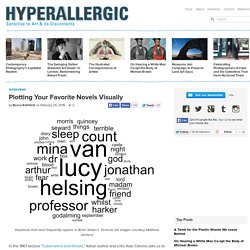
There are so many interesting details in the notes they make for each other; instructions on how to decode the often extremely abstract ways they’ve represented their findings, as well as little tidbits about their day. The topics they choose for each week vary from people and purchases they make to emotions and the number of times they look at themselves in a mirror or window. Plotting Your Favorite Novels Visually. Keywords that most frequently appear in Bram Stoker’s ‘Dracula’ (all images courtesy Matthew Jockers) In the 1967 lecture “Cybernetics and Ghosts,” Italian author and critic Italo Calvino asks us to imagine a machine that composes literature.
Would the authorship of the resulting works cheapen their value? Calvino, who follows the structuralist tradition in maintaining that literature is just the combination and recombination of a set of stock elements, thinks not. Others beg to differ. The literature machine may still be a few years away, but the literary criticism machine is already here, at least in one iteration: Matthew Jockers, a professor at the University of Nebraska, is at work compiling data from novels in an attempt to determine whether there’s a set of common plots. Jockers’s work suggests that there are six or seven recurring plots, although when he spoke to Hyperallergic he was careful to clarify that we should be cautious in drawing broader conclusions. January 6, 2015. A Periodic Table of Visualization Methods. Tagxedo - Word Cloud with Styles. Wikipedia Visualizations.
IBM: History Flow IBM: Chromogram Tod Holloway: The 'Power Struggle' in Wikipedia Yonathan Feinberg: Wordle This chart is based on the full text of the English Wikipedia article on Barack Obama (19 June 2009 18:06 GMT) The size of a word in the visualization is proportional to the number of times the word appears in the input text.
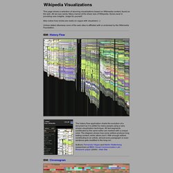
Any text can function as input. Google Wonder Wheel Keyword Research Tool Helps Discover Hidden Niches
15 Effective Tools for Visual Knowledge Management. Since I started my quest a few years ago searching for the ultimate knowledge management tool, I’ve discovered a number of interesting applications that help people efficiently organize information.
There certainly is no shortage of solutions for this problem domain. Many tools exist that offer the ability to discover, save, organize, search, and retrieve information. However, I’ve noticed a trend in recent years, and some newer applications are focusing more on the visual representation and relationship of knowledge. I believe this is in part due to the wider adoption of mind mapping (and concept mapping), and leveraging concepts and advances in the semantic web community. Most traditional personal knowledge management (PKM) or personal information management (PIM) applications offer the same basic set of features: These are essential features, however don’t offer too much to the more visually-inclined knowledge junkies. 15. Link: Platforms: Win, Mac, Linux Cost: Free (Open Source) 14.
Charts and Infographics. Data Maps. Timelines. Adobe Kuler. 5 Content Curation Sites for Data Visualization. Jon Salm published on July 11, 2014 in Design Infographics, data visualizations, and interactive visual projects are popular for a reason.

They capture imaginations, command attention, and teach new things. Above all, however, they are simply fun to look at. If you’ve spent some time getting lost in all of the projects on Visually’s community page, you know what I mean. 1. Curated by: Jason Oberholtzer, Cody Westphal, “Chartists in Residence” | @ilovecharts I Love Charts is one of the best known visual blogs on the web. I Love Charts 2. Curated by: Bloomberg Visual Data Team | @BBGVisualData While data-driven news outlets have catapulted into the public eye recently in FiveThirtyEight, The Upshot, and Vox, few have produced truly stunning visual news projects.
The Role of Algorithms in Data Visualization. It’s somewhat surprising to me to notice how little we discuss about the more technical side of data visualization.
I use to say that visualization is something that “happens in your head” to emphasize the role of perception and cognition and to explain why it is so hard to evaluate visualization. Yet, visualization happens a lot in the computer also, and what happens there can be extremely fascinating too. So, today I want to talk about algorithms in visualization. What’s the use of algorithms in visualization? When do we need them? I have grouped algorithms in four broad classes. Spatial Layout. Visual Thinking. The Best Tools for Visualization. Visualization is a technique to graphically represent sets of data.
When data is large or abstract, visualization can help make the data easier to read or understand. There are visualization tools for search, music, networks, online communities, and almost anything else you can think of. Whether you want a desktop application or a web-based tool, there are many specific tools are available on the web that let you visualize all kinds of data. Hive Plots - Linear Layout for Network Visualization - Visually Interpreting Network Structure and Content Made Possible. Network Visualization. Datavisualization.ch Selected Tools. How to become a data visualization ninja with 3 free tools for non-programmers. Time Zones. Boarrd. by weLaika — Rails Rumble MMX.
Browsing visualizations. GPS Visualizer. Real-time local Twitter trends - Trendsmap. Iomap - Visualize Evernote and Dropbox.