
FlowingData. Tools. The 50 Most Important Rules of Document Design: Color CRAYON-TIP Method – The Visual Communication Guy: Designing, Writing, and Communication Tips for the Soul. Graphic design, for those who are not designers, often seems a difficult task to master.
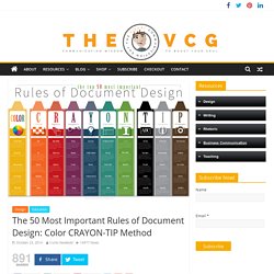
Aren’t there thousands of rules that apply to colors, typefaces, layouts, user experience, and so forth? Well, yes, technically. But the reality is, designing successful documents can be stripped down to just a few basic principles. If you can master the basics, you’ll be a good visual communicator even if you aren’t a professional graphic designer. I was recently asked what I look for when I evaluate a design and then was asked to develop a rubric for doing so. The one category that may seem strange is the “Why” category. Are there more principles and theories to consider when creating and evaluating a good design? To purchase a 30×20 printed poster of the Color CRAYON-TIP method, please visit the online store, and for more about document design, visit the Information Design section of the website.
Related Articles Five Quick Tricks for Designing With Color Color 1. 2. 3. 4. 5. Contrast 1. Data Visualization with D3.js. Quartz/Chartbuilder. Built By Balance. Tabletop takes a Google Spreadsheet and makes it easily accessible through JavaScript.
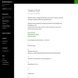
With zero dependencies! Tabletop easily integrates Google Spreadsheets with Backbone.js, Handlebars, and anything else that is hip and cool. It will also help you make new friends and play jazz piano. Download zipDownload on Github Like how easy? One Google spreadsheet plus…this here: 1 function init() { 2 Tabletop.init( { key: ‘0AmYzu_s7QHsmdDNZUzRlYldnWTZCLXdrMXlYQzVxSFE’, 3 callback: function(data) { console.log(data) }, 4 simpleSheet: true } ) will give you: Yep, that’s easy. Getting started. Vega: A Visualization Grammar. Highcharts - Interactive JavaScript charts for your webpage.
JavaScript UI Library, Ajax Components & HTML5 Framework - DHTMLX. Unbeatable JavaScript Tools - The Dojo Toolkit. Open source HTML5 Charts for your website. JavaScript Charts and Maps. Gallery · mbostock/d3 Wiki. Wiki ▸ Gallery Welcome to the D3 gallery!
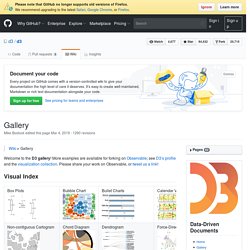
More examples are available for forking on Observable; see D3’s profile and the visualization collection. Please share your work on Observable, or tweet us a link! Visual Index Basic Charts Techniques, Interaction & Animation Maps Statistics Examples Collections The New York Times visualizations Jerome Cukier Jason Davies Jim Vallandingham Institute for Health Metrics and Evaluation Peter Cook Charts and Chart Components Bar Chart Histogram Pareto Chart Line and Area Chart Pie Chart Scatterplot and Bubble chart Parallel Coordinates, Parallel sets and Sankey Sunburst and Partition layout Force Layout Tree Misc Trees and Graphs Chord Layout (Circular Network) Maps Misc Charts Miscellaneous visualizations Charts using the reusable API Useful snippets Tools Interoperability Online Editors Products Store Apps Presentation Next: A Windows 8 HTML5/SVG Presentation Builder Libraries Games Insanity is an D3js based online game developed to train people's reaction time and awareness.
Wish List. NVD3. Infographic of the Day: The Next 25 Years in Emerging Tech. The Best Tools for Visualization. Visualization is a technique to graphically represent sets of data.
When data is large or abstract, visualization can help make the data easier to read or understand. There are visualization tools for search, music, networks, online communities, and almost anything else you can think of. Whether you want a desktop application or a web-based tool, there are many specific tools are available on the web that let you visualize all kinds of data. Here are some of the best: Visualize Social Networks Last.Forward: Thanks to Last.fm's new widget gallery, you can now explore a wide selection of extras to extend your Last.fm experience. Last Forward Friends Sociomap: Friends Sociomap is another Last.fm tools that generates a map of the music compatibility between you and your Last.fm friends.
Create infographics & online charts. Looking 4 data visualization. 40+ Visualization Tools for dashboards and social business. There is so much data that it is an incredible task to actually comprehend it.
Like looking at a TV screen full of static… trying to rationalize if one pixel means something. In order to make the data actionable we need to really focus on tools to clarify what we are looking at. We need to think about the process of tuning into a specific channelof segmenting dataof communicating the significance of that dataof doing SOMETHING with the data To that end I’ve collected another list of tools that specifically help with visualizing different types of information.
Keep in mind that some of these tools just need ‘some play time’ where you trial and test different types of data until they begin to make sense to you, your audience, and your business. You should always keep in mind. Over 100 Incredible Infographic Tools and Resources (Categorized) This post is #6 in DailyTekk’s famous Top 100 series which explores the best startups, gadgets, apps, websites and services in a given category.

Total items listed: 112. Time to compile: 8+ hours. Follow @DailyTekk on Twitter to make sure you don’t miss a week!