
The Work of Jonathan Harris. Presentation Innovation. BrowsEarth Intro by Benjamin Brownell on Prezi. Browsearth. Visual Sampler and Trends Talk. BrowsEarth. BrowsEarth is proposed framework for social engagement and currency around common-interest "success stories" and emerging action plans in the ongoing global transition to thrivable multi-cultures.
Prospective EcoSocial Ontology. Basic concept: create adaptable shared reference structures and symbology for cross-platform semantic linking and pattern reinforcement in non-fiction story-form media The Prospective Eco-Social Ontology (PESO) is an approach toward interoperable taxonomic systems for navigation and aggregation of diverse content libraries and topical threads in the realm of "common good" environmental and cultural regeneration work.
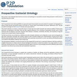
The idea sprouted from designs for the BrowsEarth semantic story-scape platform. The present objective is to evolve a composable lexicon of visual tags (icons) which represent near-universal qualities of human value expression, as applicable to the What, How, and Why cognitive dimensions of an ontology of experiential narrative. Each of these dimensions will be mapped as taxonomic structures which attempt to intuitively, conveniently, discreetly, and completely arrange the relevant icons to several levels of nested specificity. Extended Early Version. Pavel Risenberg.
Living Earth Simulator will simulate the entire world. Described as a “knowledge collider,” and now with a pledge of one billion euros from the European Union, the Living Earth Simulator is a new big data and supercomputing project that will attempt to uncover the underlying sociological and psychological laws that underpin human civilization.
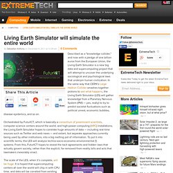
In the same way that CERN’s Large Hadron Collider smashes together protons to see what happens, the Living Earth Simulator (LES) will gather knowledge from a Planetary Nervous System (PNS — yes, really) to try to predict societal fluctuations such as political unrest, economic bubbles, disease epidemics, and so on. Life Mirrors Art Mirrors Life - Skyrail Social Network Visualisation. On my travels last week I came across this seriously cool new social network visualisation system called Skyrails.
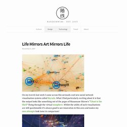
What I find particularly exciting about it is that the output looks like something out of the pages of Masamune Shirow’s “Ghost in the Shell” flying through the virtual noosphere. A picture is worth a thousand words. The expression "Use a picture.
It's worth a thousand words. " appears in a 1911 newspaper article quoting newspaper editor Arthur Brisbane discussing journalism and publicity.[1] 1913 newspaper advertisement A similar phrase, "One Look Is Worth A Thousand Words", appears in a 1913 newspaper advertisement for the Piqua Auto Supply House of Piqua, Ohio.[2] Conceptstore. Chrome Experiments - WebGL Globe. Network Visualization. The Idea. Beyond pearltrees... Web Maps. The Internet map. Visual Map Of The Internet And Websites' Connectedness. This is actually a worthwhile little time waster.
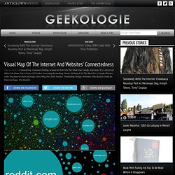
Internet-map.net is a website that depicts websites as different sized circles based on the size of their audience, and their relatedness to one another based on their proximity on the map. It has a handy search feature too, so you don't have to go scrolling around to find the site you're looking for. Because otherwise it would be complete shit. Google translation from Russian: Mathematically speaking, the Internet is a two-dimensional map display of links between sites on the Internet. The Role of Algorithms in Data Visualization. It’s somewhat surprising to me to notice how little we discuss about the more technical side of data visualization.
I use to say that visualization is something that “happens in your head” to emphasize the role of perception and cognition and to explain why it is so hard to evaluate visualization. Yet, visualization happens a lot in the computer also, and what happens there can be extremely fascinating too. The Facts and Figures about the Power of Visual Content - Infographic. We all know that images are compelling.
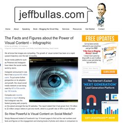
The growth of visual content has been on a rapid upward trajectory over the last 12 months. Social media platforms such as Pinterest and Instagram have taken the social media world by storm. Instagram announced in July that it had acquired 80 million users. To put some further perspective on its adoption and growth, the visual social media network is now being used by 40% of the worlds top 100 brands. Compete.com recently released a report showing that Instagram was the fastest growing web property on the planet amongst the top 50 websites. DataArt - Visualisations. L'Arbre des Possibles. Pearltrees. Introducing the Knowledge Graph. SEAS Homepage.
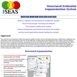
SEAS is a software tool developed for intelligence analysts That records analytic reasoning and methods That supports collaborative analysis Across contemporary and historical situations and analysts and has broad applicability beyond intelligence analysis Approach.
Knowledge Cartography. Knowledge Cartography: Software Tools and Mapping Techniques.
(Eds.) Okada, A., Buckingham Shum, S. and Sherborne, T. Springer: Advanced Information and Knowledge Processing Series. Marko A. Rodriguez. Knowledge Cartography. Knowledge Media Institute. A Periodic Table of Visualization Methods. Makanim - Multi-touch Generative Art - iPhone & iPad app op AppWereld. Koopadvies: De huidige prijs van Makanim - Multi-touch Generative Art is de hoogst bekende prijs sinds begin 2013, gezien de vakere prijswijzigingen is het waarschijnlijk de moeite om te wachten tot de applicatie in prijs wordt verlaagd. Makanim - Multi-touch Generative Art van Appakabar is een app voor iPhone, iPad en iPod touch.
Aankopen verlopen via iTunes, bekijk daar altijd de meest actuele prijs, compatibiliteit en andere informatie. Recent user review (Canada) : "COOL,FAR OUT,LOTS OF MINDLESS FUN !!!! Excellent selection of shapes,colours etc.,etc. "This generative art app will provide you with pure visual stimulation. " Pavel Risenberg. Web 2.0 Digitage 2012. The History of Visual Communication. This website, which contains the material of the course VA312, taught at Sabanci University, Istanbul, Turkey; attempts to walk you through the long and diverse history of a particular aspect of human endeavour: The translation of ideas, stories and concepts that are largely textual and/or word based into a visual format, i.e. visual communication.
Wikipedia defines visual communication as: The primary tool by which man has visualised ideas is through the usage of writing and, by extension, type: Writing/type is the visual manifestation of the spoken word. And words are what we communicate with. Ecología de las interfaces: Carlos A. Scolari at TEDxMoncloa. Anymails - Visualization of my email inbox. Gary Flake: is Pivot a turning point for web exploration?
Visual Understanding Environment. Gephi, an open source graph visualization and manipulation software. Gource - software version control visualization. Gource is a software version control visualization tool. See more of Gource in action on the Videos page. Introduction Software projects are displayed by Gource as an animated tree with the root directory of the project at its centre. Directories appear as branches with files as leaves.
Developers can be seen working on the tree at the times they contributed to the project. Augmented Reality. Interaction Design for Data Visualizations. Interactive data visualizations are an exciting way to engage and inform large audiences. They enable users to focus on interesting parts and details, to customize the content and even the graphical form, and to explore large amounts of data. At their best, they facilitate a playful experience that is way more engaging than static infographics or videos. Data & Interfaces by I M on Prezi. Virtual Environment framework. Ubiquitous Computing & The Disciplines of User Experience Design.
The Opte Project. CIRCOS Circular Data Visualization. Cytoscape: An Open Source Platform for Complex Network Analysis and Visualization. Interaction Design Foundation.
Patterndynamics.jpg (1024x734) PatternDynamics. Pattern language. 1720080407005.png (Image PNG, 1776x889 pixels) - Redimensionnée (72%) SocioPatterns.org. Patterns in Interaction Design.