

Massimo Vignelli Makes Books. The Terrors of Graphic Design – 5 Terrible Mistakes. The Basics of Graphic Design. Graphic Design Graphic design is the process of creating the appearance of a publication, presentation, or web site in an attractive, logical manner. When done successfully, it attracts attention, adds value to a message, enhances readership and readability, simplifies, organizes, provides selective emphasis, and creates unity. Steps in the Graphic Design Process: Analyze the audience. Determine the purpose of your message. Decide where and how your message will appear (whether it will be a printed publication, presentation, or web site). Establish goals. Organize text and graphics. Choose an appropriate format and layout. Select appropriate typefaces, type sizes, type styles, and spacing. Add and manipulate graphics.
Proofread Refine and fine-tune. Creating Effective Layouts Layout Guidelines A layout is the arrangement of type and graphics on a printed publication, presentation, or web site. General Guidelines for Layouts: Consider their interests, reading levels, background, etc. Design Flow - Composition Flow - Motion in Layout - Motion in Artwork. Visual flow carries the viewer's eye through the document in a way that all the important elements receive prominence, and nothing snags the vision or causes the viewer to lose sense of the piece.

Using obvious flow elements like arrows or numbers is the most common way Web designers use flow, but there are other types of elements that can be used and mis-used to direct your readers to move along a specific path. The steps in this tutorial will show you examples of good and bad flow and help you learn the vocabulary of visual flow in design. Visual flow can be achieved in many ways: Arrows Sequential images or text elements Perspective Gradients Size changes Curves Motion in images Faces - especially the eyes The following images will show you some common mistakes in flow on Web pages and how to correct them.
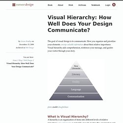
Visual Hierarchy: How Well Does Your Design Communicate? The goal of visual design is to communicate.
Fibonnaci Sequence, Phi and the rule of thirds. I can count on one hand the number of rules I will obey without question, based solely on fear of catastrophic consequences: I turn off personal electronics during landing and take-off, I keep my hands inside the ride at all times, I don’t rock vending machines, I resist the urge to climb over zoo fences and I no longer lunge for a police officer’s holstered gun on April Fools Day.

Pretty much everything else is up for debate. That brings me to the Rule of Thirds. After a tremendous amount of research (I read a book) I learned that the rule of thirds may actually be just a lazy man’s sham. Nature by Numbers. The Fibonacci in Lateralus. The Fibonacci sequence in the song Lateralus by Tool.
  The fibonacci sequence can also be found in various artworks throughout history.
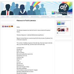
Fibonacci Sequence + Lateralus Mathematical significance Maynard James Keenan’s vocals during the first few minutes of Lateralus form a Fibonacci sequence. The number of syllables progress to the sixth step, then back down to the first step; up to the seventh step, and then back to the fourth step: [1] black[1] then [2] white are [3] all I see [5] in my infancy [8] red and yellow then came to be [5] reaching out to me [3] lets me see [2] there is [1] so [1] much [2] more and [3] beckons me [5] to look through to these [8] infinite possibilities [13] as below so above and beyond I imagine [8] drawn outside the lines of reason [5] push the envelope [3] watch it bend.
The Four Laws of Business Card Design. September 4th, 2009 Posted in Various For many customers and clients, your business card is their first point of reference when looking at your services.

With this huge importance to your business, it’s essential that your business card projects three things, not just about yourself but about your business: value, innovation, and information. By using modern design elements and selective information to build and maintain your brand image, your business card can create not just new business relationships, but powerful word of mouth buzz. These four design elements are essential for ensuring that your business card achieves what it should: Back to Basics: How to Make a Brand Iconic Through Design.
45+ Free Lessons In Graphic Design Theory. Sep 15 2011 Considering how many designers are self-taught, either in whole or in part, the importance of a solid foundation in graphic design theory is often overlooked.

New designers often want to jump right into creating websites, rather than learning the basics of why some designs work and some don’t. But they’re putting themselves at a disadvantage to designers who do have formal training or have taken the time to learn the principles behind good design. Below are more than 45 recent lessons in graphic design theory. A Negative View of White Space. After reading through the article on The Web Design Ledger, “Whitespace: The Underutilized Design Element” I felt compelled to respond and clear up what I feel is spreading misconceptions about design in relation to white space.

Note that for the purpose of this article I will refer to white space as negative space. Negative space being the area that is void of elements like type or imagery. Both are accepted terms, but I believe that negative space better represents the design concept. White Space Example. 1.

Good use of white space: this advertisement show how their product cancels noise by using the lawnmower metaphor to cut the noise "grass", leaving behind only white space, a common metaphor for silence. 2. Sweet White Space « stoneboard.ca. White space design used for communication materials is a good thing.

A beautiful thing. Just so we are on the same page here, “white space” is the “blank space” that surrounds pictures and text. The Science of White Space in Design. White space, also referred to as “negative space”, is an important aesthetic tactic utilised in a majority of graphical/design illustrations/publications.
In its most generalised definition, white spaces are the strategic visual sections of a page/illustration that are left unmarked and thus uncluttered by any specific aesthetic detail. Characteristically, these ‘blank spaces’ are strategically located, between margins, leading text and sub-sections of a page layout.
Whitespace. My first design job was with a small print design agency in Manchester that produced work in varying media: packaging, publications, and marketing support materials, and…direct mail. Article Continues Below I soon discovered that the graphic design principles I’d learned in college were of little use when I designed for direct mail, where big, bold, and crowded is the order of the day. In the words of one client—words I will never forget—“whitespace is empty space.” Direct-mail clients need their packages to look down-market, because it works for them.
But for just about everything else, my client couldn’t have been further from the truth. Meet whitespace#section1 “Whitespace,” or “negative space” is the space between elements in a composition. So what does whitespace do? Micro whitespace and legibility#section2 A couple of months ago, I was lucky enough to see Erik Spiekermann give a lecture.
In newspaper design, information is dense. Brand positioning#section3 Figure 3. Figure 4. Figure 5. YouTube videos for everything in the Composition chapter. RastervsVector.pdf (application/pdf Object)