
Fred Griffin Art: Where to Put the Cow. Chris Schweizer's Blog: The Schweizer Guide to Spotting Tangents. Comic art is, as a general rule, a line-based medium.
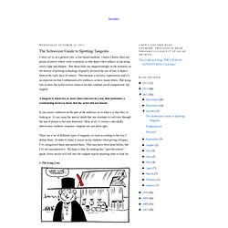
I know, I know, there are plenty of artists whose work is painted, or who depict their subject in ink using solely light and shadow. But these folks are unquestioningly in the minority, as the history of printing technology originally dictated the use of line to depict form in the early days of comics. This became a stylistic expectation, and it’s an expectation that I enthusiastically embrace, as have many others. But using line to draw the world invites chances for that cardinal sin of composition: the tangent. A tangent is when two or more lines interact in a way that insinuates a relationship between them that the artist did not intend.
It can create confusion on the part of the audience as to what it is that they’re looking at. Youtube. Pdf/Mulan_Style_Guide.pdf. Composition Basics: Value Structure. Composition Basics: Sketching Thumbnails. -By Dan dos Santos In this post, I'd like to demonstrate my process for sketching concepts for a client.
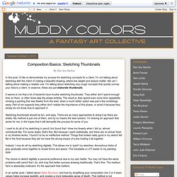
I'm not talking about sketching with the intent of making a beautiful drawing, where line weight and texture matter. Nor am I talking about making a realistic one. I'm talking about sketching very rough concepts that quickly convey your idea to a client. In essence, these are just elaborate thumbnails. It seems to me that a lot of students have trouble sketching thumbnails. Sketching thumbnails should be fun, and easy. I used to do all of my sketching in pencil, but found that I drew too linearly when I did so, almost comicbook-like. Instead, I now do all my sketching digitally. The choice to sketch digitally is personal preference due to my own habits.
In an earlier post, I talked about Value Structure, and how by simplifying your composition into 3 or 4 basic values helps increase legibility, and creates a more believable sense of depth. WOC ILLO TUTORIAL. -Focus • Leading the viewer's eye through an image is the fundemental challenge of pictorial storytelling.
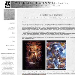
Just as it is difficult to hear more than one person speaking at a time, it is difficult to focus on more than one element in a picture at a time. In music, it's called a Theme, in literature it's called a Plot. Percy Principles of Art and Composition. Percy Principles of Art and Composition Percy Principle #1 - Avoid a sore thumb. Nothing in the composition should be so strong that the rest of the composition looks neglected. When you have a sore thumb, you do not notice the rest of your hand. Avoid the SORE THUMB. I study my composition to see if anything looks too important, I change that part to make it less important, OR I find something else in the composition and make it more important.
Composition assignments & tips for better graphic design. Composition, or how we place visual elements on a page, is a defining element that can make or break a design. I’ve scoured the web to come up with a list of resources, specifically assignments, explanations, tips and tutorials on the subject of composition. May they serve as inspiration for graphic and web designers like myself who are looking to refresh their skills or want to get back to the basics and have some fun. Diagonal method. 19 Factors That Impact Compositional Balance. Imagine a boulder leaning too far over the cliff’s edge.
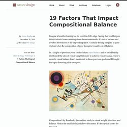
Seeing that boulder you think it should come crashing down the mountainside. It’s out of balance and you feel the tension of the impending crash. A similar feeling happens in your visitors when the composition of your design is visually out of balance. In a couple of previous posts I talked about visual balance and in each I briefly mentioned the idea of visual weight in order to achieve visual balance. There’s more to visual balance than I mentioned in those previous posts and I thought the topic deserving of its own post.
Composition 8 by Kandinsky (above) is a study in visual weight, direction, and balance. What is Visual Balance? Visual balance (PDF) results from 2 major factors, visual weight and visual direction. Consider the image below of a small block and a large block on a lever. You likely see the larger block as being much heavier than the smaller block. Optical Center. Photography Composition Articles: Landscape Composition Rules. Perception and Composition. Introduction We perceive some things as "beautiful", and other things as "ugly".
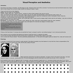
Research shows most of this is universal. If we know why we react and what the factors are, it might help us make stronger more successful images (whether we're going for 'beauty' or 'ugly'). Things we like fall into two main categories: Human - here are roughly four subcategories: Anatomy - bodies, faces, eyes... reason is obvious - members of a tribe or family needed to stay close for survival. Shiny - we evolved to like the shininess of eyes, teeth, tongue, hair, juicy fruit, water, and that translates to other things like metals, jewels, silk... Tessellations. Art 1. Optical Design.