
Infographics & Data Visualizations - Visual.ly. Data Visualization, Information Design and Infographics. The Infographics Showcase - Data Visualization - Infographic Design. Les 50 meilleures infographics et data visualization.
Cool Infographics - Blog. Ideas, issues, knowledge, data - visualized! Le Monde diplomatique. Multimédia : technique + initiation CMS - Pierre Romera. 10 Awesome Free Tools To Make Infographics. Advertisement Who can resist a colourful, thoughtful venn diagram anyway?

In terms of blogging success, infographics are far more likely to be shared than your average blog post. This means more eyeballs on your important information, more people rallying for your cause, more backlinks and more visits to your blog. In short, a quality infographic done well could be what your blog needs right now. Google est ton ami… ou pas ! « Heat Miser's blog. Par Heat Miser J’évoquais il y a peu la difficulté d’avoir un avis sur la réelle sécurité d’un service de stockage de données en ligne estampillé “sécurisé”.
Dans les commentaires de ce billet, @paulpkk rappelait que bien peu de personnes se souciaient réellement de savoir si leurs données étaient en lieu sûr. La réalité est bien souvent encore pire, certains laissant carrément traîner toute leur vie sur Internet, si si je vous montre ! Où pouvons nous trouver toutes ces données ? Sur des sites gérés par les mafias du net ? ExtJS tutorial — MapFish. This tutorial provides a tour of ExtJS.
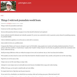
Here, you will learn the basis of this javascript framework and how to deal with core concepts as well as with UI components. Get Prepared with ExtJS Before you can start playing with ExtJS you must now how to install it. Upload via l'extension APC de PHP. Leçon de Data-journalisme par Simon Rogers. Efattal.fr. Infographies, journalisme graphique et data en dessert - storify.com. Maps aren't easy. There is an art to data journalism, and in many cases that art requires an involved and arduous process.
In a recent interview, Simon Rogers, editor of the Guardian’s Datablog and Datastore, discussed many of the issues his team faced when they assembled databases and reports from the WikiLeaks releases. More recently, journalists have been building scads of interactive maps to illustrate news from the disaster in Japan and the political situation in Libya. A recent story at Poynter looking at the importance of such maps also briefly noted their return on investment: “The data-driven interactives take a lot of time and teamwork to produce, but they have the greatest value and generate good traffic and time-spent on the site,” said Juan Thomassie, senior interactive developer at USA Today. So, hard work yields strong engagement. Warden walked me through the labor-intensive process — one that may very well justify a full cartography team [Ed. duly noted].
Our interview follows.
20 Essential Infographics & Data Visualization Blogs. In the tradition of Inspired Mag’s huge lists, here goes a new one – all the blogs with cool data visualization eye candy in the same place! Enjoy and leave some comments with suggestions, questions and so on. Information is Beautiful Visual Compelxity. Data mining. Things I wish tech journalists would learn. Things I wish tech journalists would learn: Counts are not the same thing as surveys.
Surveys yield projections that have margins of error that should be disclosed and explained. Survey methods should be disclosed and critically examined. If a survey was conducted in order to generate a press release for marketing purposes, it's probably bullshit. Units in distribution pipelines are not the same as units sold to consumers. Lines outside of stores are a publicity stunt. Companies like Nielsen and Comscore attempt to report on Web traffic, using samples (not counts) and making statistical projections. R (logiciel) Un article de Wikipédia, l'encyclopédie libre. Pour les articles homonymes, voir R. Le logiciel R est considéré par ses créateurs comme étant une exécution de S, avec la sémantique dérivée du langage Scheme. C'est un logiciel libre distribué selon les termes de la licence GNU GPL et est disponible sous GNU/Linux, FreeBSD, NetBSD, OpenBSD, Mac OS X et Windows.
Le forum officiel de l'Association Asterisk France - Installer Asterisk sur une debian lenny. Après avoir installé le système d'exploitation (Debian Lenny dans ce tuto)sur votre serveur, voici un exemple parmis tant d'autre pour installer Asterisk sur votre serveur.
Pour commencer, logguer vous en tant que Root sur votre machine. et executez les commandes suivantes afin de créer un dossier dans lequel on mettra les sources d'asterisk....
Data src. Tools. Prospective. 10 Best Data Visualization Projects of the Year – 2010. Data visualization and all things related continued its ascent this year with projects popping up all over the place.
Some were good, and a lot were not so good. More than anything, I noticed a huge wave of big infographics this year. It was amusing at first, but then it kind of got out of hand when online education and insurance sites started to game the system. Although it's died down a lot ever since the new Digg launched. That's what stuck out in my mind initially as I thought about the top projects of the year. One of the major themes for 2010 was using data not just for analysis or business intelligence, but for telling stories. So here are the top 10 visualization projects of the year, listed from bottom to top. 10. Scott Manley of the Armagh Observatory visualized 30 years of asteroid discoveries. 9. Hannah Fairfield, former editor for The New York Times, and now graphics director for The Washington Post, had a look at gas prices versus miles driven per capita. 8. 7. 6. 5. Mapping America — Census Bureau 2005-9 American Community Survey.
Plus de 800 infographies sur le thème du web et de ses usages. En une seule minute, une quantité monstrueuse de données est échangée sur le web.
5 Ways to find, mix and mash your data. One of the most popular trends in online journalism is taking publicly available data and translating it into visualizations or infographics that readers and viewers can quickly and easily understand. A large percentage of the visualizations you see on the web were built from scratch, which can take a considerable amount of time and effort. The following sites allow you to mash your data in record time. Swivel Swivel features more than 15,000 data sets for users to play with in various categories ranging from Economics to Health to Technology.
From the data, users have created hundreds of thousands of graphs, charts and infographics, including the one below that visualizes the amount of rainfall in California since 1870. Flight & Expulsion. Journalism in the Age of Data: A Video Report on Data Visualization by Geoff McGhee. How to be a data journalist. Data journalism is huge.
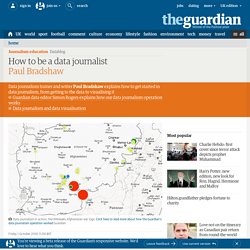
I don't mean 'huge' as in fashionable - although it has become that in recent months - but 'huge' as in 'incomprehensibly enormous'. It represents the convergence of a number of fields which are significant in their own right - from investigative research and statistics to design and programming.
The idea of combining those skills to tell important stories is powerful - but also intimidating. Who can do all that? The reality is that almost no one is doing all of that, but there are enough different parts of the puzzle for people to easily get involved in, and go from there. 1. 'Finding data' can involve anything from having expert knowledge and contacts to being able to use computer assisted reporting skills or, for some, specific technical skills such as MySQL or Python to gather the data for you. 2. 3.