
Free textures for your next web project. Nothing like a field of beautiful flowers. Download Download These lovely water-colorful dots will make your designs pop. Download More leaves from another angle. Download Download Look at all these bubbles! Download Download Download Tiny little flowers growing on your screen. Download Subtle oriental tiles pattern, with a mystic vibe. Burger Bar Stationery Mockup. Here is a just took the ribbon off new Burger Bar Stationery Mockup.
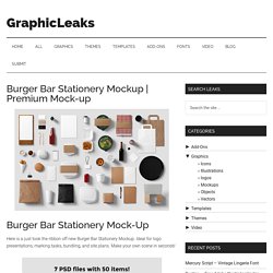
Ideal for logo presentations, marking tasks, bundling, and site plans. Make your own scene in seconds! Home - Death to the Stock Photo. Noun Project - Icons for Everything. Premium & Free PSD Mockups. Free PSD for web designers. Code-Free Responsive Website Design Software.
Makerbook - The best free resources for creatives. A handpicked selection of premium and free themes and templates. Web resource and source, more articles, more information, tutorials, free psd, resource typography, resource websites, fonts, online, vector resources. Nucleo. LaMode - Responsive HTML5 Multipurpose Template. Awwwards Agency .
Shop . Portfolio . Blog 7 Homepages || 38 Pages || 2 Menus || 4 Headers || 2 Footers || 12 Columns || 13 Predefined Colors Static Background Agency Classic Navbar Image Logo. Designmodo Market - Digital Goods Marketplace for Web Creatives. Button Styles Inspiration. Winona Ujarak Wayra Tamaya Rayen Pipaluk.
GUI PSD Templates for Twitter, Facebook, YouTube & LinkedIn. SVG devices. Framer - Import Designs. Import Designs Framer Studio lets you import Sketch or Photoshop documents.
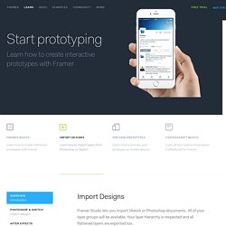
All of your layer groups will be available. Your layer hierarchy is respected and all flattened layers are exported too. Sketch App Sources - Free graphical resources - Sketch Freebie - Free Sketch Files and SVG Files for Sketch 3 software. High quality Sketch Resources. Awesome Sketch Plugins. The Pattern Library. 40 Free High-Quality Line Icon Sets. Learn Sketch 3 - Design+Code. Sketch is a vector design tool entirely focused on user interface design.
It’s easy to pick up and costs a fraction of the price of Photoshop. Because of its simplicity, anyone with little to no training can learn Sketch. It’s perfect for designing for multiple devices, and delivering assets is a breeze. Sketch uses a single unit, styles only relevant to UI design, a built-in iPhone previewing tool called Mirror and Artboards, the most efficient way to design multiple screens.
NRGthemes Wordpress Theme - Miagency. Screen Sizes. Pttrns - Mobile User Interface Patterns. Find Guidelines - The fastest way to brand assets. Typewolf → Typography Inspiration for the Modern Web. Free Online Website Design Software. Best fit for designers who create multiple websites.
A tailor-made solution for large scale companies. An ideal solution for mid-size companies and studios. 250 Projects 10 Team Members 3 Month Revision History. Blog.SpoonGraphics. Material Interaction. TheStocks.im best royalty free stock photos in one place. The Grid. OhDeerGames/Farsight-Example. Using with Adobe Photoshop. Vector icons pack - Vector icons for iOS 7 / 8 & android. Codrops.
Share and Discover. How to Use Polyvore to Drive Traffic and Sales for Your Online Store. If you thought you had all your social commerce bases covered, you might be in for a surprise.
Launched in 2007, Polyvore has gradually emerged as one of the most effective social platforms for ecommerce sites to drive high-value traffic and sales from. Focusing on fashion and home décor, the community powered social network allows you to create collections and collages called “sets”. These sets can be made up of products from online stores around the web – including your own. Products can be mixed and matched using Polyvore's visual set creation tool to create elaborate or simple designs, with each product presenting pricing, details and origin when hovered over. Free Photoshop Files, Resources & Templates. Webdesign : idées et ressources pour présenter votre travail. Créer le plus beau et le plus efficace webdesign de la Terre entière est une chose, mais réussir à le mettre en scène pour le sublimer en est une autre… Pour vous aider dans votre quête de belles présentations, je vous propose quelques idées inspirées par des portfolios de designers.
Ces derniers mois, nous avons pu voir émerger un vrai travail de fond dans les portfolios et les galeries en ce qui concerne la présentation d’un webdesign. En travaillant sur le web, il est difficile et absurde de se constituer un book papier comme pourrait le faire un graphiste print par exemple. Pour sentir l’essence même du design et parfois même de l’UX, les webdesigners redoublent d’ingéniosité en proposant des idées originales. Change de peau. CSS3 gradients - Adobe - The Expressive Web - Beta. 20 Nouveaux Thèmes Wordpress Gratuits pour 2012. Note : Cet article a été publié en janvier 2012, certaines choses peuvent avoir changé depuis.
Il était hors de question de commencer l’année sans publier une nouvelle sélection de thèmes WordPress gratuits ! Voici des thèmes tout beaux tous neufs pour apprendre à utiliser WordPress sans risque. Les tendances e-commerce à surveiller - Retour sur Internet Retailer Conference & Exhibition 2013. La semaine dernière se tenait IRCE2013, le plus grand salon e-commerce au monde, à Chicago, et pour une quatrième année consécutive, Adviso y était, à la fois pour prendre le pouls des grandes tendances du commerce en ligne, que pour rencontrer toutes sortes d'entreprises intéressées par le commerce électronique ou fournissant des services à celles-ci.
Une fois de plus, des journées remplies de conférences (j'en ai suivi 28), et de rencontres (plus que 28, mais clairement un petit échantillon parmi les… 10 000 personnes présentes. Voici donc mes grands constats, en quelques mots. 10 Best (FREE) WordPress Responsive Themes from 2011. Responsive Web Design was one of the hottest topic talked around in 2011, along with the explosion of various mobile devices like smart-phones and tablets which each has different screen size. So now designers could no longer rely on a standard 1024px desktop monitor to create their web and apps.
Then a solution called “responsive design” emerged, a method that makes a design layout respond to any screen size and orientation (portrait or landscape). 9 White and Elegant WordPress Themes. This time we are featuring a white and minimal (we might say) selection of WordPress themes from ElegantThemes. Don’t forget that you can grab all 69 themes for an elegant price of $39. Enjoy! Minimal Minimal is a great theme for those who want to give their blog a truly simple and elegant feel without sacrificing any of the advanced features you have come to expect from ElegantThemes.
Unique variations on a 3×4 grid. i2Clipart - Royalty Free Public Domain Cliparts. HTML5 & CSS3: Take Your Design to Another Level. While both languages for HTML5 and CSS3 aren’t fully complete yet, taking the time time to familiarize yourself with some of the pointers in this post can really help you achieve that clean look and feel for your site. Let’s take a deeper look at them. HTML5 is the latest version of HTML or Hypertext Markup Language.
It is currently only fully supported by a handful of browsers but the next year should see a large increase in usage. It isn’t expected to be completed until 2014, but the features that are available now are a great way to become acquainted with HTML5 and add some cool elements to your website. Steve Jobs famously refuses to allow Flash on the iOS due to the many bugs and crashes it experiences, therefore, learning how to use the more intricate features of HTML5 is going to be a must for those who want to develop apps and iOS-friendly websites. HTML5 simply builds upon the widespread success of HTML4.
2011 in review: 20 sites that took 3D to the next level. WebGL Water. Loading... Made by Evan Wallace This demo requires a decent graphics card and up-to-date drivers. If you can't run the demo, you can still see it on YouTube. Interactions: iOS Fonts. HTML5 Rocks - A resource for open web HTML5 developers. HTML5 gallery, tutorials and demos showcase. Best 20 webfonts from Google Web Fonts and @font-face embedding. At the moment there are several ways to use non-system fonts on a website. We will focus on the two least complicated, least expensive systems, Google Web Fonts and the @font-face rule.
Fear not, we have not ruled out other paid methods such as Typekit, Fonts.com Web Fonts, Fontdeck, Webtype, WebINK or Fontspring for future posts as they certainly offer high quality typefaces and deserve to be considered. It’s important to be aware that web fonts can generate inadequate visualizations on operating systems which have subpixel rendering turned off in the case of Windows XP. They can also be represented differently depending on the browser used to visualize them. The aim of this post is to facilitate the choice of a series of fonts (out of the hundreds available) whose technical and visual characteristics make them more readable and compatible with a wide variety of devices, browsers and operating systems.
Basically, there are two implementation models: Clouds. Tubular, a YouTube Background Player jQuery Plugin. Video controls:Play | Pause | Volume Up | Volume Down | Mute Tubular is a jQuery plugin that lets you set a YouTube video as your page background. Just attach it to your page wrapper element, set some options, and you're on your way. $(page content wrapper element).tubular(options); Tubular's hello, world Assuming you're happy with the default options and you use a wrapper div with the id of wrapper, you simply attach to your wrapper div and specify the video you want to load: Web Design & CSS Inspiration for the Mobile Web — CSS iPhone. CSS Load.net - Loading CSS spinners and bars generator for AJAX & JQuery. Smashing UX Design — Usability, Psychology and Information Architecture. Category: UX Design This category features quality articles on usability, information architecture, interaction design and other user experience (UX) related topics – for digital (Web, mobile, applications, software) and physical products.
Through these articles, experts and professionals share with you their valuable ideas, practical tips, useful guidelines, recommended best practices and great case studies. Curated by Chui Chui Tan. . Popular tags in this category: Freebies, Web Design, Techniques, Inspiration, Business A Guide To Validating Product Ideas With Quick And Simple Experiments You probably know by now that you should speak with customers and test your idea before building a product. Flat Design Inspiration. L'évolution du Web. 10 Great Alternatives to Lorem Ipsum. Lorem ipsum dolor sit amet, consectetur adipiscing elit. Nam fringilla sem in tellus placerat luctus. Fusce in massa eu sem semper hendrerit quis a ipsum. No, we have not put the above paragraph here by mistake, but we are sure that if you work on a design related field, you immediately recognized the classic fake latin placeholder text Lorem Ipsum.
BannerBlog : Where Banners Click. 25 Awesome Youtube Takeovers on BannerBlog News. 30 Grid-Based Websites. UI Stencils. Corporate Identity Photoshop Mock-up (Psd) 10 Best iPad Apps for Web Designers. If you’re a web designer and own an iPad, I’ve got great news. There are apps out there that will actually help you be productive. Free PSDs & Resources for Web Designers by Orman Clark. Downloads. If you still haven't received it, please try refreshing the page.
Free Premium Web Design Resources. Web Fonts. Minimal Monkey - Stephen Burgess. Pixelentity - Web Design - Freebies. User Interface Design Search Engine, UI Inspiration, UI Elements, GUI Design, Freebies. 150 Free Photoshop PSD Files. Implement The Impressive Paper Folding Effects. Honcheng/PaperFold-for-iOS.
Freebies. Free Photoshop Files & Resources. HTML5 Up! Responsive HTML5 and CSS3 Site Templates. Recommendations for building smartphone-optimized websites. UDTHEMES - Premium WordPress Themes. BonBon Buttons - Sweet CSS3 buttons. Creating A Free Website. Icon Search Engine. Web Design and Development Magazine. Ligature Symbols. QRhacker.com - Pimp your code! Adobe : Wallaby pour convertir Flash en HTML5. CatchMyFame jQuery Plugins. Make Your HTML Email 5½ Times More Mobile Friendly. 51+ Best of jQuery Tutorials and Examples. Demos. Presentation tool based on the power of CSS3 transforms and transitions in modern browsers.
Jquery : l'essentiel des plugs-in de 2011. Isotope.