

A Look Inside Mobile Design Patterns. Patterns for mobile application design Design patterns for mobile are emerging as the platform matures.

Theresa Neil’s new book Mobile Design Pattern Gallery provides solutions to common design challenges. Read a sample chapter on Invitations and learn how to immediately engage your customers with your application. We recently had a new mobile project starting and all of our experienced mobile designers were booked. Since we primarily design enterprise apps and productivity tools, not everyone in our group was well versed in mobile application design. These 70 patterns, illustrated with hundreds of examples from iOS, BlackBerry, Android, Symbian, Windows and webOS applications, will be released this month from O’Reilly Media as the “Mobile Design Pattern Gallery”.
Crash Course: Design for Startups. I recently stumbled across screenshots of old websites of mine and was hurled into a state of reminiscent shock.
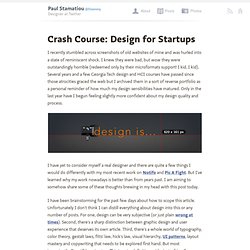
I knew they were bad, but wow they were outstandingly horrible (redeemed only by their microformats support! I kid, I kid). Several years and a few Georgia Tech design and HCI courses have passed since those atrocities graced the web but I archived them in a sort of reverse portfolio as a personal reminder of how much my design sensibilities have matured. Only in the last year have I begun feeling slightly more confident about my design quality and process. I have yet to consider myself a real designer and there are quite a few things I would do differently with my most recent work on Notifo and Pic A Fight. I have been brainstorming for the past few days about how to scope this article. What I can do is share what has worked for me. Subtle is key! 5 Things a Good Product Manager Should Think About.
1.

Minimal Viable Product thinking can be a trap – there has recently been a huge movement toward creating a “minimum viable product” and then going out to market as quickly as possible. I would argue it is important to temper this trend. This has turned into a tendency to quickly roll out half-baked functionality because developers believe they are following the MVP mantra. Well thought out features that deliver value, even if they take a bit longer to come to market, will (in my opinion) deliver more ultimate value to the product and to the user experience. I am all for iterating something early on once it is in the hands of the customer, but I would argue that some companies have misconstrued this and roll out an untested, half written piece of functionality 2.
It will help make money – If you are a start-up working towards break-even, then this needs to be ever present in every decision you make. 3. 4. 5. In summary, the role of a product manager is never easy. Le Blog de l’Ergonomie Web. 12 Useful Techniques For Good User Interface Design - Smashing Magazine. Advertisement Last week, we presented 10 Useful Web Application Interface Techniques, the first part of our review of useful design trends in modern Web applications.
Among other things, we highlighted embedded video blocks, specialized controls and context-sensitive navigation. We also encouraged designers to disable pressed buttons, use shadows around modal windows and link to the sign-up page from the log-in page. This post presents the second part of our review: 12 useful techniques for good user interface design in Web apps. We also discuss how to implement these techniques so that they are properly used. You may also want to take a look at the following related articles: 1. One of the most significant elements of a good user interface is visibility of the system’s status. Yammer applies not one but three effects on all new messages in a feed: fade in, slide down and highlight. One great way to do this is with animation. 2. How do you implement this? Here is the (X)HTML: ... 3. 4. 5.
Responsive webdesign : adapter un site à toutes les résolutions. Le Responsive webdesign (conception adaptative ou réactive en français) représente un ensemble de méthodes et techniques permettant d’universaliser un site Web.
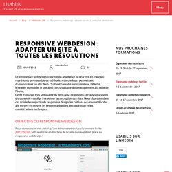
Qu’il soit consulté sur ordinateur, tablette, e-reader ou mobile, le site ainsi conçu s’adapte automatiquement à la taille de l’écran. Cette évolution très séduisante du Web pose néanmoins certaines questions d’ergonomie et oblige à repenser la conception des sites. Nous abordons dans cet article les objectifs du responsive design, les critères qui doivent décider à le mettre en œuvre, les recommandations de conception et les considérations techniques. Objectifs du responsive webdesign Pour commencer, rien de tel qu’une démonstration. Entrons dans le vif du sujet. Why Your Links Should Never Say “Click Here” By anthony on 06/20/12 at 10:39 pm Have you ever wanted your users to click your links, but didn’t know how to get them to act?
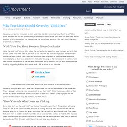
When some designers run into this problem they’re tempted to use the words “click here” on their links. Before you give in to the temptation, you should know that using these words on a link can affect how users experience your interface. UI & UX. Imbriquer les call to action pour doubler son taux de transformation : l'exemple d'ING Direct : Ergonomie Web, Expérience Utilisateur et Ruby On Rails. Le call to action est un des éléments clés de la transformation.
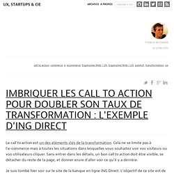
Cela ne se limite pas à l’e-commerce mais à toutes les situations dans lesquelles vous souhaitez voir vos visiteurs ou vos utilisateurs cliquer. Sans entrer dans les détails, un bon call to action doit être visible, se détacher du reste de la page, et donner envie d’aller voir ce qu’il y a derrière. Je suis tombé hier soir sur le site de la banque en ligne ING Direct. Quand le haut et le pied de page vous suivent. Avec la généralisation des écrans plats, la résolution moyenne des moniteurs qui équipent les internautes est en constante hausse (cf.
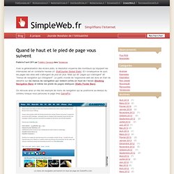
Patterns.