
User Interface design. Tools. Ready or Not, Here Comes HD Web Design. Apple is pushing the tech industry forward by increasing the pixel density on iPhone and iPad screens.
This is great from a user’s perspective, but as a web designer or developer it literally threatens to completely change the way you build websites. Web Design. The Art of Color Coordination. Colors affect us in countless ways—mentally and physically, consciously and subconsciously. Psychologists have suggested that color impression can account for 60% of the acceptance or rejection of a product or service. Good color choices should never be neglected in web design. A bad color combination can have the same negative effect as poor copy and slow load times. In this infographic, we will briefly discuss color coordination and how you can use this to your advantage when designing your site.
Special thanks to @speckyboy, @smashingmag and @onextrapixel. Click on the infographic below to view a larger image: View an enlarged version of this Infographic » Click here to download a .pdf version of this infographic. Want to display this infographic on your site? Simply copy and paste the code below into the html of your website to display the infographic presented above: Website Color Scheme Examples Complementary Colors – Naturestable.com.
5 Former Design Trends That Aren’t Cool Anymore (So Stop Using Them) If you’re like me, looking at your own design work from a few years ago can often result in some laughable or even cringe-worthy moments.

Design styles have been steadily evolving and most of us can’t help but be affected by these changes. Who among us hasn’t piled on the cheesy Photoshop layer effects, all the while thinking the result was downright awesome?
JavaScript. The Secret To Pinterest's Astounding Success: A Brilliant Sign-Up Process You Should Copy. Password strength verification with jQuery. Many sites that require login credentials enforce a security setting often referred to as password complexity requirements.
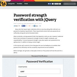
These requirements ensure that user passwords are sufficiently strong and cannot be easily broken. What constitutes a strong password? Well, that depends on who you ask. However, traditional factors that contribute to a password’s strength include it’s length, complexity, and unpredictability. HTML5 & CSS3. Label Placement in Forms. By Matteo Penzo Published: July 12, 2006 “We were able to subject Luke’s theories to usability testing and enrich them through the power of numeric data.”
In using eyetracking to evaluate the usability of search forms for my previous article for UXmatters, “Evaluating the Usability of Search Forms Using Eyetracking: A Practical Approach,” we discovered much interesting data. How do colors affect purchases? New Approaches To Designing Log-In Forms - Smashing Magazine. Advertisement For many of us, logging into websites is a part of our daily routine.
In fact, we probably do it so often that we’ve stopped having to think about how it’s done… that is, until something goes wrong: we forget our password, our user name, the email address we signed up with, how we signed up, or even if we ever signed up at all. These experiences are not just frustrating for us, but are bad for businesses as well.
How bad? User Interface Engineering’s analysis of a major online retailer found that 45% of all customers had multiple registrations in the system, 160,000 people requested their password every day, and 75% of these people never completed the purchase they started once they requested their password. To top it off, visitors who are not logged in do not see a personalized view of a website’s content and recommendations, which reduces conversion rates and engagement. Is This You? The sign-in form on Gowalla. A log-in error on Gowalla. Instant Sign-In New Log-In Problems. Why Rounded Corners are Easier on the Eyes. By anthony on 08/17/11 at 10:17 pm Designers use rounded corners so much today that they’re more of an industry standard than a design trend.
They’re not only found on software user interfaces, but hardware product designs as well. So what is it about rounded corners that make them so popular? Indeed they look appealing, but there’s more to it than that. Rounded Corners are Easier to Process Anyone can appreciate the aesthetic beauty of rounded corners, but not everyone can explain where exactly that beauty comes from. Some experts say that rectangles with rounded corners are easier on the eyes than a rectangle with sharp edges because they take less cognitive effort to visually process. Scientific research done on corners by the Barrow Neurological Institute found that the “perceived salience of a corner varies linearly with the angle of the corner.
Finger-Friendly Design: Ideal Mobile Touch Target Sizes. In darts, the bulls-eye is harder to hit than any other part of the dartboard.
This is because the bullseye is the smallest target. The same principle also applies to touch targets on mobile devices. Smaller touch targets are harder for users to hit than larger ones. When you’re designing mobile interfaces, it’s best to make your targets big so that they’re easy for users to tap. But exactly how big should you make them to give the best ease of use to the majority of your users? What the Mobile Platform Guidelines Say Apple’s iPhone Human Interface Guidelines recommends a minimum target size of 44 pixels wide 44 pixels tall. While these guidelines give a general measurement for touch targets, they’re not consistent with each other, nor are they consistent with the actual size of the human finger. Why ‘Ok’ Buttons in Dialog Boxes Work Best on the Right. By anthony on 05/25/11 at 11:30 pm Designers often question where to place their ‘Ok’ and ‘Cancel’ buttons on dialog boxes.
The ‘Ok’ button is the primary button that completes the task action. The ‘Cancel’ button is the secondary button that takes users back to their original screen without completing the action. 0to255. 31 Extremely Impressive Web Icon Sets for Free. 31 Extremely Impressive Web Icon Sets for Free 13,185 views In Freebies by Sheila Mahusay Sep 28th, 2011 2 Comments Icons are one of the fundamental components of Graphical User Interface (GUI).
In web applications, icons serve as an intuitive representation of hypertext links and quick navigation from a web page to another. Creating icons can be very protracted since certain design specifications are to be considered such as its color, shape, design, size and scalability. So, why squander much of your time creating them when you can avail free high quality icons in just a few clicks. You may also want to read the related article below.