Cool Maps of Fictional Literary Places - Book Recommendations and Reviews. I love maps.

This Is Roughly 200 Years Of American History In One Mesmerizing GIF. There's a ton of juicy stuff in this incredible map. Couple of takeaways for me: 1. How about that neutral territory between Oklahoma and Texas that went away around 1890? Trying to get mail there must've been a real bummer. 2. What caught your eye about this map, Internet? Click image to Zoom If this whole show is moving a little too quickly for you, here it is broken down frame-by-frame. Clarification: This map takes on history from the lens of how America became 50 states. American Indians Tribes Map. Alternate North America. 40 more maps that explain the world.
Maps seemed to be everywhere in 2013, a trend I like to think we encouraged along with August's 40 maps that explain the world.
Maps can be a remarkably powerful tool for understanding the world and how it works, but they show only what you ask them to. Old Maps Online. Let's explore the world! Watch 1000 Years of European Borders Change In 3 Minutes. Free Charts, Maps, Magazines, News, Etc. Maps Of War: Visual History Of War, Religion, & Govt. What One Product Makes the Most Money For Each Nation? Check This Map.
Mali makes makes the most money from exporting cotton.
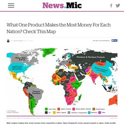
New Zealand's most valued export is dairy. India profits most from selling precious stones abroad, and Sri Lanka's hottest export is tea. The export topography of each country's most valuable product demonstrates where countries trading in the world market are yielding financial gains. Although some are extremely obvious, other countries benefit financially from unlikely sources. Predictably, oil is the most traded commodity in the global market.
After mining data from the CIA's World Factbook, Global Post assembled a map illustrating each country's top exports, according to their worth on the international market. Commodities like electronics-related equipment, motor vehicles and parts, and clothing command the top spot in North America. The Middle East and Central Asia make the most money from selling oil and its derivatives. And finally, in Africa, mineral resources dominate: Mali makes makes the most money from exporting cotton. 22 Gorgeous Maps That Define The United States Of America. 40 Maps That Will Help You Make Sense of the World. If you’re a visual learner like myself, then you know maps, charts and infographics can really help bring data and information to life. Maps can make a point resonate with readers and this collection aims to do just that. Hopefully some of these maps will surprise you and you’ll learn something new.
A few are important to know, some interpret and display data in a beautiful or creative way, and a few may even make you chuckle or shake your head. If you enjoy this collection of maps, the Sifter highly recommends the r/MapPorn sub reddit. You should also check out ChartsBin.com. 1. 2. 3. 4. Pangea was a supercontinent that existed during the late Paleozoic and early Mesozoic eras, forming about 300 million years ago. Cartographies of Time: A Visual History of the Timeline. By Maria Popova A chronology of one of our most inescapable metaphors, or what Macbeth has to do with Galileo.
I was recently asked to select my all-time favorite books for the lovely Ideal Bookshelf project by The Paris Review’s Thessaly la Force and artist Jane Mount. Despite the near-impossible task of shrinking my boundless bibliophilia to a modest list of dozen or so titles, I was eventually able to do it, and the selection included Cartographies of Time: A History of the Timeline (public library | IndieBound) by Daniel Rosenberg and Anthony Grafton — among both my 7 favorite books on maps and my 7 favorite books on time, this lavish collection of illustrated timelines traces the history of graphic representations of time in Europe and the United States from 1450 to the present, featuring everything from medieval manuscripts to websites to a chronological board game developed by Mark Twain.
The first chapter, Time in Print, begins with a context for these images: Donating = Loving. 40 maps that explain the world. By Max Fisher By Max Fisher August 12, 2013 Maps can be a remarkably powerful tool for understanding the world and how it works, but they show only what you ask them to.
So when we saw a post sweeping the Web titled "40 maps they didn't teach you in school," one of which happens to be a WorldViews original, I thought we might be able to contribute our own collection. Some of these are pretty nerdy, but I think they're no less fascinating and easily understandable. A majority are original to this blog, with others from a variety of sources.
I've included a link for further reading on close to every one. [Additional read: How Ukraine became Ukraine and 40 more maps that explain the world] Click to enlarge. 25 maps that explain the English language. English is the language of Shakespeare and the language of Chaucer.

It’s spoken in dozens of countries around the world, from the United States to a tiny island named Tristan da Cunha. It reflects the influences of centuries of international exchange, including conquest and colonization, from the Vikings through the 21st century. Here are 25 maps and charts that explain how English got started and evolved into the differently accented languages spoken today. The origins of English 1) Where English comes from English, like more than 400 other languages, is part of the Indo-European language family, sharing common roots not just with German and French but with Russian, Hindi, Punjabi, and Persian. 2) Where Indo-European languages are spoken in Europe today.