
Geographic visualization tools.
Quantum. Domestic Violence in Spain. Public Safety and Security. Location-based Big Data Analytics for 21st Century Security Needs Mobile phones are everywhere today.

There are over 5 billion phones across the planet and all of them continuously produce location data. Location-based Big Data analytics is emerging as a key technology enabler for a new generation of mobile applications and services. That allows authorities to gain access to critical data in a matter of seconds – which previously took days and weeks. Main fields of application How we do it Reach-U Public Safety and Security solutions are based on mobile phone location data.
Our entire solutions base can be deployed just in cooperation with mobile operators – none of our solutions require applications or specific phones on the mobile user side. There are several ways to get location information from mobile operators. The accuracy level may differ by operators. Uses. Supercharge yourself. Think, talk and work more creatively.
Data Map. Gephi. Social Media Tool for Social Media Marketing Agencies - eCairn Conversation. Cool Infographics - Blog. How Corporate Logos Evolve, from The Logo Company, shows us how even iconic world-wide recognized company logos change over time.
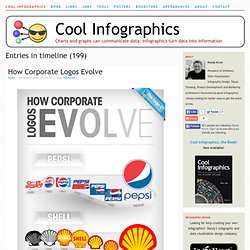
We often get asked for a logo design that can stand the test of time. Something that will last forever. I mean, we look at all these “Mega Corporates” and their logos never change. Do they? Well, actually and surprisingly, they do….a lot.This illustration depicts some of the biggest global brands and highlights the evolution of their logos from humble beginnings to the present day. This is a perfect use of an informative infographic that ties directly into a company’s business, and makes for a great content tool for marketing. They should have included a copyright (or Creative Commons) license and the direct URL to the infographic blog post in the footer of the design.
Found on Best Infographics. Visibo Product Updates. TagCrowd: make your own tag cloud from any text. NodeXL: Network Overview, Discovery and Exploration for Excel. Gephi, an open source graph visualization and manipulation software. TimeFlow Analytical TimelineVisual timelines for investigation - GitHub. OpenStreetMap. OpenLayers: Home.
OpenHeatMap. Welcome to the Quantum GIS Project. Protovis. Protovis composes custom views of data with simple marks such as bars and dots.
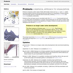
Unlike low-level graphics libraries that quickly become tedious for visualization, Protovis defines marks through dynamic properties that encode data, allowing inheritance, scales and layouts to simplify construction. Protovis is free and open-source, provided under the BSD License. It uses JavaScript and SVG for web-native visualizations; no plugin required (though you will need a modern web browser)! Although programming experience is helpful, Protovis is mostly declarative and designed to be learned by example. Protovis is no longer under active development.The final release of Protovis was v3.3.1 (4.7 MB). This project was led by Mike Bostock and Jeff Heer of the Stanford Visualization Group, with significant help from Vadim Ogievetsky. Updates June 28, 2011 - Protovis is no longer under active development. September 17, 2010 - Release 3.3 is available on GitHub. May 28, 2010 - ZOMG!
Getting Started. JavaScript InfoVis Toolkit. SIMILE Widgets. Choosel - Choosel: A data visualization framework for GWT. Servicio de generación de informes en línea e inteligencia comercial: Zoho Reports. Data Visualization Demo. Many Eyes. Free Data Visualization Software. IMPURE. Fusion Tables - Gather, visualize, and share data tables online. Bust your data out of its silo!

Get more from data with Fusion Tables. Fusion Tables is an experimental data visualization web application to gather, visualize, and share data tables. Visualize bigger table data online Filter and summarize across hundreds of thousands of rows. Then try a chart, map, network graph, or custom layout and embed or share it. Two tables are better than one! Merge two or three tables to generate a single visualization that includes both sets of data. Make a map in minutes. The R Project for Statistical Computing. Refine - Google Refine, a power tool for working with messy data (formerly Freebase Gridworks) Data Wrangler. UPDATE: The Stanford/Berkeley Wrangler research project is complete, and the software is no longer actively supported.
Instead, we have started a commercial venture, Trifacta. For the most recent version of the tool, see the free Trifacta Wrangler. Why wrangle? 22 free tools for data visualization and analysis. You may not think you've got much in common with an investigative journalist or an academic medical researcher.
But if you're trying to extract useful information from an ever-increasing inflow of data, you'll likely find visualization useful -- whether it's to show patterns or trends with graphics instead of mountains of text, or to try to explain complex issues to a nontechnical audience. There are many tools around to help turn data into graphics, but they can carry hefty price tags. The cost can make sense for professionals whose primary job is to find meaning in mountains of information, but you might not be able to justify such an expense if you or your users only need a graphics application from time to time, or if your budget for new tools is somewhat limited.