
Data Visualization, Infographics, and Statistics. Data Visualization: Modern Approaches - Smashing Magazine. About The Author Vitaly Friedman loves beautiful content and doesn’t like to give in easily. When he is not writing or speaking at a conference, he’s most probably running … More about Vitaly Friedman … 7 Essential Books on Data Visualization & Computational Art. By Maria Popova What 12 million human emotions have to do with civilian air traffic and the order of the universe.
I’ve spent the past week being consistently blown away at the EyeO Festival of data visualization and computational arts, organized by my friend Jer Thorp, New York Times data artist in residence, and Dave Schroeder of Flashbelt fame. While showcasing their mind-blowing, eye-blasting work, the festival’s all-star speakers have been recommending their favorite books on the subject matter, so I’ve compiled the top recommendations for your illuminating pleasure. Enjoy. Visual Complexity. Sigalon's Data Visualization Soup. HINT.FM / Fernanda Viegas & Martin Wattenberg.
Hans Rosling shows the best stats you've ever seen. David McCandless: The beauty of data visualization. Demo: Stunning data visualization in the AlloSphere. Aaron Koblin: Artfully visualizing our humanity. Pulse of the Nation: U.S. Mood Throughout the Day inferred from Twitter. Click for high-resolution PDF version (11MB) Video A time-lapse video of the maps, cycled twice, is available below (best viewed at 720p): Mood Variations A number of interesting trends can be observed in the data.
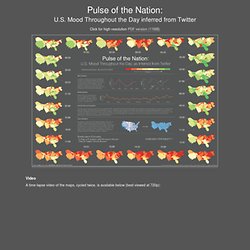
First, overall daily variations can be seen (first graph), with the early morning and late evening having the highest level of happy tweets. Similar variations were discovered independently by Michael Macy and Scott Golder, and first reported in the talk "Answers in Search of a Question" at the New Directions in Text Analysis Conference in May 2010. Weekly Variations Weekly trends can be observed as well, with weekends happier than weekdays. Pitch Interactive, Inc. - A Data Visualization Studio. The Work of Jonathan Harris. We Feel Fine / by Jonathan Harris and Sep Kamvar. Jonathan Harris: the Web's secret stories. Interactions Homme—Données.
Data Visualization Hierarchy of Needs The Excel Charts Blog. Vintage data visualization: 35 examples from before the Digital Era. This is a guest post by Tiago Veloso, the founder of Visual Loop, a collaborative digital environment for everything related to information design and data visualization.
He lives in Brazil, and you can connect with him online on Twitter and LinkedIn. If you follow us regularly on Visual Loop, you’ve probably noticed we like to featured not only modern interactive visualizations and infographics, but also examples from the past, from the time when there were no computer softwares to help analyzing and designing and no Internet to access and share data. Graphics, charts, diagrams and visual data representations have been published on books, newspapers and magazines since they exist, not to mention old maps and scientific illustrations, and despite the lack of tools such as the ones we have at our disposal nowadays, they are as inspiring and important as the best contemporary visualizations. Search engine data visualisations « Search insights. I’ve decided I need a single place to put all of the search engine data visuals that I’ve been working on. The visuals are made up of thousands of actual queries put into search engines by UK users over the course of a year.
This gives us an idea of ‘search demand’ which can/may/should equal actual, offline demand for a topic. Feel free to republish however please link to this blog and also to James Webb who helped to create them. They can be downloaded as PDF’s at the bottom of this page. Click the links below to open the visuals in PDF format for better quality printing / viewing. Overall. Data Visualization by ZingChart. ICT4D Wiki » Data Visualization.
Data visualization. Data visualization or data visualisation is viewed by many disciplines as a modern equivalent of visual communication.
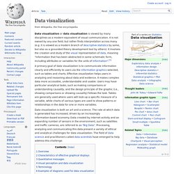
It is not owned by any one field, but rather finds interpretation across many (e.g. it is viewed as a modern branch of descriptive statistics by some, but also as a grounded theory development tool by others). Data & Interfaces by I M on Prezi. Graphs Of Wikipedia: Influential Thinkers. Celebrating Excellence in Data Visualization and Information Design. Many Eyes. Bestiario. DataArt - Visualisations. Billions of Geotagged Tweets Visualized in Twitter's Amazing Maps. Ever wonder what it would look like to plot every single geotagged tweet since 2009 on a map?
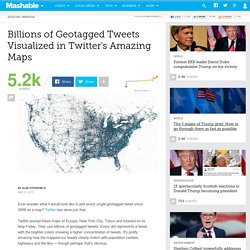
Twitter has done just that. Twitter posted these maps of Europe, New York City, Tokyo and Istanbul on its blog Friday. They use billions of geotagged tweets: Every dot represents a tweet, with the brighter colors showing a higher concentration of tweets. It's pretty amazing how the mapped-out tweets clearly match with population centers, highways and the like — though perhaps that's obvious. 1. 2. 3. 4. The Art of Data Visualization: How to Tell Complex Stories Through Smart Design. The volume of data in our age is so vast that whole new research fields have blossomed to develop better and more efficient ways of presenting and organizing information.
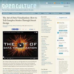
One such field is data visualization, which can be translated in plain English as visual representations of information. The PBS “Off Book” series turned its attention to data visualization in a short video featuring Edward Tufte, a statistician and professor emeritus at Yale, along with three young designers on the frontiers of data visualization. Titled “The Art of Data Visualization,” the video does a good job of demonstrating how good design—from scientific visualization to pop infographics—is more important than ever. In much the same way that Marshall McLuhan spoke about principles of communication, Tufte talks in the video about what makes for elegant and effective design.
One of his main points: Look after truth and goodness, and beauty will look after herself. Visualizing Music. A Clickstream Map of Science - Detail - Places and Spaces. Physics Simulations and Artwork. Here is a 3D view of a hydrogren atom in the 4f state.
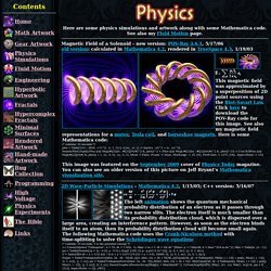
The left image was made in C++ using a technique described by Krzysztof Marczak to make it volumetric like a cloud of smoke. The right image was made in Mathematica by adding 2D cross-sectional layers. The animations were made in POV-Ray using DF3 density files. The right animation shows what a "12o" orbital might look like. POV-Ray has a built-in internal function for the 3d orbital: // runtime: 4 seconds camera{location 16*z look_at 0} #declare P=function{internal(53)}; #declare P0=P(0,3,0,0); box{-8,8 pigment{rgbt t} hollow interior{media{emission 0.5 density{function{(P(x,y,z,0)-1.2)/(P0-1.2)} color_map{[0 rgb 0][1 rgb 1]}}}}} Links Atomic Orbital - time-dependant hydrogen atom simulation, by ? SIMILE Widgets. Infographics & Visualizations. Create, Share, Explore. Visual Understanding Environment.
Data Visualization. Visualizing.org. Ideas, issues, knowledge, data - visualized! S Best Photos by BigSee. 15 Stunning Examples of Data Visualization. Data Visualization is a method of presenting information in a graphical form.

Good data visualization should appear as if it is a work of art. This intrigues the viewer and draws them in so that they can further investigate the data and info that the graphic represents. In this post there are 15 stunning examples of Data Visualization that are true works of art. Click on the title or image for a larger view of each visualization. The Strengths of Nations Here’s an image that discusses the variations in how different nations pursue science. Madrid.Citymurmur CityMurmur tries to understand and visualize how media attention reshapes the urban space and city. Genome Jules & Jim This visual represents the relationship between characters in the movie Jules & Jim. One Week of the Guardian. 50 Great Examples of Data Visualization. Wrapping your brain around data online can be challenging, especially when dealing with huge volumes of information.

And trying to find related content can also be difficult, depending on what data you’re looking for. But data visualizations can make all of that much easier, allowing you to see the concepts that you’re learning about in a more interesting, and often more useful manner. Below are 50 of the best data visualizations and tools for creating your own visualizations out there, covering everything from Digg activity to network connectivity to what’s currently happening on Twitter. Music, Movies and Other Media Narratives 2.0 visualizes music. Liveplasma is a music and movie visualization app that aims to help you discover other musicians or movies you might enjoy. DataArt - Visualisations. Chart Porn. Visual Gadgets. Datavisualization. Information aesthetics - Information Visualization & Visual Communication.
What is Data Visualization? World Bank Dataviz. Visualizing Economics. Stanford Visualization Group. Data Visualization and Infographics Examples and Resources. Things wordy, geeky, and webby Since taking a class that discussed Edward Tufte‘s work, I’ve been fascinated by turning information into visual data.
His site contains many examples that you could easily spend hours on the site. I have. Plus, I spent several days browsing sites with articles, resources, and examples of infovis (information visualization) in action. It’s not just about presenting data in a presentation or making things colorful. "data visualization" The Rise of Interactive Data Visualization. The visualization below highlights something only recently possible on the web: a dynamic, interactive canvas.
Titled “Disaster Strikes: A World In Sight”, it visualizes a century of floods, fires, droughts, and earthquakes around the globe. (Below is a snapshot of 1996, an apparently costly year for disasters). It’s not a passively animated graphic, but one that users can actively engage with, freezing or pivoting dimensions to reveal new views of the data. It’s a harbinger of a new class of documents, which digital publishers are beginning to embrace, to provide a richer information experience for readers.
Four Easy Visualization Mistakes to Avoid. Creating a great visualization is not as hard as it seems. Provided you have some interesting data and an effective tool with which to visualize it, a little bit of thoughtful design will lead to a decent result. That said, there are some mistakes that are very easy to make, but can ruin even a thoughtfully-made piece. Here are four data visualization mistakes you should avoid. 1. Serving the Presentation Without the Data.
Celebrating Excellence in Data Visualization and Information Design. Data Journalism Awards winners. Over 300 applications from all over the world, and the winners were just announced The Data Journalism Awards (DJA) is the prime international competition recognizing outstanding work in the field of data journalism.
Sponsored by Google, the DJA 2013 received over 300 applications from all over the world, ranging from major media groups, regional newspapers, and research groups, and the winners were just announced at the award ceremony held at the Global Editors Network News Summit. This year, the DTJ had four categories: Data-driven investigative journalism, Data-driven applications, Storytelling with data, and Data journalism website or section, as well as a special “Public Choice Award”. And here are the winners, as they were announced on Twitter by the organization (@EditorsNet):
Chris Harrison. Graphical visualization of text similarities in essays in a book. Grafische Visualisierung von Textähnlichkeiten zwischen Fach-Artikeln. Frühe Stadien der Visualisierung Die Entwicklung der Visualisierung durchschritt einen Prozess, der durchaus auch Sackgassen und Nebenzweige hervorbrachte. Hier können sie einige frühe Stadien betrachten.
VisualMiscellaneumTypesofInformationL.gif (Image GIF, 762x1000 pixels) Visualized: Over 4 Million Micro-Loans Fly Around the Globe. Kiva is a company that facilitates micro-loans between people from all over the world; incidentally, nothing to do with the Finnish KiVA. Complex Diagrams. JESS3™ SAAS Business Intelligence. From startup to fortune 500 Accessibility, fair pricing, infinite scalability, premium support. There is something for everyone in here. Visualizing Del.icio.us Roundup.
I have been coming across many del.icio.us tools to visualize usage during my daily researching hours. So many, that I have decided to start making note of the ones I come across. From the span of about two weeks, I have been collecting as many as I could find. I will list each one along with a description. Welcome to Viewshare. Wiki eyeplorer.