DataViz
DataViz Mediaeater MMX Archive / RSS June 21 (Source: thedailywhat) May 26
Data Visualization: Modern Approaches - Smashing Magazine
About The Author Vitaly Friedman loves beautiful content and doesn’t like to give in easily. When he is not writing or speaking at a conference, he’s most probably running … More about Vitaly Friedman …
The World Factbook
ShowIntroduction :: GREECE Panel - Collapsed Greece achieved independence from the Ottoman Empire in 1830. During the second half of the 19th century and the first half of the 20th century, it gradually added neighboring islands and territories, most with Greek-speaking populations. In World War II, Greece was first invaded by Italy (1940) and subsequently occupied by Germany (1941-44); fighting endured in a protracted civil war between supporters of the king and other anti-communist and communist rebels. Following the latter's defeat in 1949, Greece joined NATO in 1952. In 1967, a group of military officers seized power, establishing a military dictatorship that suspended many political liberties and forced the king to flee the country.
12 Valuable Wordle Tips You Must Read…Word Clouds in Education Series: Part 1
Welcome to a series of posts devoted to the use of Word Clouds. I know you will find new information… whether you are a seasoned user of word clouds, or brand new. I enjoy working with teachers and helping them use word clouds in their lessons because they are a great way to get any teacher started with integrating technology. In this series of posts I will cover: 12 Tips in Using Wordle (Some you may now… but other you may not.)Over 10o ways to use Word Clouds in the classroomThere is more to Word Clouds then Wordle… other awesome word cloud generatorsBeyond word clouds… cool sites and applications to integrate word clouds
20+ Tools to Create Your Own Infographics
A picture is worth a thousand words – based on this, infographics would carry hundreds of thousands of words, yet if you let a reader choose between a full-length 1000-word article and an infographic that needs a few scroll-downs, they’d probably prefer absorbing information straight from the infographic. What’s not to like? Colored charts and illustrations deliver connections better than tables and figures and as users spend time looking back and forth the full infographic, they stay on the site longer. Plus, readers who like what they see are more likely to share visual guides more than articles. While not everyone can make infographics from scratch, there are tools available on the Web that will help you create your very own infographics.
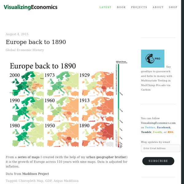
40 Maps That Will Help You Make Sense of the World
If you’re a visual learner like myself, then you know maps, charts and infographics can really help bring data and information to life. Maps can make a point resonate with readers and this collection aims to do just that. Hopefully some of these maps will surprise you and you’ll learn something new.
Mind42.com - Collaborative mind mapping in your browser
Datavisualization.ch Selected Tools
Gapminder: Unveiling the beauty of statistics for a fact based world view.
ShowMe - The Online Learning Community
visual.ly - Create, Share, Explore Great Visualizations.
Chart Porn