

Forum Qualitative Sozialforschung / Forum: Qualitative Social Research FQS is a peer-reviewed multilingual online journal for qualitative research established in 1999. FQS thematic issues are published tri-annually. In addition, selected individual contributions and contributions to the journal's regular features FQS Reviews, FQS Debates, FQS Conferences and FQS Interviews are published as soon as they have undergone peer review. FQS is an open-access journal, so all articles are available free of charge. Current Issue: CurrentBack Issues: Archives
Cool Infographics - Blog Hatch'd step 3 Rate and comment on ideas. No more messy email chains. All your ideas in one place, easily filtered by labels and sorted by popularity. Fantastic! Digital Buzz Blog | Digital Campaigns, Online Marketing, Social & More. FlowingData | Data Visualization, Infographics, and Statistics Quantified Self | Self Knowledge Through Numbers 7 Exciting Web Development Trends for 2011 At the end of December, you read Andrew's list of the hottest technologies, tools, and resources to come from 2010. Today, we're going to look forward, and take a peek at some exciting emerging technologies and trends. A Word from the Author The tools and technologies that we, as web developers, work with is in a state of constant flux, much like every other industry. What separates us from the rest is that we have to learn, unlearn and relearn new developments at a much faster rate, much more frequently. Today, I'd like to talk about a few technologies and trends that I think are going to be quite important in the coming year: a pseudo prediction/wish list/what we're going to cover this year post of sorts. The technologies listed below weren't exactly hatched recently. 1. noSQL Why are people excited about noSQL? Sometimes, you simply want to store and have access to your data, with low latency and excellent scalability. The issue is the relational model isn't really necessary everywhere.
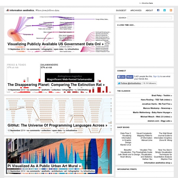
15 Stunning Examples of Data Visualization Data Visualization is a method of presenting information in a graphical form. Good data visualization should appear as if it is a work of art. This intrigues the viewer and draws them in so that they can further investigate the data and info that the graphic represents. In this post there are 15 stunning examples of Data Visualization that are true works of art. Click on the title or image for a larger view of each visualization. The Strengths of Nations Here’s an image that discusses the variations in how different nations pursue science. Madrid.Citymurmur CityMurmur tries to understand and visualize how media attention reshapes the urban space and city. Genome Jules & Jim This visual represents the relationship between characters in the movie Jules & Jim. One Week of the Guardian This is one day in a series that takes the news from one week of the Guardian newspaper, and visually represents it as a series of static visualisations. One Week of the Guardian Leisure & Poverty Stock Data Related Posts
Choosing a web development framework | Brajeshwar Illustration from Wordle.net Web Dev FrameworksWhich one is right for you? So you have decided you want to start your startup, or may be you just want to build a hobby site. Step 1. Of course the first step to choosing is to enumerate the choices. … And others. Step 2. You are a startup, (or a single person, or two). A detour – Why Oracle uses Java, but you should not. For a large organization using Java is a no brainer. Step 3. For this project, the client needed to to do a lot of statistical and numerical processing. Step 4: What do you already know? Do you have some legacy code in a given language you would like to reuse? Step 5: How large is the community. When you get stuck in a deep, challenging framework problem would you be able to ask a question in the framework forums and get a quick response? Finally Choosing a framework is one of the major decisions you make, and will influence a lot of your development choices.
DataViz DataViz Mediaeater MMX Archive / RSS June 21 (Source: thedailywhat) May 26 April 30 December 5 (Source: mrharristweed) November 12 November 9 (Source: toukubo, via handa) November 3 September 3 August 15 (Source: thedailyfeed) Next » Adverblog | Digital advertising and marketing: only the best ideas worldwide, since 2003 Search Information Visualization Database
Wireframe and mockup tools, best examples It’s usual to see graphic designers having problems while trying to explain their customers the main idea of the project that they want to develop, this happens often because graphic and web designers are getting used to draw everything straight in the computer, without a previous hand drawn sketch. When the creative arrives to the costumer’s office / house and finds out that the person is not familiar with graphic programs such as Photoshop and Illustrator and so there’s is no way to show him the super cool vectorized interface that was supposed to blow out your client’s mind; don’t worry my dear creative people, because now there’s a product that will solve all your graphic presentation needs regardless of having the complete Adobe Suite at your disposal. We are talking about the mockups and wireframes, applications that are designed to work on your main idea without having to worry about resolution, color mode and other similar topics. Icon by Iconshock . 1. Mockingbird 2. iPlotz 3. 4.
Data Visualization: Modern Approaches - Smashing Magazine