
/r/DataIsBeautiful sur Twitter : "The Cumulative Number of Reddit Posts with more than 10,000 Upvotes since 2005 [OC] #dataviz. The Cumulative Number of Reddit Posts with more than 10,000 Upvotes since 2005 [OC] : dataisbeautiful. 22 maps and charts that will surprise you. By Ezra Klein on March 11, 2015.
Laurent_local : Where people run ? Where people run. There are many exercise apps that allow you to keep track of your running, riding, and other activities.
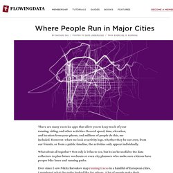
Record speed, time, elevation, and location from your phone, and millions of people do this, me included. However, when we look at activity logs, whether they be our own, from our friends, or from a public timeline, the activities only appear individually. What about all together? Not only is it fun to see, but it can be useful to the data collectors to plan future workouts or even city planners who make sure citizens have proper bike lanes and running paths. Ever since I saw Nikita Barsukov map running traces in a handful of European cities, I wondered what the paths looked like for others. The maps below are what I got, mostly for American cities, but there are a few European cities in there too (alphabetical order).
Where Are House Hunters Searching? - Trulia Insights. 22 outils gratuits pour visualiser et analyser les données (1ère partie) Vous avez des données à explorer ?
Voici quelques outils qui pourront vous être utiles pour les transformer en informations et en graphiques attrayants. Pour faire parler des données, rien ne vaut une panoplie d'outils de visualisation graphique. Il en existe de nombreux, notamment destinés aux professionnels versés dans l'analyse statistique. Mais leur prix, généralement élevé, ne convient pas aux utilisateurs moins spécialisés qui n'ont besoin qu'occasionnellement d'afficher des données sous une forme graphique. Or, il existe, pour ceux dont le budget est limité, un nombre surprenant d'outils très intéressants pour la visualisation et l'analyse de données, accessibles gratuitement. #praTIC : typologie des visualisations du web. J’ai eu le plaisir de participer aujourd’hui à la journée PraTIC sur le thème Spatialité et Temporalité du Web, organisée par l’Atelier de Vidéomatique du Laboratoire Paragraphe (UP8), en partenariat avec l’école des Gobelins.
Map Marquer - Noun Project Le thème de mon intervention était : Visualisation interactive de données, nouveaux outils et nouvelles mécaniques cognitives pour comprendre le web. Ma présentation interroge les différentes façons de visualiser le web en tant que paysage informationnel. Elle s’appuie sur le constat de Jonathan Stray : nous n’avons pas de carte des contenus sur le web. Ce qui nous pose un irrémédiable problème d’appréhension de la complexité du monde. I have met people who have never seen a world map. Les moteurs recherche de Google (ou autres) nous permettent de chercher et d’accéder aux contenus. Néanmoins, s’il n’existe pas de carte globale de l’information sur le web, il existe de nombreuses visualisations du web, et de ses ressources.
My Digital Footprint - where your privacy is someone else's business ... Europe's Energy - energy.publicdata.eu. :-) visualisation. Data Visualization and Statistics. 28 Rich Data Visualization Tools - InsideRIA. OpenDataCamp : Atelier visualisation – cartographie « RegardsCit. Partie de l’exemple des représentations des circonscriptions et de l’activité des députés sur notre site, la discussion a évoqué les différents enjeux de la repésentation de données au travers de nombreux exemples.
La question de la source, de la validité et de la disponibilité de la donnée brute est d’abord apparue comme essentielle. Même les données brutes présentent toujours une part de subjectivité. Un travail rigoureux est donc indispensable à la préparation de ces données dès lors qu’elles vont donner lieu à une représentation visuelle. Cela est d’autant plus important lorsque l’on a à sa disposition un volume important de données très diverses. Il existe des rêgles scientifiques de la visualisation (et des livres très précis sur le sujet existent) et c’est un travail de statisticien que de mettre vraiment en valeur les données réutilisables et de quelle façon afin d’éviter toute perte de neutralité due à la représentation. D’autres exemples en vrac évoqués durant la session : Build Statistical Graphics Online With ggplot2. Statisticians are generally behind the times when it comes to online applications.
There are a lot out-dated Java applets and really rough attempts at getting R, a statistical computing environment, in some useful form through a browser. So imagine my surprise when I tried this tool by Jeroen Ooms, a visiting scholar at UCLA Statistics. It actually works pretty well, and for a prototype, it isn't half bad. Statistical Graphics as Layers The engine behind Jeroen's tool is Hadley Wickham's ggplot2, an R implementation of of Leland Wilkinson's Grammar of Graphics. Those who use Adobe products, like Illustrator or Photoshop, are familiar with the idea of layers in your graphics. Many Eyes: Recettes de l'Etat Français 2007 (prévisions V2)
Browser war data viz. Chart Wars: The Political Power of Data Visualization — Making G. IV10. 50 Great Examples of Data Visualization.