
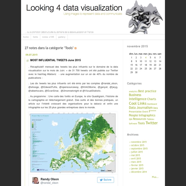
The Volume, Velocity, Variety, and Visualization of Big Data Today’s Big Data Scientists are being challenged with discovering actionable insights from the Volume, Velocity and Variety of data resources in cost-effective innovate ways. This is the foundation of Big Data Trends and has tremendous value when understanding is Visualized by today’s Big Data Artists. Big Data Artists and Data Storytelling Data comes to life in the hands of Data Artists. Big Data Virtualization Processing unstructured, semi-structured, and structured data can be accomplished with open-source tools such as Hadoop, MongoDB, Node.JS, with multiple programming languages including Java and Python. Big Data Visualization Getting the right information to the right person at the right time in the right way is a big deal. Data Visualization Tools Great artists experiment with a variety of material and tools to create their masterpieces. RapidMiner Data Mining System: RapidMiner is an open-source system for data mining. Sencha Ext JS is an “Enterprise grade JavaScript Framework”.
How To Create Outstanding Modern Infographics In this tutorial you will learn that data doesn't have to be boring, it can be beautiful! Learn how to use various graph tools, illustration techniques and typography to make an accurate and inspiring infographic in Adobe Illustrator. Start by using the Rectangle Tool (M) to draw a shape. The entire design is based on a grid of four columns. Condense the shape so it fits within the left-most guide and centre guide. Move the shape over to the right and add another guide to the centre here. Using the Rectangle Tool (M) draw a thin white box on the centre line that will be the width of the gap between the columns. Repeat the process for the other columns with your final result being below. I like to place the most important graphics first and work-in the ancillary charts and graphs afterwards. Early on you can experiment with placing a main graphic that will help give the piece some visual interest. Give the circles a variety of gradients. I'm using a variety of graphs in this infographic.
World: Humanitarian and Country Icons 2012 - World ************************************* Icons optimized and hosted for use in online maps (64 and 32 pixel png images) by google. The 64px icons are recommended for use in Google Earth, and 32px icons are recommended for Google Maps. Web font by Tomnod: True type fonts, ESRI Stylesheets and QGIS XML files for the bounded, unbounded and transparent formats by MapAction: *************************************OCHA adds 500 free humanitarian symbols to communications tools and services The United Nations Office for the Coordination of Humanitarian affairs (OCHA) has created a set of 500 freely available humanitarian icons to help relief workers present emergency and crisis-related information quickly and simply.
How to Master Data Visualization Data Visualization Data visualization is the study of the visual representation of data, meaning “information which has been abstracted in some schematic form, including attributes or variables for the units of information”. According to Friedman (2008) the “main goal of data visualization is to communicate information clearly and effectively through graphical means. It doesn’t mean that data visualization needs to look boring to be functional or extremely sophisticated to look beautiful. Data Visualization Strategy Edward Tufte @EdwardTufte delivered a great presentation about data visualization strategy for the star studded Tech@State event audience. If your display isn’t worth 1000 words, to hell with it – @EdwardTufte Data Visualization Tools & Services Google Data Visualization Services Google Data Visualization Service provides a variety of charts that are optimized to address your data visualization needs. Sencha ExtJS Data Visualization Tools Highcharts Data Visualization Tools Mr.
Presentation Design 101: Making Data Compelling in a Presentation This post was written by Aristotle Presentation philosopher, teacher, in search of the best gyro. What are the first words that come to mind when someone says “data”? Probably something along the lines of ‘boring’, ‘tedious’ and ‘complicated’. There’s little chance ‘exciting’ or ‘engaging’ came to mind. Below are several slides from a recent presentation in which we worked on both content and design, and all of them serve as great examples of how to make data compelling in a presentation. Immediately after glancing at this slide, the audience knows what fact is the most important on it, and that’s the number: 80%. The message here is that “85% of all risk comes from 5% of the population.” The message point here is: ”Over the next decade… Notice how we chose to include just two of the data points on this slide in an effort to emphasize the most important information; the presenter can speak to the other two data points if he or she desires. Let’s take a look at these two slides together.
Selected Tools Datavisualization.ch List of available online WMS services (Weather, Land Data, Place Names...) current community your communities Sign up or log in to customize your list. more stack exchange communities Stack Exchange sign up log in tour help Geographic Information Systems Ask Question Take the 2-minute tour × Geographic Information Systems Stack Exchange is a question and answer site for cartographers, geographers and GIS professionals. List of available online WMS services (Weather, Land Data, Place Names…) 11 Answers active oldest votes Your Answer Sign up or log in Sign up using Google Sign up using Facebook Sign up using Stack Exchange Post as a guest discard By posting your answer, you agree to the privacy policy and terms of service. Not the answer you're looking for? Get the weekly newsletter! Top questions and answers Important announcements Unanswered questions see an example newsletter By subscribing, you agree to the privacy policy and terms of service. Linked WMS weather data for Europe Third party base layer other than Google map Related WMS + Google Earth + tilted view = alignment failure?
Looking 4 data visualization Data, BigData, DataViz, Data Scientist, OpenData… reprenons du début Un des principaux objectifs de ce blog est d'aborder les différents aspects de la diffusion de l'information géographique. Cela commence forcément par évoquer la source de toute information: la donnée. Autour du concept de la Data, gravitent de nouveaux phénomènes comme le Big Data, la Data Viz ou l'Open Data … Des journalistes aux décideurs en passant par les spécialistes techniques, tout le monde s'en fait désormais l'échos. Alors avant d'aborder régulièrement ces thèmes dans les prochains mois, reprenons depuis le début chacun de ces concepts. La Data La Data constitue le cœur de tous nos systèmes d'information et jouent donc un rôle essentiel dans la prise de décisions économiques, stratégiques ou politiques. GeoData Sans qu'il soit évident de le démontrer, il est communément admis que 80% de nos bases de données ont une composante géographique, on parlera donc parfois de GeoData. Big Data, le nouveau défi de la Data Un nouveau métier: Data Scientist Et l'Open Data dans tout ça ?