
Noun Project Search. Design Concepts for Better Power BI Reports. The 1-3-25 Reporting Model. What is the MECE principle? A deep dive into the problem structuring framework. MECE is a fundamental, problem structuring framework that stands for Mutually Exclusive, Completely Exhaustive.

Why is it so popular with management consultants? Well, management consultants essentially spend all day solving problems - it's a huge part of their job. As a result, the better consultants get at quickly decomposing problems and bucketing them into key issues, the better they get at their job! Gestalt Principles for Data Visualization: Figure/Ground and Metastability. Figure/Ground Simply by outlining the rectangles in the region that could be a horizontal bar chart, we establish it as the figure and the orange area, which has a stronger hue and saturation signal, recedes into the background.
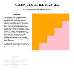
If we reverse this process, and use outlines to create a horizontal bar chart, then the reverse occurs. The pink region recedes and becomes the ground while the orange region becomes the figure. In either case, metastability issues are present both because of the strong color signals and our memory of the chart in its previous horizontal bar chart form. Gestalt Principles for Data Visualization – Elijah Meeks – Medium. Gestalt refers to the patterns that you perceive when presented with a few graphical elements.
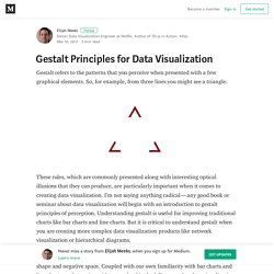
So, for example, from three lines you might see a triangle. These rules, which are commonly presented along with interesting optical illusions that they can produce, are particularly important when it comes to creating data visualization. Bar widths. Data Visualization: Clarity or Aesthetics? Data Visualization: Clarity or Aesthetics? Modernes Reporting ist visuell! Andreas Wiener - reportingimpulse - Vortrag MI 2015. How William Cleveland Turned Data Visualization Into a Science. This post is adapted from the blog of Udemy, a Priceonomics customer.
Data visualization is increasingly at the center of how we digest information. The last several decades have seen an explosion in the use of charts, and a recognition of the incredible ability of the human mind to process data visually. The rise of visualization has coincided, probably not coincidentally, with a formalization and deeper consideration of just what works best when attempting to convey information in graphical form. Perhaps no person is more responsible for giving data visualization a scientific foundation than the statistician William Cleveland. His studies on graphical perception, the cognitive processes people use to understand a chart, are among the earliest attempts to study visualization and develop a theory of how it should be best done.
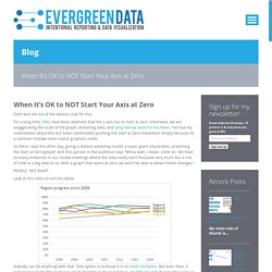
When Memorability Matters: Another Practitioner’s View. The following comments are in response to Stephen Few’s recent newsletter entitled “Information Visualization Research as Pseudo-Science” in which he critiqued an academic paper by Borkin et al entitled “Beyond Memorability: Visualization Recognition and Recall“.
I’m not an academic researcher, so I will leave it to others in the field to respond to Few’s specific criticisms of the paper’s methods. My goal in this article is to respond to opinions Few voiced about memorability in data visualization. I’d like to start by asking a few questions: Rules for using color. Understanding what makes a visualization memorable. John Wihbey teaches data journalism in the Media Innovation program at Northeastern University’s School of Journalism.
The world of data visualization has long been shaped by canonical ideas from theorists like Edward Tufte. His book The Visual Display of Quantitative Information is a must-read for information designers, which include newsroom graphics editors. Infovis submission251 camera. Visualization Tools. All That Glitters Is Not Gold: A Common Misconception About Designing With Data. Too often when working in information design, you’ll hear the request, “Can you make the data look cool?”

“Cool” is a rather ambiguous term, and means different things to different people. Unfortunately, when working with data, the term “cool” is often directly juxtaposed with common charts like line, bar and pie, which are often relegated to the backbench, and written off as “boring.” The emphasis on the instant visual appeal of an infographic over the clarity of the presentation of data is a troubling trend that plagues the modern incarnation of the infographic. Data Visualization And The “Cool” Factor Link.
3 Beginner-Friendly Data Visualization Tricks. Statistics and data validate your presentation.
Many times, showcasing numerical research is the main point of a presentation. But charts and graphs are overused formats, and as a result they are easily forgotten and often completely ignored by audiences. As easy as it is to drag and drop a chart into your deck, most people simply do not want to decipher a series of dots on a graph or bars on a chart during a speech. It is thus your job as the presenter to deliver your data so that it is easy — and perhaps even enjoyable — to comprehend. When It’s OK to NOT Start Your Axis at Zero. Don’t kick me out of the dataviz club for this.
For a long time, folks have been adamant that the y axis has to start at zero. Otherwise, we are exaggerating the scale of the graph, distorting data, and lying like we work for Fox News. Three Ways to Show Down is Good. Humans in the western culture tend to see things that trend upward as positive and lines that trend downward as bad.
But what if bad is good? And not like my college boyfriend. The Three Elements of Successful Data Visualizations. Now that we’ve discussed when data visualization works — and when it doesn’t, let’s delve into what makes a successful data visualization. Although there are a number of criteria, including ease of comprehension and aesthetics, I’d like to explore the three that designers most often overlook. 1. It understands the audience. Before you throw up (pun intended) data in your visualization, start with the goal, which is to convey great quantities of information in a format that is easily assimilated by the consumers of this information — decision-makers. A successful visualization is based upon the designer understanding whom the visualization is targeting, and executing on three key points:
How people engage with data visualisations and why it matters. In this context, visualisation literacy is a necessary skill for living in our information and (big) data times. Data visualisation expert Andy Kirk of Visualising Data estimates that there are around 75 common chart types, and that’s just the ones that have names. The proliferation of visualisations and chart types can make understanding them difficult, yet it is also essential for those of us who wish to make sense of the data within them and so to participate in informed ways in data-driven conversations and society. Previous research. How people engage with data visualisations and why it matters. Understanding Data Visualisations - Seeing Data. Home » Understanding Data Visualisations This resource aims to help people make sense of data visualisations. It’s for the general public – people who are interested in visualisations, but are not experts in this subject.
Each section tells you something different, and it attempts to build your confidence and skills in making sense of data visualisations. Give Mockup presentations on your iPad/iPhone with Link Viewer – Mockups Product Blog – Balsamiq. Hello Balsamiq friends! Today we asked Eileen and Max of Link Viewer to write up a blog post introducing their app for testing iOS Mockups. Enjoy! Presenting your UX concept to your client is a crucial moment in product development. MyBalsamiq. RAW.
Notationsneurosen meiden - Mountfield, Reporting, Horváth & Partner - Business Intelligence Magazine. 04.07.2014, Zürich, Andrew Mountfield* Klares Reporting - Sexl, pmOne, Reporting, Finanz, Forecasting, Corporate Design, Grafik - Business Intelligence Magazine. 17.06.2014, Stefan Sexl, pmOne AG.
Fonts & Colors. SAP LAVA. Presentation Techniques. Mobile BI Design Framework: The Use of Colors - The Decision Factor Blog. In mobile business intelligence (BI) design, the use of colors plays an important role because colors are some of the easier components to incorporate into our mobile assets. However, this ease of use often leads to misuse and, subsequently, ineffective design of our mobile solutions. I often find that the oversight happens not because we lack the knowledge or technical capability, but because we make the wrong assumptions. Introducing the Data Visualization Checklist. Intentional Data Visualization & Evaluation Reporting. Every Number Can Tell a Story: The Art and Business of Data Visualization. Statisticians look for clarity in numbers. Artists understand how color and shape appeal to, and influence, people. Marketing professionals can combine the clarity of numbers with the appeal of graphics, using data visualization (DV) tools.
If you’ve ever used a spreadsheet or presentation program, you’re probably familiar with the simple graphic tools they contain for creating line graphs, bar charts or pie charts. DV tools combine that simple approach with the power of graphics software to create much more sophisticated displays. The Data Visualisation Catalogue. Lumira: Recreating the author Andy Kirks da. Death by PowerPoint: An Inforgaphic - Get Organised. By admin • October 26, 2013 • Leave a comment. BLOG Horváth & Partners. Aspektum gmbh - rethinking business communication. 25 Best Chart and Graph Design Ideas. Have you ever presented a corporate presentation or published a write-up related to some economical or statistical topic?