
More Vibrant Tales of Obsolete Pigments. After our first installment of obsolete pigments, we had such a strong response that we realized we’d only hit the tip of the curious history of vanished colors.
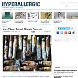
Below are a few more pigments that have mostly gone out of favor, due to them being hazardous to the health of their manufacturers or artists, having a shortage of their weird material (antlers, for example), or just advances in technology replacing them with synthetics. Orpiment Made from arsenic and sulphide, orpiment was naturally very toxic. According to New Scientist, the vivid “King’s Yellow” as it was known was very popular with 17th century Dutch masters, sometimes mixed with blue to make their landscapes green. Yet not only were the fumes poisonous, it also apparently smelled horrid. Hartshorn One pigment that could mix with the above mentioned orpiment was Hartshorn. Ivory Black Rembrandt, “Old Man with a Gold Chain” (1631), oil on panel (via Wikimedia) Paris Green Iris Green. Neale Worley - Portrait Painting. The Wonderful World of the Limited Palette. When you’re first taught to paint with a limited palette, you’re usually given three primary colors—red, yellow and blue.
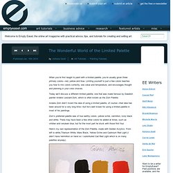
Limiting yourself to just a few colors teaches you how to mix colors correctly, see value and temperature, and encourages thought and planning in your color choices. Today we’ll discuss a different limited palette, one that was made famous by Swedish painter Anders Leonard Zorn, which is often known as the Zorn Palette. Anders Zorn didn’t invent the idea of using a limited palette, of course—that idea has been around for a very long time—but he’s well known for using a limited palette in most of his paintings.
Zorn’s preferred palette was of four earthy colors: yellow ochre, vermilion, ivory black and white. There may have been a few other colors he added at times, such as viridian and cerulean blue, but for the most part he stuck with those first four. Skin Shading. Overview The idea to this painting came when I sat down with my notebook in my sofa one evening, and tried to come up with something that was both upclose and personal, yet touched on larger issues, such as affairs of state.

Preferrably involving only two people, because I find that can often be more intense. A royal assassination, I thought, and since I like Fantasy, it became an idea of two fairy sisters, one of them Queen, and a serious case of sibling jealousy. I added a sleeping husband in the background, to supply one more possible reason for jealousy. Later, I came up with a whole screenplay based on this and two of my other paintings featuring fairies. 1. the sketch. Free Online Oil Painting Guide. Online Oil Painting Gallery Bill Martin's Guide to Oil Painting OIL PAINTING EXERCISES ~ Color and Form You Are Now Ready for Color and Form In this exercise the colored toys provide bright simple forms to practice mixing three values of colors.
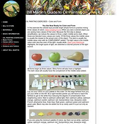
(See Creating Form) When you see a colored object you are seeing many values of that color. All forms begin as three values. The dark value will usually have the complement of the middle value added. Lay out your colors on your palette in this order. If you are using the minimum palette of colors, lay them out as white, cadmium yellow, cadmium orange, cadmium red, Quinacridone rose, dioxazine violet, ultramarine blue and cadmium green. How to mix colors with oil paint. Free Online Oil Painting Guide. 12 Fascinating Things You Didn't Know About Paint. Consider yourself an expert on paint?

You may know less than you think. Even experts are surprised at these little-known — often odd — facts about paint and paint color. How many of them come as a surprise to you? 1. The color purple became associated with royalty because at one time only aristocrats could afford the expensive pigment. Skin tones for painting. C olor mixing is one of the most difficult aspects of painting.
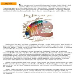
Back in Holbein's day it wasn't too difficult simply because there were so few colors from which to chose. Today's huge spectrum of colors makes choosing colors difficult. Should I choose a red that stays warm when mixed with white or should I choose one that becomes cool when mixed with white? The answer to the above question involves knowing the characteristics of more than two dozen red pigments - and five different whites. Confusing? Caucasian flesh tones are composed of yellows and reds with greys added to neutralize certain areas. The head can be divided into three areas: forehead, cheeks and jaw. The ears, cheeks and nose (as well as the mouth) have an ample blood supply that makes them red. The area under the nose - the jaw, has the most neutral color.
The neck should be slightly neutralized. The following illustrations were sketched out in gouache rather than oils but the same principles apply. New Page 2. Art Forums - A Singular Creation Art Community. We would like to ing you this feature tutorial by Linda Bergkvist, renowned in the digital arts community for her gorgeous portrayal of characters.

In this tutorial, Linda shows us step by step how she paints realistic eyes. About Linda Bergkvist Linda Bergkvist is a renowned digital artist who currently lives in Sweden. Linda Bergkvist's website can be found at www.furiae.com.
Watercolors. ‘Painting Begins Where Language Fails': Gao Xingjian Ink-Paintings.