
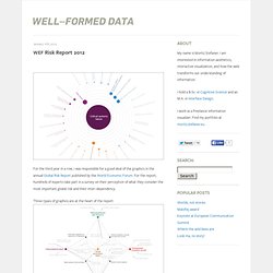
Musical Spectrum Analysis. WEF Risk Report 2012. For the third year in a row, I was responsible for a good deal of the graphics in the annual Global Risk Report published by the World Economic Forum.
Mapping the Republic of Letters. TNS - Mobile Life. 20 Great Visualizations of 2011. Notabilia – Visualizing Deletion Discussions on Wikipedia. Just Landed: Processing, Twitter, MetaCarta & Hidden Data. I have a friend who has a Ph.D in bioinformatics.
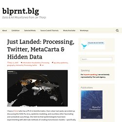
All The Names: Algorithmic Design and the 9/11 Memorial. In late October, 2009, I received an e-mail from Jake Barton from Local Projects, titled plainly ‘Potential Freelance Job’.
NYTimes: 365/360 : un album. 17 Ways to Visualize the Twitter Universe. I just created a new Twitter account, and it got me to thinking about all the data visualization I've seen for Twitter tweets.

I felt like I'd seen a lot, and it turns out there are quite a few. Here they are grouped into four categories - network diagrams, maps, analytics, and abstract. Network Diagrams Twitter is a social network with friends (and strangers) linking up with each other and sharing tweets aplenty. These network diagrams attempt to show the relationships that exist among users.
Twitter Browser Twitter Social Network Analysis The ebiquity group did some cluster analysis and managed to group tweets by topic. Twitter Vrienden Twitter in Red. Backtalk - SENSEable City Lab. Our cities, buildings and objects are getting ‘smarter’ and embedded with an increasing amount of electronic devices.
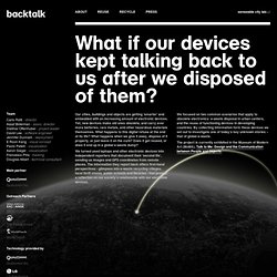
Yet, new devices make old ones obsolete, and carry ever more batteries, rare metals, and other hazardous materials themselves. What happens to this digital refuse at the end of its life? What happens when we give it away, dispose of it properly, or just leave it on the curb? Foursquare chek-ins. Trash. For more information, please contact: senseable-trash@mit.edu.
The Sexperience 1000 - Sexperience. Welcome to The Sexperience 1000, an interactive journey through the sexual experiences and preferences of one thousand British individuals.
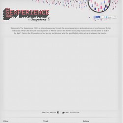
What’s the favourite sexual position of iPhone users in the North? Do country music lovers over 55 prefer to do it in the dark? The city in real-time. The MIT SENSEable City Lab presents five different perspectives of the ebb and flow in Singapore at the Singapore Art Museum.
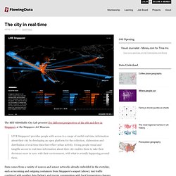
LIVE Singapore! Provides people with access to a range of useful real-time information about their city by developing an open platform for the collection, elaboration and distribution of real-time data that reflect urban activity. Giving people visual and tangible access to real-time information about their city enables them to take their decisions more in sync with their environment, with what is actually happening around them. Data comes from a variety of sources and sensor networks already embedded in the everyday, such as incoming and outgoing containers from Singapore's seaport (above), taxi traffic combined with weather data (below), and energy consumption with local temperature changes. The result: an ever-updating view of the living, breathing city. [SENSEable City Lab | Thanks, Afian] 50 Great Examples of Data Visualization.
Wrapping your brain around data online can be challenging, especially when dealing with huge volumes of information.

And trying to find related content can also be difficult, depending on what data you’re looking for. But data visualizations can make all of that much easier, allowing you to see the concepts that you’re learning about in a more interesting, and often more useful manner. Below are 50 of the best data visualizations and tools for creating your own visualizations out there, covering everything from Digg activity to network connectivity to what’s currently happening on Twitter. Music, Movies and Other Media Narratives 2.0 visualizes music. Liveplasma is a music and movie visualization app that aims to help you discover other musicians or movies you might enjoy.
Mapping America — Census Bureau 2005-9 American Community Survey. CINEMETRICS. Selected Works. 138 Years of Popular Science (2011) In the Fall of 2011, I was asked by the publishers of Popular Science magazine to produce a visualization piece that explored the archive of their publication.
Carte mondiale d'alertes épidémiques. What a Hundred Million Calls to 311 Reveal About New York. New Yorkers are accustomed to strong odors, but several years ago a new aroma began wafting through the city’s streets, a smell that was more unnerving than the usual offenders (trash, sweat, urine) precisely because it was so delightful: the sweet, unmistakable scent of maple syrup. It was a fickle miasma, though, draping itself over Morningside Heights one afternoon, disappearing for weeks, reemerging in Chelsea for a few passing hours before vanishing again. Fearing a chemical warfare attack, perhaps from the Aunt Jemima wing of al Qaeda, hundreds of New Yorkers reported the smell to authorities. The New York Times first wrote about it in October 2005; local blogs covered each outbreak, augmented by firsthand reports in their comment threads.
The city quickly determined that the odor was harmless, but the mystery of its origin persisted for four years. But then city officials had an idea. On January 29, 2009, another maple syrup event commenced in northern Manhattan. We Feel Fine / by Jonathan Harris and Sep Kamvar. Gary Flake: is Pivot a turning point for web exploration? Mapping America — Census Bureau 2005-9 American Community Survey. Riot rumours: how misinformation spread on Twitter during a time of crisis. Patrickcain.ca » A journalist who makes maps for the Web.