
Bootstrap. Focal Point: Intelligent Cropping of Responsive Images. The practice of implementing responsive images is still in its infancy.
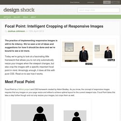
We’ve seen a lot of ideas and suggestions for how it should be done and we’re bound to see a lot more. Today we’re going to look at a fascinating little framework that allows you to not only automatically resize your images when the viewport changes, but also crop the images with a specific important focal point in mind. Developing WordPress Themes Using Responsive Frameworks. Responsive design is slowly but surely becoming an expected standard for web developers.
This tutorial will show you how to add a responsive framework to your next WordPress theme. What Is Responsive Design? It used to be you only had to worry about website consistency across multiple browsers, but now we have to look at the bigger picture – consistency across multiple devices. The computer used to be our only gateway to the Internet, but now we jump online from our phones, TVs, tablets and who knows what else will come down the pipe. Having your website appropriately render and perform on any device should be a top priority this year. Responsive design is all about making things fluid and adjusting according to screen size. Les Media Queries CSS3. La spécification CSS3 Media Queries définit les techniques pour l'application de feuilles de styles en fonction des périphériques de consultation utilisés pour du HTML.
On nomme également cette pratique Responsive Web Design, pour dénoter qu'il s'agit d'adapter dynamiquement le design à l'aide de CSS. Ces bonnes pratiques permettent d'exploiter encore plus les avantages de la séparation du contenu et de la présentation : l'intérêt est de pouvoir satisfaire des contraintes de dimensions, de résolutions et d'autres critères variés pour améliorer l'apparence graphique et la lisibilité (voire l'utilisabilité) d'un site web. 15 Best Responsive Web Design Testing Tools. Responsive Web Design is regarded as being the approach which suggests that web design and development should respond to the end-user’s behavior and environment based on their screen size, platform and orientation.
Responsiveness consists of a mix of flexible grids and layouts, images and an intelligent use of CSS media queries. When the end-user switches from their laptop over to their iPad, the website being viewed should automatically switch to accommodate that particular resolution, image size and scripting abilities. In other words, the website should have the technology to automatically respond to the end-user’s preferences. This would eliminate the need for a different design and development phase every time a new gadget device is introduced on the market. Along with all of the newest devices – also come varying screen resolutions, definitions and orientations. 1. ProtoFluid simplifies the development of fluid layouts, adaptive CSS and responsive design. 2. Responsive CSS Framework Comparison: Bootstrap, Foundation, Skeleton. Bootstrap 4.0.0-alpha is a fairly large update to the framework.
It has dropped Less support in favor of Sass, converted from px-based to rem-based sizing, improved its grid system, and dropped IE8 support. Also, all its JS plugins were re-written in ES6, it now uses a customized reset CSS file called Reboot, and offers flexbox support via a Sass boolean variable. In addition to this update, Bootstrap now offers themes at themes.getbootstrap.com. Also, Bootstrap will continue supporting version 3, unlike the dropping of version 2 support after the release of version 3. You can read more here. Foundation 6 is a fairly major update which includes more grid flexibility, custom breakpoints, optional flexbox, and more. 10 Best Responsive HTML5 Frameworks and Tools. This is a review of 10 open source responsive HTML5 frameworks, boilerplates and tools for front-end web development (HTML, CSS, and JavaScript).
I’ve included tutorials and resources related to each of them, and a comparison table at the end. 1. Twitter Bootstrap. 50 fantastic tools for responsive web design. As introduced/coined by Ethan Marcotte in both his article "Responsive Web Design" as well as his best-selling book, one needs three elements to make a site responsive: A flexible/fluid grid Responsive images Media queries There are plenty of other great articles that cover motives, concepts, and techniques regarding responsive web design, so we'll keep the focus of this article on some top tools that will help you become responsibly responsive.
Tools for starting out Before you start with building your site, it's best to sketch out how the elements on the page will adapt to fit the different browser sizes of the various devices that they will be viewed upon, and to avoid the disconnect that often comes from thinking primarily about the desktop design and the rest of the responsive iterations as an afterthought (see especially Stephanie (Sullivan) Rewis' comment). The top 25 responsive web design tools. Over the past few years we've seen an explosion of web-enabled devices with varying resolutions, capabilities, form factors, pixel densities, interaction methods and more.
CSS Media Queries & Using Available Space. We've covered using CSS media queries to assign different stylesheets depending on browser window size.
In that example, we changed the layout of the entire page based on the space available. It isn't required that we make such drastic changes with this technique though, so in this tutorial we'll go over a design tweak with a smaller scope. We'll also cover the syntax for using media queries within a single stylesheet and more examples of that. The CSS media query syntax for calling an external stylesheet is like this:
Beginner’s Guide to Responsive Web Design. Whether you’re a beginner or a seasoned web professional, creating responsive designs can be confusing at first, mostly because of the radical change in thinking that’s required.
As time goes on, responsive web design is drifting away from the pool of passing fads and rapidly entering the realm of standard practice. In fact, the magnitude of this paradigm shift feels as fundamental as the transition from table based layouts to CSS. Designing for a Responsive Web. The web as we know it is changing. In the past, designers and developers only had to concern themselves with one medium: the computer screen. In recent years, however, a plethora of fully internet-enabled devices with scores of different shapes and capabilities have cropped up, meaning that we now have to design our websites to fit comfortably in as many screen sizes, shapes, and resolutions as you can possibly think of. Our old fixed-width layout approach is out of the question now.
What Creative Design Agency. Now, this post was supposed to go out about two weeks ago, and since then it seems that every designer under the sun has written on the same subject – That’ll teach us for being lazy. Nonetheless, we decided to publish it anyway, just in case anyone missed any of the other great posts out there… By now you should all have heard of the iPad, and if not then you must have been living under a rock for the last few months!
Touch screen devices are here to stay and you need to start thinking about how to design and develop to get the most out of them. Apple would like you to believe that the iPad is the only touch screen device that anyone should own (and to be honest it probably is the best), but there are already some strong competitors, and many more coming to the market this year. Less Framework 4. I called Less Framework "a CSS grid system for designing adaptive websites". It was basically a fixed-width grid that adapted to a couple of then popular screen widths by shedding some of its columns. It also had matching typographic presets to go with it, built with a modular scale based on the golden ratio. The resources it was originally published with are still available on GitHub.
Contrary to how most CSS frameworks work, Less Framework simply provided a set of code comments and visual templates, instead of having predefined classes to control the layout with. This is how I still work today and definitely a method I advocate. /* Default Layout: 992px. Less Framework was popular in the early days of responsive design.
Eventually, I moved on from fixed-width grid systems and worked on a fully fluid-width one, in the form of Golden Grid System. Less Framework's popularity was helped by the following contributions and the lovely people behind them (dead links crossed off): Responsive Web Design with HTML5 and the Less Framework 3. What’s responsive web design? It’s a relatively new technique, first described in mid-2010 by Ethan Marcotte in his A List Apart article of the same name. Put simply, it involves providing a number of site layouts adapted to various screen widths, and then serving those layouts accordingly thanks to the use of CSS3 media queries. In the very aptly put words of Jeffrey Zeldman: Les fondamentaux du Responsive Web Design.
I. Introduction▲ Prenons deux exemples simples. Le premier pourrait être ces vitres qui s'opacifient en fonction de la luminosité extérieure. Ou encore ces murs-miroirs où plus nous nous approchons, plus ils nous semblent se déformer. Bref, ce que cherchent les architectes dans ce mouvement, c'est de dépasser/s'abstraire des contraintes inhérentes liées aux différents supports. Le « Responsive Web Design » est né, car nous sommes de plus en plus confrontés aux mêmes problèmes que les architectes : s'adapter aux supports. Voyez plutôt : autrefois, nous n'avions qu'un ou deux navigateurs et les tailles d'écrans variaient peu. Et tout cela, c'est ce que nous avons maintenant. Responsive Web Design: What It Is and How To Use It.
Advertisement Almost every new client these days wants a mobile version of their website. It’s practically essential after all: one design for the BlackBerry, another for the iPhone, the iPad, netbook, Kindle — and all screen resolutions must be compatible, too. In the next five years, we’ll likely need to design for a number of additional inventions.
When will the madness stop? It won’t, of course. In the field of Web design and development, we’re quickly getting to the point of being unable to keep up with the endless new resolutions and devices. Les 10 commandements du web adaptatif. 11 Reasons why responsive web design isn't that cool! Responsive design : définition, fonctionnement, ressources et tutoriels. Si vous vous intéressez de près ou de loin au webdesign ou à l’intégration, vous n’avez pas pu échapper au dernier terme à la mode : le “responsive web design”. Cette avancée technologique est également une nouvelle philosophie de création de site. Avantages et inconvénients du Responsive Web Design (RWD) Crème Graphique, création sites Web et outils communication, Poitiers.
Si le RWD présente certains avantages au premier abord, la mise en place d’un projet n’est pourtant pas aussi simple et évidente qu’il n’y parait. Il implique une restructuration de la phase de développement. Synthèse.