
Infographics & Data Visualization. Get The Action You Want On Your Website Using These Four Visual Cues. Not seeing the action you want on your website?
If you’re not leading your website visitors to take specific actions, they’ll just randomly browse through your pages, look at odd text and icons, then leave without buying anything. Get Your FAQs Straight: Convert Your Curious Customers. Your FAQ page represents one of the most valuable moments in a conversion funnel.
Nowhere else does a visitor so deliberately indicate that they want to know the details of your product or service. Graph Viewer Test. 1.3.15 demo - jQuery. Window 1.
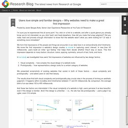
Users love simple and familiar designs – Why websites need to make a great first impression. Posted by Dave Thau, Senior Developer Advocate Google's GeoEDU Outreach program is excited to announce the opening of the second round of our Geo Education Awards, aimed at supporting qualifying educational institutions who are creating content and curricula for their mapping, remote sensing, or GIS initiatives.
If you are an educator in these areas, we encourage you to apply for an award. To celebrate the first round of awardees, and give a sense of the kind of work we have supported in the past, here are brief descriptions of some of our previous awards. Nicholas Clinton, Tsinghua University Development of online remote sensing course content using Google Earth Engine Nick is building 10 labs for an introductory remote sensing class. Topics include studying electromagnetic radiation, image processing, time series analysis, and change detection. Declan G.
UX. Online Form Builder! No Such Thing As Perfect. Q: Is it possible for a designer to look at their designs from a brand new user’s perspective?
Over the years, have you learned how to do this even a little bit better than when you began? Sometimes I feel like I can, and that with more practice I’ll be even better, but people keep saying that I should suck it up and have other people test my designs for me. I learn something new every time, but I wonder if I’ll ever reach a point where user testing reveals what I made is “perfect” and doesn’t need to be fixed. A: First off, let’s deal with this idea of “perfect”. Nothing you will ever make will ever be perfect.
Discover the secrets of a great landing page. How do you persuade someone to visit your web page?
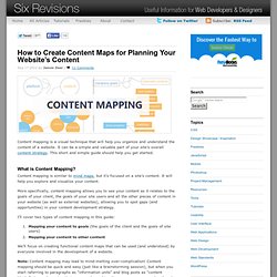
And how do you persuade them to purchase your product or sign up for your newsletter? Landing page optimization is the answer. We have some handy tips to follow and some examples of websites who already know the secrets. How to Create Content Maps for Planning Your Website’s Content. Content mapping is a visual technique that will help you organize and understand the content of a website.
It can be a simple and valuable part of your site’s overall content strategy. This short and simple guide should help you get started. Login Screen – behind the scenes. Here at GoSquared, we love to obsess over the little details that make the real difference in your experience of the site and Dashboard.
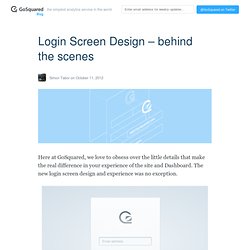
The new login screen design and experience was no exception. We wanted the login screen to feel personal and for our customers to feel comfortable and familar with signing in. How To Design Mental Models That Create a Superior User Experience. “Much of this article is adapted or excerpted from the book Mental Models: Aligning Design Strategy with User Behavior by Indi Young (Rosenfeld Media, 2008).”
Designing something right requires that you completely understand what a person wants to get done. You need to understand how a person uses something if you’re going to get the design right for them. You also need to know the person’s goals and the procedures she/he follows to accomplish those goals. Mental models give you a deep understanding of people’s motivations and thought processes along with the emotional and philosophical landscape in which they are operating.
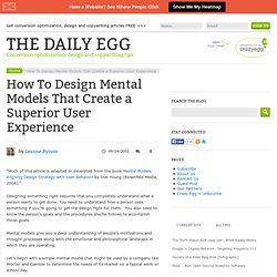
Let’s begin with a simple mental model that might be used by a company like Procter and Gamble to determine the needs of its market on a typical work or school day. Click to enlarge. The Code Side Of Color. Advertisement The trouble with a color’s name is that it never really is perceived as the exact same color to two different individuals — especially if they have a stake in a website’s emotional impact.
Name a color, and you’re most likely to give a misleading impression. Even something like “blue” is uncertain. To be more precise, it could be “sky blue”, “ocean blue”, “jeans blue” or even “arc welder blue”. Descriptions vary with personal taste and in context with other colors. FF3300 – Blog - Part 2. You can, if you want, see Mark Zuckerberg’s social network on Facebook . Here is his profile . But while those might be the folks that Zuck hangs out with on weekends, what’s potentially more important is are his work connections, the web of people who serve on boards and invest in the five major social web startups: Twitter , Zynga , Facebook, LinkedIn , and Groupon .
These companies are creating so much stock value, whether real or imagined, and are becoming the major drivers in our economy (the city of San Francisco just gave Twitter an enormous tax break so the company won’t move its headquarters). To help clarify where all the money and decisions in this corner of Silicon Valley is coming from, the Dealbook blog made this handy graph of the network of social tech companies .
Flickr Related Tag Browser. 12W MAT 259 Visualizing Information. Twitter data visualization. 3D data visualization for the last twitter messages containing a certain term or group of terms. the visualization was made in processing, using a ‘compact’ version of the twitter4j library and the twitter API. this was proposed as an exercise for the workshop datajockey, that took place in the Museum of Image and Sound of São Paulo, Brazil, from may 17th to 31st, 2011. Www.bestiario.org/research/videosphere/
Idan Gazit · UI/UX and Subjectivity. Because design is often confused with art, designers must contend with the (mistaken) opinion that design is purely subjective. UI/UX is purely a matter of taste in much the same way that cooking is just a matter of taste. There are a many cooks who can prepare delicious food. Why Your Qualified Leads Refuse to Sign Up: The UX of Plans and Pricing. Every SaaS application has a funnel. Landing page, maybe a demo or pricing page, and then sign up. Qualified leads will stop by your “Plans and Pricing” page to make an informed decision.
If you owned a car dealership, would you fill your showroom with stray dogs and blasting loud music? Well, too many startup founders, product managers, and user experience designers are letting the dogs and loud music run wild. NTYAsked. Don’t Use Automatic Image Sliders or Carousels, Ignore the Fad. Www.graphics.stanford.edu/courses/cs448b-04-winter/lectures/treesgraphs/tree.graph.pdf. Vis.stanford.edu/files/2012-EnterpriseAnalysisInterviews-VAST.pdf.
The quick, revolutionary way to check your cardiovascular wellness is now at your fingertip. Unforgettable: 10 Purple Cow Websites to Spark Your Imagination and Your Creativity. On this blog we talk a lot about websites that have effective calls to action, non-cluttered home pages, and trustworthy designs with the intention of showing what techniques help improve conversions. After years of showing our readers examples of what works and what doesn’t, one thing we have noticed is an awful lot of similarity between website designs in the same space. Above: We have your typical “software as a service” (SaaS) website. Look! Home — Playframework. Know Thy User: The Role of Research in Great Interactive Design. By David Sherwin - September 30, 2012. MIT Media Lab. Fridge - Alpha. The User Experience Experiment.
Listening Closer, To Find The Next Big Interaction Idea. 3D Spin Rotate & Zoom 360 product viewer Javascript jQuery VR Objects 360° Reel. Hand picked AJAX-ZOOM 360° example highlights. CreativeApplications.Net. GMU:Einführung ins Programmieren mit Processing/Seminar - Medien Wiki. 50 fantastic tools for responsive web design. The top 20 data visualisation tools. 15 top web design and development trends for 2012. Create fluid layouts with HTML5 and CSS3.
Awesome Sauce gifsockets!!!11. Infographic: 50 People Shaping The Future Of Design. Future of Internet: What will the Internet look like in 2020. iOS Icon Design Gallery. Dieter Rams / Selector for 25/25 - Celebrating 25 Years of Design. Dieter Rams Industrial Designer (1932-) Selector for 25/25 - Celebrating 25 Years of Design 29 March - 22 June 2007 As head of design at Braun, the German consumer electronics manufacturer, DIETER RAMS (1932-) emerged as one of the most influential industrial designers of the late 20th century by defining an elegant, legible, yet rigorous visual language for its products.
Dieter Rams 10 Commandments of Design: Martin kaltenbrunner. “giles colborne” on SlideShare. Sphere. Let's Be Frank. Moritz.stefaner.eu - / Jellyfish. A visual exploration on mapping complex networks. Datavisualization.ch Selected Tools. Hive Plots - Linear Layout for Network Visualization - Visually Interpreting Network Structure and Content Made Possible. 2012 Logo Trends. Visible Map of Knowledge Sought. Startups, This Is How Design Works – by Wells Riley.
Design Thinking Barcelona. The difference between a UX Designer and UI Developer « Melbourne, as in the city. Browse & Simple Desktops.