
Understanding the Bootstrap 3 Grid System. With the 3rd version of the great Bootstrap out for about 4 and a half months now, people have had their time to play around with it, learn the changes, find new features, and build amazing things. # The Difference The most interesting change for me was the difference in the grid system.

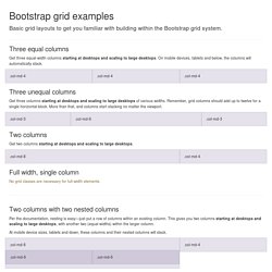
Bootstrap 2 catered to two different browser sizes (desktop and then mobile). With Bootstrap 3, you now build with mobile in mind first, and the grid system lets you create different grid systems based on browser size. Bootstrap 2 The grid you create works on desktops and then stacks on top of each other when browser size is below 767px. Bootstrap 3 The new Bootstrap grid system applies to mobile first. For example, let’s say you want a site that has: 1 column on extra small devices2 columns on small AND medium devices4 columns on large devices Since the grid system now cascades up from mobile devices, this is how this code will look. <div class="row"><div class="col-sm-6 col-lg-3"> This is part of our grid. Grid Template for Bootstrap. Three equal columns Get three equal-width columns starting at desktops and scaling to large desktops.
On mobile devices, tablets and below, the columns will automatically stack. Create a Responsive Photo Gallery with Bootstrap Framework. So you’ve been tasked with creating a photo gallery for you website.

One that looks good on a desktop, a phone – even a tablet. One that has a grid of thumbnails, plus a modal functionality when the thumbnails are clicked. This is part one of two series. Part two is where we add “previous” and “next” links to our modal box, click here to view it. Well you’re in luck. View Demo Before we begin, make sure you read our in-depth look of Bootstrap’s grid system. So ready to start? Create the Markup Assuming that you’ve downloaded and linked to Bootstrap’s files, let’s create our .container div, along with an un-ordered list. Save it and we should have something like below: Nothing magical here, just an un-ordered list of images with no styles. Save and view it in the browser: Believe it or not, we’re halfway done. Add a few CSS styles just to get rid of the list styles and unnecessary padding and margins.
Bootstrap 3.0 Grid System - a look into the heart of this amazing framework. The idea of a grid system has been around since the 960.gs framework days.

Web designers from all over the world began realizing the importance of pixel perfect alignment, gutter spacing and the rule of thirds. Understanding Twitter Bootstrap 3 Grid System - Tutorial Republic. The Bootstrap grid system is the fastest and easy way to create a layout.
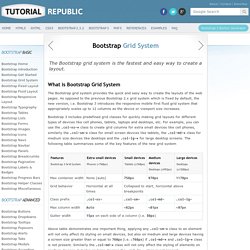
What is Bootstrap Grid System The Bootstrap grid system provides the quick and easy way to create the layouts of the web pages. As opposed to the previous Bootstrap 2.x grid system which is fixed by default, the new version, i.e. Bootstrap 3 introduces the responsive mobile first fluid grid system that appropriately scales up to 12 columns as the device or viewport size increases. Bootstrap 3 includes predefined grid classes for quickly making grid layouts for different types of devices like cell phones, tablets, laptops and desktops, etc. Above table demonstrates one important thing, applying any .col-sm-* class to an element will not only affect its styling on small devices, but also on medium and large devices having a screen size greater than or equal to 768px (i.e. ≥768px) if .col-md-* and .col-lg-* class is not present. Creating Two Column Layouts Creating Three Column Layouts. Experience Design at Hello Erik. IMPORTANT NOTE: Bootstrap 4 will be out soon, and it will be moving to Sass for its CSS instead of Less.
Most of the principles of this article will still apply – but I will do my best to quickly either rewrite the post for Sass, or just update this post for both. I do not expect huge changes to how the grid HTML classes are applied. Read more here: After over 9-months of work, Bootstrap 3 is here. It introduces a new way of thinking on how the responsive grid works, when it is best applied, and how the styled elements within the breakpoints work as well. The Subtle Magic Behind Why the Bootstrap 3 Grid Works. IMPORTANT NOTE: Bootstrap 4 will be out soon, and these articles will be updated to reflect both v3 and v4.
I do not expect major changes to how things work with regards to the content of these articles, but everything will be updated for continued education and assistance with Bootstrap. Read more here: Things like CSS grids should remain behind the curtain. No one really needs to know how it works, or why. Until you have a broken design or something complex and you can’t figure out why your spacing, margins, paddings etc are all messed up. I’ve seen a number of people confused or irritated at how the bootstrap grid works. Container The container has 2 purposes: To provide the width constraints on responsive widths.
You never need another container inside of a container. Row The row provides the columns a place to live, ideally having columns that add up to 12. Rows also have a unique aspect of having 15px of negative margin on each side, as seen in blue in the image below. Column Nesting.